What is a landing page and how to create one that converts
The internet is crucial for successful marketing for both companies and the self-employed. By optimising your website and making it user-friendly, you will be more successful by encouraging customers to make a purchase that may lead to them becoming regular customers. An important online marketing tool, landing pages kill two birds with one stone: they connect advertisements and customer interaction with one another. They offer the ideal platform for bringing offers directly to users and persuading them to buy. However, some things have to be taken into account first before landing pages can obtain contacts and make a profit:
What are landing pages and what do they do?
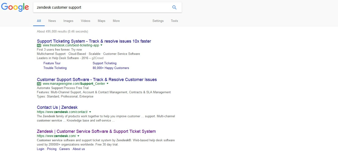
The landing page is a specific offer page, which users are directed to when they click on an advertisement. A few examples of where these kinds of ads can be found include on advertising banners, on search engine results pages (SERPs) such as Google, Bing, and Yahoo, on info pages, blogs, and in magazines, as well as on commercial partner sites of second-party providers (known as 'affiliate websites'). A common tool in online marketing, landing pages aim to attract potential customers to their offers or products. Good landing pages are optimised for a specific target group, content optimised for search engines, as well as also offering users attractive content. On the landing page, the user is encouraged to interact with the provider or carry out a direct transaction by being shown additional information and CTA elements ('call to action') such as links, buttons, or contact forms. For online providers, the landing page aims to achieve two things: conversions (user transactions) and leads (contacts with potential customers). Landing pages lead the user to what they are looking for and encourage them to make a purchase, download a file, or leave their contact details. For this to be successful, the user needs to be able to reach what is on offer in just a few clicks and carry out the desired action. With every user transaction completed, the user obtains customer data or a direct sale. If the site is thoroughly optimised for specific content and indexed by search engines, it will also receive a positive ranking and can, therefore, be found more quickly with organic search queries. Good landing pages are therefore essential tools for every employer and salesperson in online marketing.
What content features on a landing page?
A landing page is often the first access point to a certain offer on the internet. However, unlike a website’s homepage, it’s not actually the beginning, but rather the provisional goal of the customer’s journey. If the user clicks on an advertisement, they usually have a certain idea of what should be awaiting them. If they click on an ad for 'cheap men’s shoes for summer', they shouldn’t be forwarded to a page offering 'trendy swimwear for men and women'. They will quickly lose interest if they have to then click through more pages to find the shoes since the original page didn’t match their search query. The landing page’s content should therefore always correspond with what the advertisement 'promises'.
It doesn’t matter whether you’re in charge of a magazine, a blog, or an online store – your content needs to be suitable and useful in order to encourage the user to make use of your service, or purchase your products. Your landing page’s content should address the users’ most important questions:
- Where am I?
- What do I receive?
- How do I receive it?
- What are the benefits?
The user should find the answer to these questions by quickly scrolling through the informative, appealing text and images on the landing page in order to find out how useful it is. They need to feel like they have found exactly what they are looking for. Text is the most important information resource, but appealing images and explanatory videos, however, will give you a higher chance of getting a conversion.
The landing page content must be carefully prepared and clearly structured. Short, clear, and error-free texts demonstrate professionalism, competence, and quality. You need 'crisp' headlines and short blocks of information with subheadings so that the user can quickly get an impression of what the content is about. Matching illustrations ('hero shots') reinforce this.
Information should be displayed in descending order of importance when the user scrolls: frequently asked questions should be answered first, and uncommon or specific questions should be answered last. Since search engines also find content and evaluate it, you need to ensure that the content is used in a sensible and sparing way. Fewer lines with flowing text, clear lists, and keywords describing the features and advantages are required so the user feels confident taking action.
With IONOS, get your business online in just a few steps with a fully customisable one-page website including a free domain and a personalised email address!
Call to action and legal advice
The CTA buttons should be distributed within the text so that the user can carry out a transaction (purchase, download, or enter contact details). Additional 'testimonials' (references and recommendations) from satisfied customers or partners complete the presentation. The information must, however, be binding and reliable. The user shouldn’t feel like they’re in front of a bargain counter, but rather in a customer-friendly specialist store. This also means you shouldn’t include everything you’re offering on the landing page – commit yourself to one offer so as not to overwhelm the user. Users will only fill out a contact form, download files, or complete a transaction on a landing page if they feel personally spoken to and at ease. In addition to the content, you also need to think about the legal aspects: data protection guidelines, and general terms and conditions (specifically for online stores). The provider’s contact details should be visible as well as an explanation of which user data is required e.g. name, telephone number, address. The information should be clearly visible and linked to all the website’s subpages – and thus the landing pages. When it comes to generating certain leads, it’s important to use the double-opt-in method for signing up to newsletters so that the user has to confirm by e-mail after entering their data that they definitely want to subscribe. Before launching your website or landing page, you should be aware of these legal guidelines.
Structure and design
Even the best content is worthless if it is poorly conveyed. When it comes to landing pages, as is the case of websites in general, optimal user friendliness (usability) is required. The user must be able to quickly get an overview and orientate themselves without any problems. The structure and design of the landing pages should inform the user and lead them to their target. If the page is too complex, the user might quickly lose interest. If they end up aborting the operation, the bounce rate will increase. Canceling pages before they’ve loaded and short retention times not only prevent conversions and leads, but also have a negative impact on search engine rankings. The most important information should, therefore, be compact and placed in single blocks on a page as well as being easily visible. A good landing page isn’t an abstract work of art, but rather an appealing, clear, and purposeful page. The visual design is like good makeup: it’s relevant to the offer and is attractive, but is not too over the top. In terms of colour and image composition, the design should support the content and not superimpose or distract from it. A matching colour scheme should be nuanced, harmonious, and conform to corporate identity (CI). If the CI is rather conservative, the landing page should not be too boring. Artistic landing pages, on the other hand, must not be too chaotic or glary as this can confuse the user or deter them. The style of the original ad (e.g. an advertisement banner) is typically also found on the landing page i.e. the colour, font, and images. Optimising for mobile devices means that your landing pages should have a responsive or adaptive design for smartphones and tablets. This way, you ensure that content is well displayed and can be used without any problems. This means that users can access the page when they’re out and about. This also improves the search engine ranking. Arrange the content of your landing page sparingly so that what you’re offering is accessible without the user having to click on anything or search around a lot for it. 'White spaces' should be used to make the document look less crowded and to create an overview. Depending on how much information you want to include, it makes sense to place all essential content in the browser view so that the user doesn’t have to scroll at all. The perfect landing page follows a strict plan – it’s compact, quick, and clear:
- Introduction: logo, title, and brief introduction with representative image
- Product description: most important information, USPs (unique selling points), price, advantages, features
- Call to action with text and/or image
- References: testimonials, certificates, quality certificates
This isn’t just for optical reasons; too much data, high-resolution images, unnecessary plugins, and senseless additional features can also slow down the landing page’s loading time and cause error messages that will discourage customers from staying on the page. This makes it important for the performance of the landing page to adapt these regularly and to continue to optimise them with data analyses, A/B tests, and error checks. Only when you know which elements of the landing page customers are drawn towards, can you make them more efficient and profitable in the long run.
Examples of good landing pages
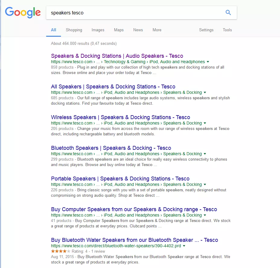
Here is a selection of examples for well-ranking landing pages for specific search queries:
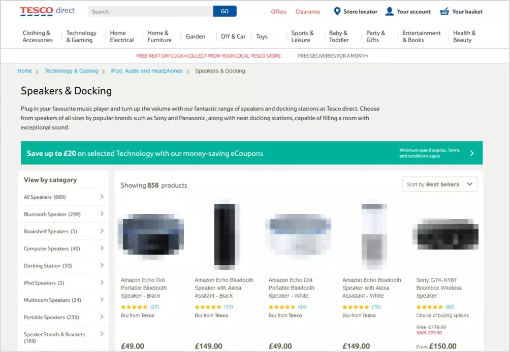
Tesco’s logo is easy tto see in the top left-hand corner. It’s simple and therefore easily recognisable and when clicked on, sends the user to the shop’s main page. The layout of the page is relatively plain and therefore doesn’t overwhelm the user, and the main two colours used: white and grey, complement each other quite well. It’s clear that the user is in the technology section, which then branches into audio, and subsequently then also speakers. Each speaker has a photo showing what the buyer can expect from the product. The first piece of information is the product title, which includes the brand; something which is often a deciding factor. This is followed by the product’s rating (number of stars). Underneath this is the price of the product, and while this may be the last piece of information, it must be noted that it is the one written in the biggest and boldest font.
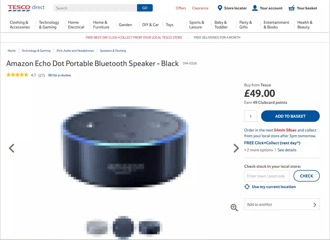
This second screenshot shows what happens once a particular speaker has been selected. Due to its size and contrasting colour, the call to action button stands out and encourages the user to ‘Add to basket’. The pictogram denoting a basket in the top right hand corner allows the user to easily view see which product(s) they’ve added to it and potentially want to buy.
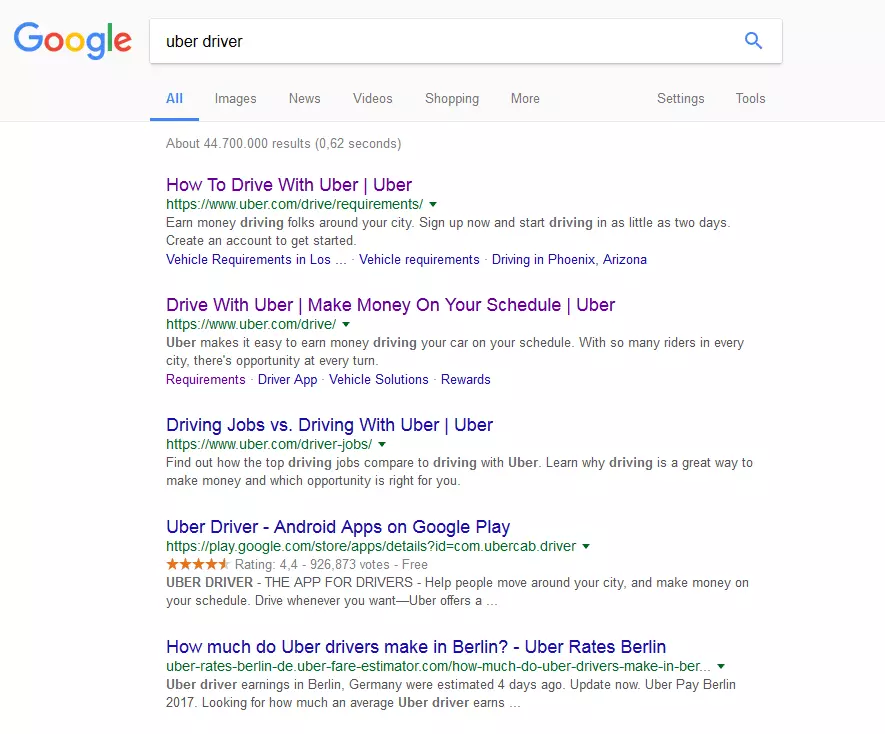
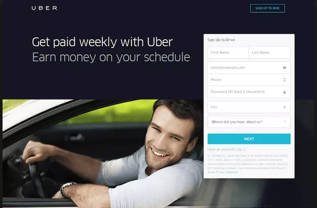
Taxi company Uber’s landing page is very clear and concise. The brand logo is visible in the top left corner, and the images are simple and straightforward. The page is kept quite empty with very few items to actually click on. The copy is short and simple, making a clear and attractive proposition to site visitors: ‘Get paid weekly with Uber: Earn money on your schedule’. The message leaves no illusions about what Uber offers. All of the space created by limited features and copy means that the focus of the page is the call to action towards the bottom right hand corner of the screen. Uber encourages all visitors to ‘Sign up to drive’ by having an application right there onm their landing page. The list of personal information required appears to be short, further encouraging site visitors to just give it a go.
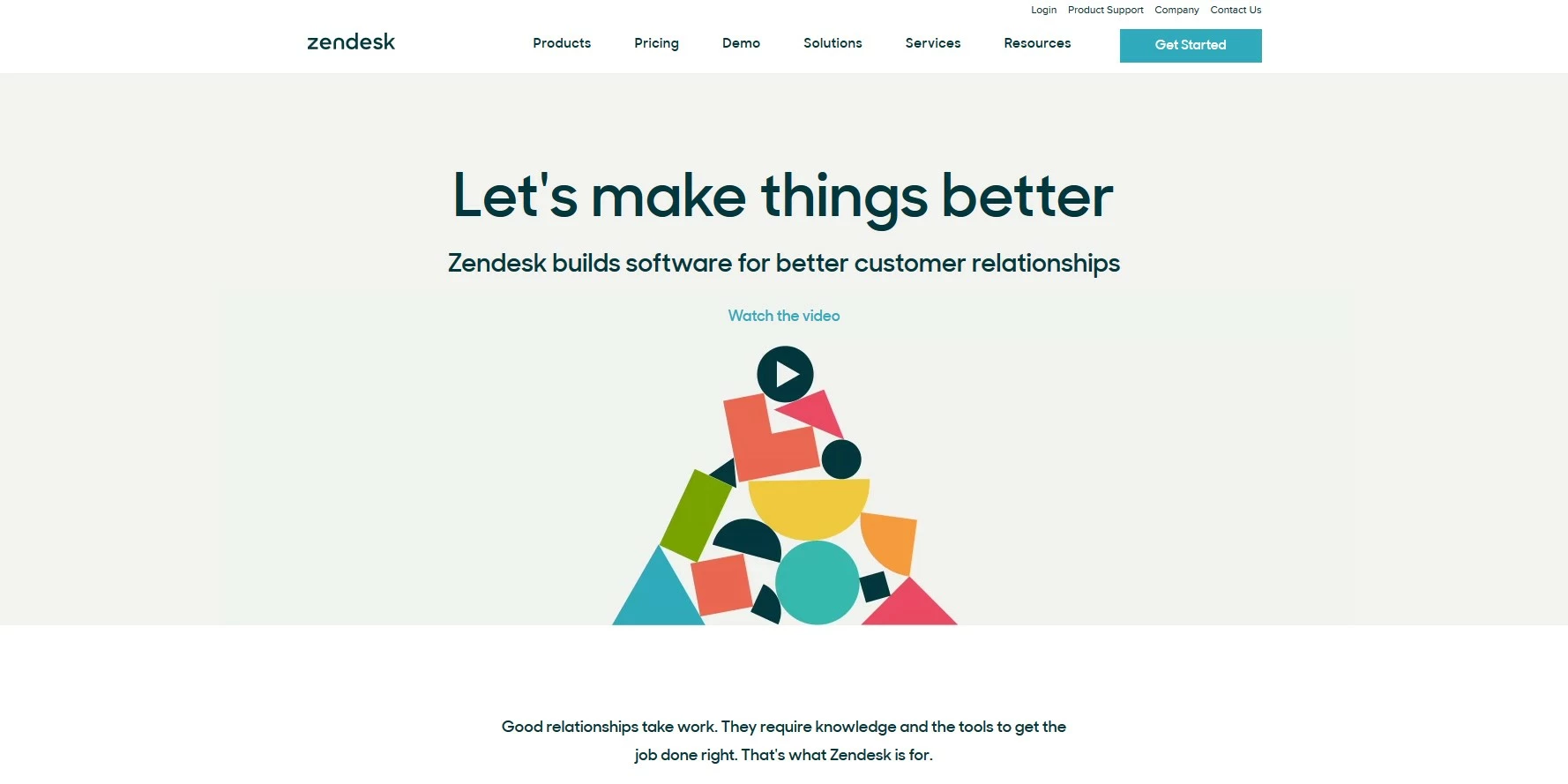
Zendesk describes itself as a provider of software for ‘better customer relationships’, and one look at their landing page shows how much value they place on customer interaction. As the page loads, interactive blocks make their way from the edge of the screen to form a triangular pile in the center, immediately catching your eye. A ‘play’ icon takes its place at the top, just underneath an instruction to ‘Watch the video’. The message of this call-to-action is clear: And once you’ve clicked on the play icon, a pop-up video explaining all of Zendesk’s core values and features begins to play. Above the graphic video prompt, Zendesk offers short and simple copy. Their tagline, ‘Let’s make things better’, implies a collaborative group effort and encourages the site visitor that they’re on your side. Below is a 7 word explanation of what Zendesk does in a nutshell: ‘Zendesk builds software for better customer relationships’. Underneath this attractive and clear central page area, there’s a slightly longer explanation of what Zendesk offers and the problem it tries to solve. While at the top of the page is a classic header with the company logo, a selection of drop-down menus, and another call-to-action in the form of a large ‘Get Started’ button.
Planning a web project and already have an idea of the perfect landing page? Click here to discover IONOS's creative design templates portfolio.
