Rich Cards: the new Google results format
In May 2016, Google announced its new search results format with structured data. Like with the highly successful Rich Snippets update, this structured data enabled Google to present more attractive, visual search results – designed to match the content of the respective web project. According to Schema.org, this new Google format also requires structured markups. Unlike the Snippets, Google Rich Cards are have seemingly had an immediately positive effect on the experience of users accessing the site on mobile devices. They display in an info carousel, similarly to the Accelerated Mobile Pages (AMP), meaning a user can scroll through display results. Google has limited the new results format to the categories of content: recipes, films, and articles. Originally these Rich Cards only displayed on mobile search queries from the American Google.com. But since May 2017, Google Rich Cards are now available on other language versions of the search engine, meaning that the variety of the content on offer has been extended. When it comes to presenting products, the new results format seems to offer a great opportunity and is sure to be hotly contested by operators of e-commerce platforms in future. The same is true for artists and businesses in the hotels, restaurants, and events industries: Google’s Rich Cards will impact them greatly, for better or for worse. So how does it work?
How will Google Rich Cards differ from Google Rich Snippets?
Google has been constantly improving the quality of its search results since its foundation in 1998. Its first big move was to optimise the way that ads were displayed in the search engine results pages (SERPs), which gave rise and importance to the now crucial instrument of search engine optimisation (SEO) and its power to make a website better known. But in recent years, there’s been a clear trend for Google to focus on the optical appearance of result hits (the introduction of the internal AdWords service did add another way of changing search engine ranking, but this was detached from the organic search itself). Webmasters today don’t just have the chance to grab the attention of users by earning a good search engine ranking – they also have the tools to offer a successful visual and informative appearance in the market leader’s SERPs.
You wish to find out how well your website can be found by the search engine? Do a quick website check now!
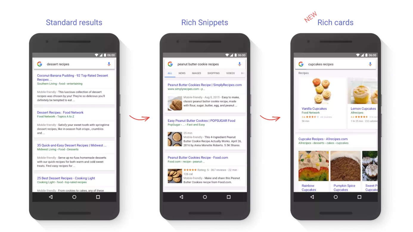
When Google launched its latest change with the announcement of Rich Cards, it presented the following image on its company blog to illustrate the difference between the traditional display methods and this newest foray:
The image above shows how the Google Rich Cards differ from the Rich Snippets: when it comes to structure, Rich Cards are more similar to the Product Listing Ads that Google rolled out at the start of the decade. These display at the top of the search engine results pages for mobile devices. But, unlike these, Rich Cards are actually part of the organic search results display. Rich Snippets display in a more traditional way, with results arranged underneath one another like in the standard results pages. It remains to be seen which way the new search results will be laid out in future now that Google has to juggle between paid ads, Rich Cards, and other, more traditional display results.
The focus of the new results format lies in the presented image that accompanies the search result. Just like with Snippets, Rich Cards offer some or all of the following additional information in the search results:
- Duration of the cooking time or the film
- Number of calories or credited actors
- User rating
Rich Cards and Rich Snippets also both include an external link to the website where the content is displayed. But the short teaser, known as the ‘Description’ is excluded from Rich Cards in favour of a more compact format and a larger image display.
The third distinct difference between the two has been discussed already: Google only displays Rich Cards on search results pages responding to queries made on mobile devices. So if you search on a desktop PC, you’ll only be shown Rich Snippets at present. There’s currently no information available about whether Google plans to keep this separation or explore a Rich Cards desktop format as well.
Google Rich Cards: how to take advantage
Rich Cards and Rich Snippets do have one major thing in common: Both formats insist upon the use of structured data for displays. This means that web operators who want to be featured in either of the Rich display formats have to arrange their data in the right way so that Google’s crawler can read and interpret it before classifying the data accordingly. If as a website owner you don’t choose to use this structured data format, your result will only display in the standard results format. If you’ve previously implemented a suitable set of structured data into your project to allow your website to be featured as a Snippet, then you’ll find it very straightforward to make the extra adjustments to meet the Google Rich Cards criteria. Google recommends the RDFa framework for all formats. Google also offers listings for different types of content including available features like Rich Cards on the developer forum. There’s also an informative page for each form of display presentation that tells you the different information that you should put in each of the corresponding markup areas. So here’s an example of the information needed to present a recipe in the RDFa script format for Google:
| Category | Value (according to Schema.org) | Description | Relevance |
|---|---|---|---|
| name | Text | name of the meal | necessary |
| image | URL oder ImageObject | image of the finished meal | necessary |
| author | Person | recipe creator | recommended |
| datePublished | Date | date when the recipe was first published – in ISO-8061 format | recommended |
| description | Text | brief description of the recipe | recommended |
| aggregateRating | AggregateRating | average user rating | recommended |
| review | Review | reviews of the meal | recommended |
| prepTime | Duration | approximated preparation time; can be offered as minimum and maximum value estimates; given in ISO-8061 format | recommended; always required in combination with cookTime or totalTime |
| cookTime | Duration | approximated cooking time | recommended; always required in combination with prepTime or totalTime |
| totalTime | Duration | approximated total time for preparation and cooking; presented in ISO-8061 format | recommended; can be combined with prepTime or cookTime |
| recipeYield | Text | portion size | recommended |
| recipeIngredient | Text | ingredients list used in the recipe | recommended |
| recipeInstructions | Text | instructions for the recipe | recommended |
In addition, you should be sure to make use of Schema.org to define the basic vocabulary you’re using (@context) and ‘recipe’ as the type of content you’re writing about type (@type). A completed script will look something like this at the end:
<script type="application/ld+json">
{
    "@context": "http://schema.org/",
    "@type": "Recipe",
    "name": "Pizza Mozzarella Recipe",
    "image": "https://pixabay.com/photo-711662/",
    "author": {
        "@type": "Person",
        "name": "User"
    },
    "datePublished": "2016-08-05",
    "description": "Delicious Pizza Mozzarella with fresh ingredients that can be made easily and quickly at home.",
    "aggregateRating": {
        "@type": "AggregateRating",
        "ratingValue": "5",
        "reviewCount": "52"
    },
    "prepTime": "PT20M",
    "totalTime": "PT60M",
    "recipeYield": "1 Person",
    "nutrition": {
        "@type": "NutritionInformation",
        "calories": "900 cal"
    },
    "recipeIngredient": [
        "Ingredients"
    ],
    "recipeInstructions": "Instructions"
}
</script>
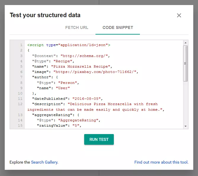
After this, you’ll have the chance to use the Google Structure Data Testing Tool to check your markup for errors. To do so, simply start a new test using the link and enter the URL of your web project or your code snippet into the tool:
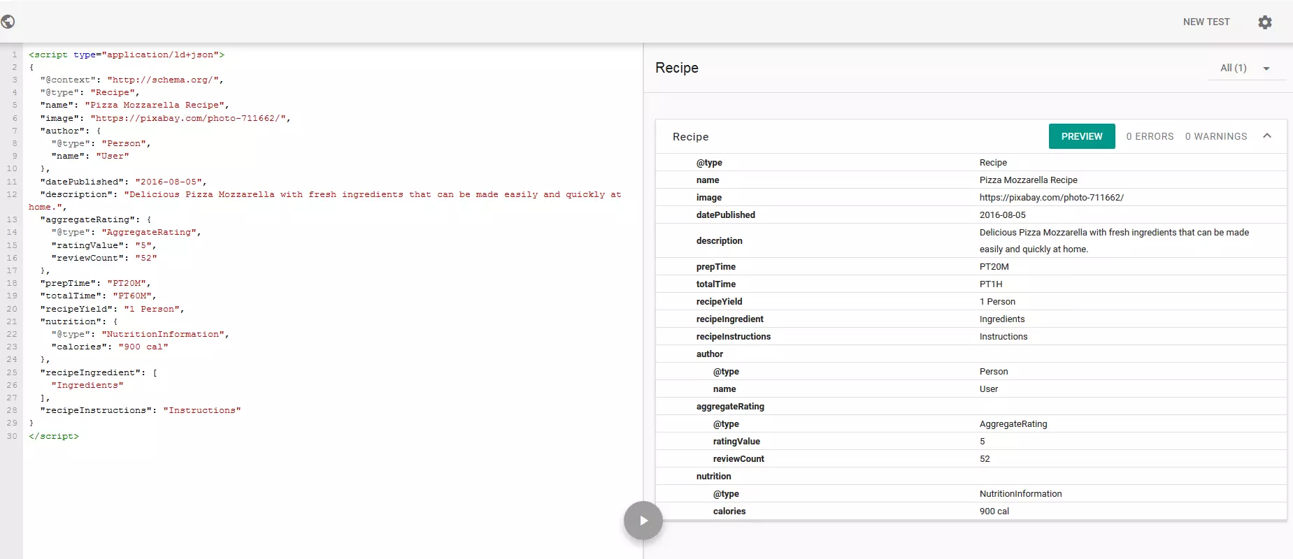
Our example checked out with the tool finding no errors or warnings. Should yours appear with either, it’s sensible to follow the instructions and rethink your website display. By using the ‘preview’ button, you can have a look at how your Rich Card will look once it’s been created. But your image has to be indexed by Google first and so the final result might end up looking considerably different to the preview.


