Tips and examples to help create great 404 pages
The error message ‘404 Not Found’ tells website users that no content can be found on the website they’ve tried to visit. If you want to know exactly what an error 404 (also known as code 404 or http 404) is, what causes it, and how to avoid it, you can find out more in our article on the 'Error 404 Not Found'. So what ways have companies found to handle this error message? Many websites have proven that it’s possible to turn the error 404 into a positive by creating an original and amusing 404 page, in place of the plain and standard error display. Using 20 inspiring expert examples, we’ll show you how you can do the same.
What’s the point of a creative 404 page?
Unfortunately, the scenario happens far more often than you’d hope: potential website visitors click on a link from a search engine or another website and end up on a 404 page – a dead end on the internet. This can be incredibly frustrating – for starters, the content the user was searching for isn’t displayed, but worse yet, the design of the error page is unappealing and bland.
By using an unusual and exciting 404 error page, you can quickly ease the blues of your sites visitors. If you surprise your users by using the design of your 404 page to get creative, you can turn a negative into a positive and put a smile on the face of your customers; making them more likely to let you off the hook and keep your site in mind for future visits.
How can you create a good 404 page?
Simply put: Good error pages distinguish themselves through a pleasant visual display and a charming and/or amusing message. The following tips are important to keep in mind:
- Stay true to the style of the website: a good 404 webpage matches the design of its website and the corresponding identity of the company behind it. Make sure that your error displays fit the content, tone, and visuals of your online presence.
- Briefly explain what’s happened to the visitor: not every user is aware of what an error 404 means. Instead of simply writing ‘404 Not Found’ or ‘Error 404: page not found’, you should briefly and simply explain why the user has reached this page. This can be done in a light-hearted, amusing way – often, creative 404 error messages will suggest that the user has been lost in the vast, empty world of the internet forever, or that they were too slow and the content of the webpage has been moved.
- Humour: many of the best 404 pages employ a humorous and self-deprecating stance on the subject. But it’s important to make sure that this text is only as long as it has to be. Remember that your site visitors have actually been promised other content – so the joke should be quick and to the point. A good way to speed this up would be to use images, animation, gifs, or even short videos to entertain your users.
- Integrate animation or a mini browser game: although they require the most effort, the use of animated or even interactive 404 pages always provides the most entertainment and captures visitor attention.
- Always link back to your homepage: while 404 pages can be good fun, the most important thing is to get your visitors back on track as soon as possible. You should do this by either linking back to your homepage or embedding a search function to allow users to find the page they want on your website.
20 funny, original, or just simply great 404 pages
To help inspire you into finding a great design for your own http 404 error page, we’ve assembled a list of 20 of our favourite examples for you to enjoy below. In the selection, you’ll find charming, quirky, funny, and surprising ideas for implementing a creative 404 page.
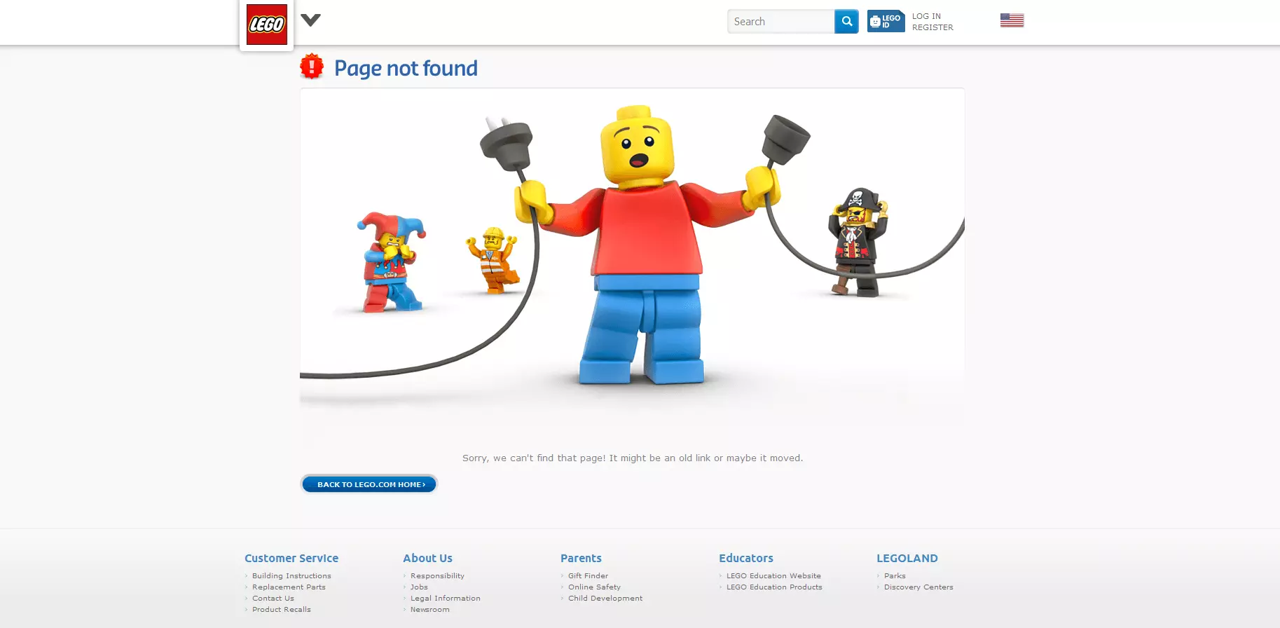
Lego
Danish company Lego feature several iconic Lego figures on their error page, each reacting in a different way to the 404 error. This is a good example of how to maintain corporate identity on an error page.
South Park
Cartoon classic South Park follows Lego in the style of its South Park Studios website’s 404 page. The writers feature a character from the show using one of their classic catchphrases. In our example, it’s the turn of Butters, the loveable fourth grader. But they’ve featured Stan, Cartman, Kenny, and Kyle already in the past. Switching things up keeps the page fresh and users entertained.
Blizzard Entertainment
The Blizzard error page blames the visitor entirely for the 404 error. The video game producer features a smashed internet page, ironically blaming the user and using slang language that gamers typically use to chat with one another online.
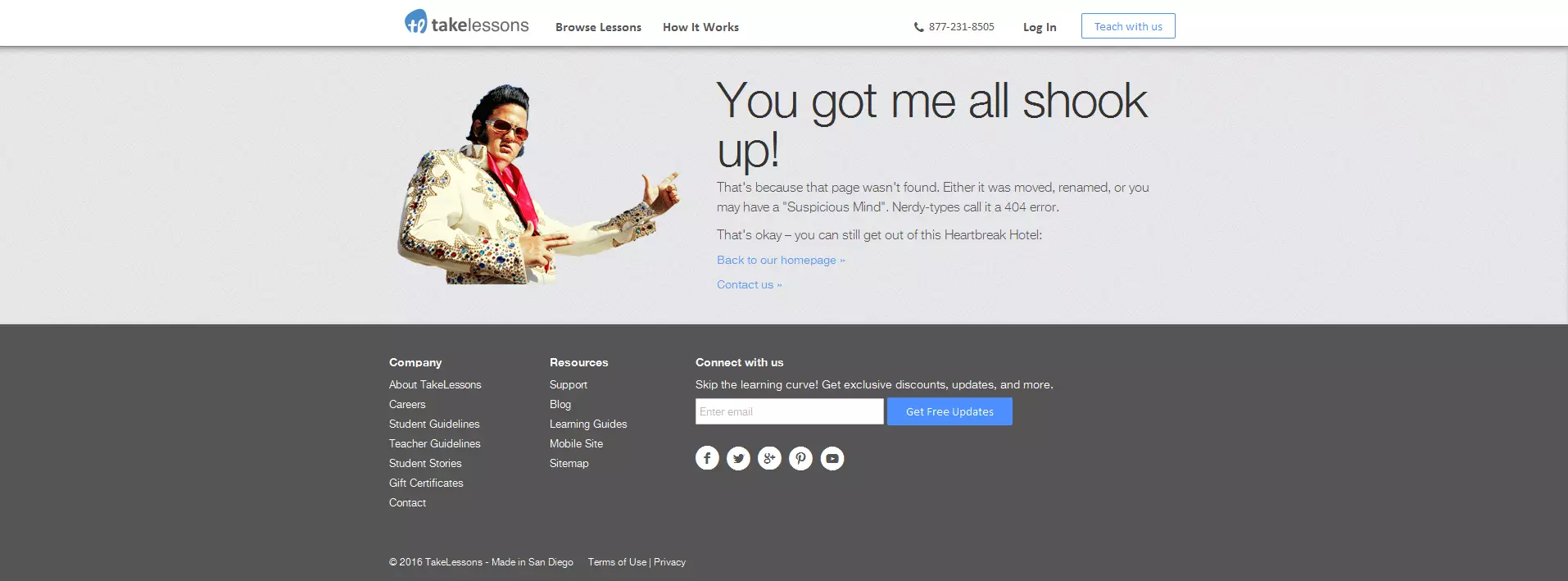
takelessons
The learning portal takelessons connects tutors with students in a vast array of creative arts, including singing, guitar, languages, and acting. Starting as a music lessons business, they stay true to their musical nature in this great 404 page. Using a classic image of Elvis ‘The King’ Presley, they quote some of his classic songs in their humorous error message.
The social network for professional contact, XING, offers a clever search function for their website on their 404 page. The picture looks amusingly unprofessional, featuring a handwritten note on a lamppost – amusing for a professional social network.
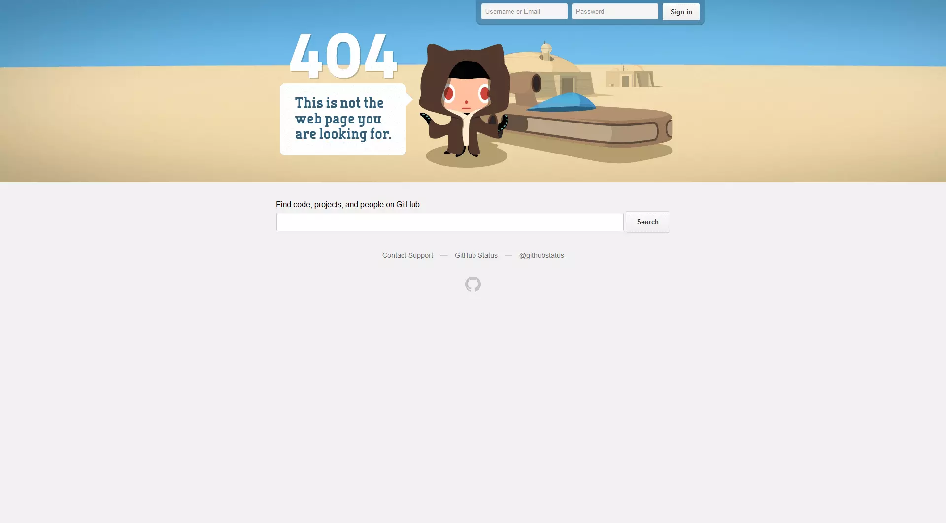
GitHub
This online service for software developers knows that its audience are likely to be fans of ‘Star Wars’ as well. GitHub play on this on their 404 page by using a classic line from the saga on an interactive Star Wars backdrop that bounces and slides as you move your cursor over it.
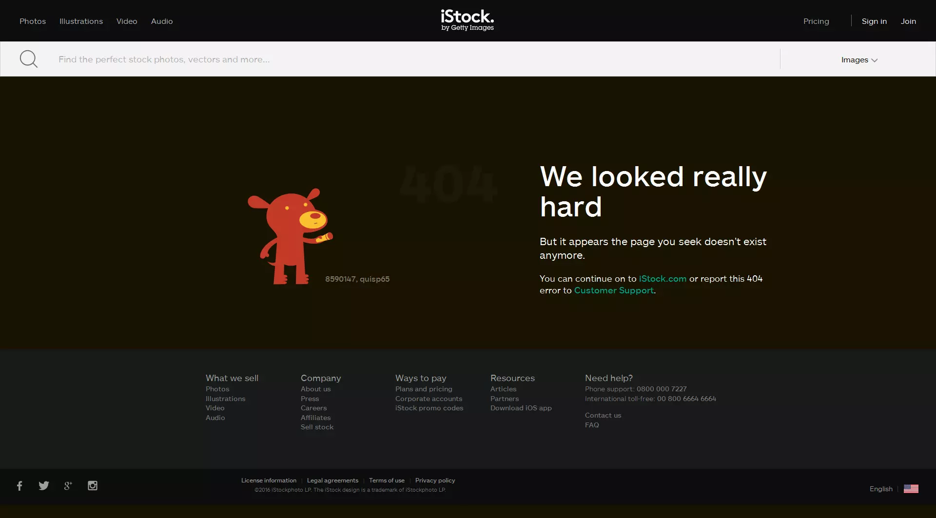
iStock
The Canadian image database iStock doesn’t go so far as to include film quotes on their 404 page, but, like GitHub, they combine an amusing design idea with a witty, self-deprecating message.
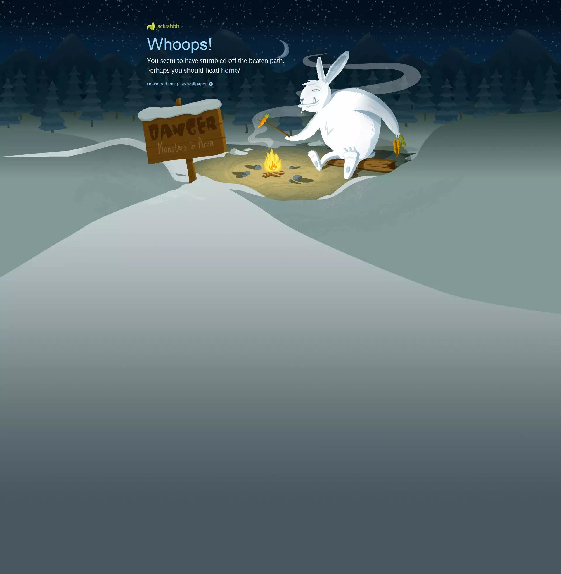
Jackrabbit Design
Marketing agency Jackrabbit Design have opted for an amusing way to return you to their homepage on their 404 page. Like with many other 404 error displays featured here, they play on the idea that the user has wandered off and become lost.
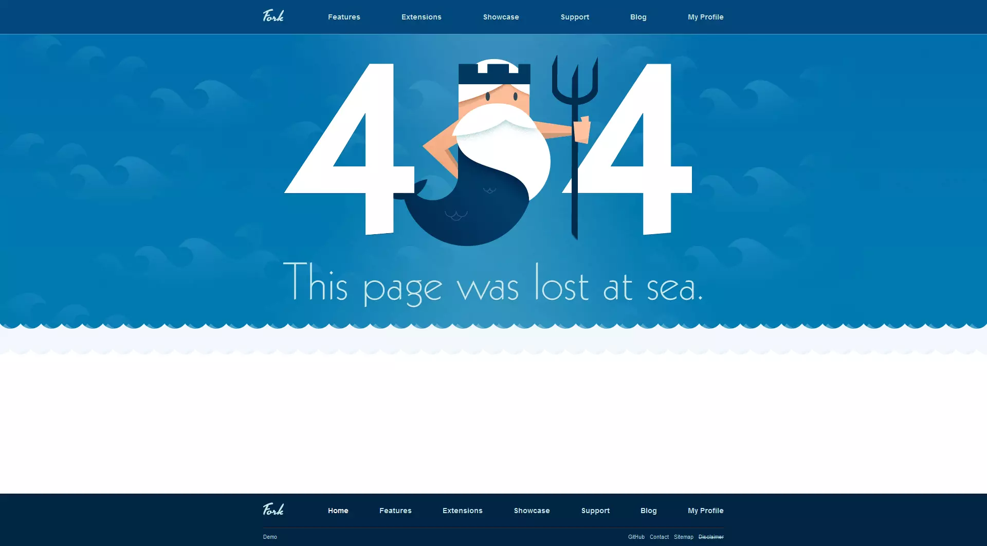
Fork
The online presence for content management system Fork continues their maritime theme (in keeping with the corporate design of their software). Fork’s 404 page tells the user that their page was regrettably lost at sea.
Audiko
It’s rare to find quite such an artistic and stylish 404 page – the error message of online ringtone archive Audiko entertains the user with a surrealist snapshot of London, featuring Sherlock Holmes, Big Ben, red telephone boxes, and more.
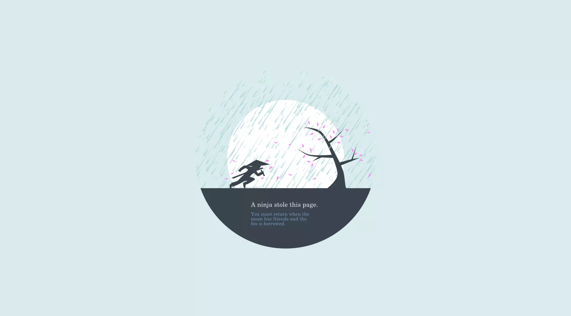
Huwshimi and Friends
The designer website Huwshimi and Friends takes a different approach to display their lovely 404 page: according to the company, a ninja is responsible for stealing the webpage in question. The notice underneath follows the theme with an absurd, poetic explanation.
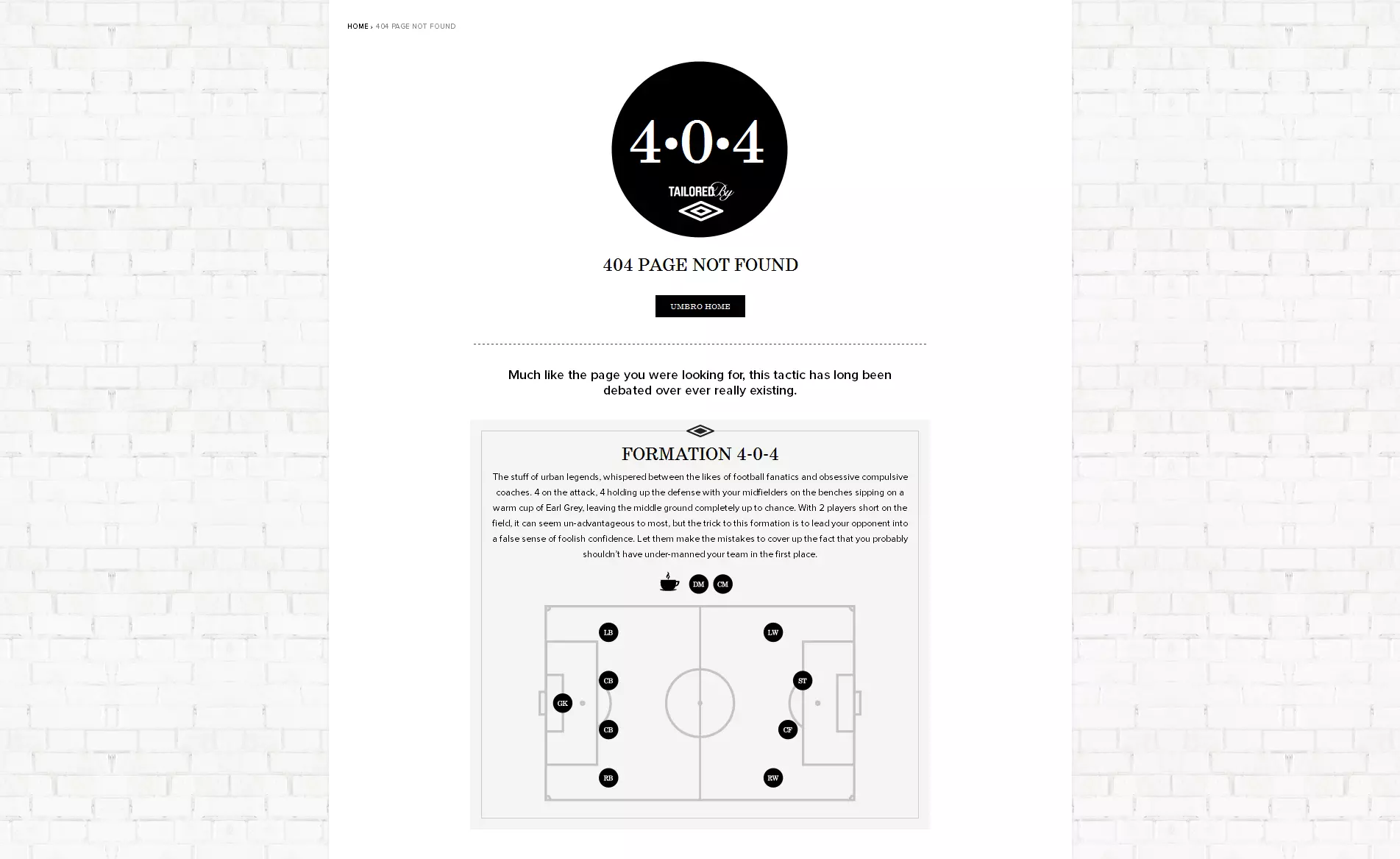
Umbro
The error page for the sporting goods manufacturer from England turns the 404 code into a football formation, discussing whether or not the tactic ever really existed and what its issues are.
Airbnb
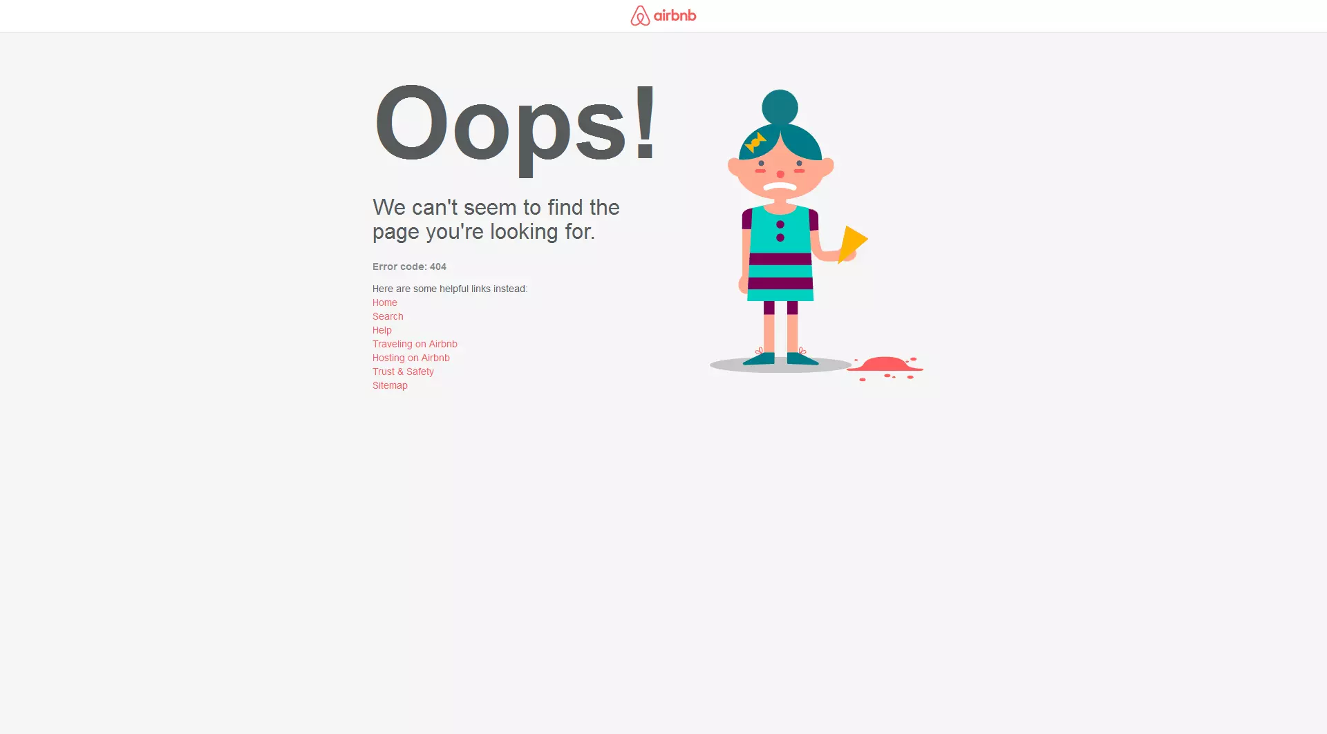
Alongside many helpful links, the Airbnb platform for private accommodations offers a short animation of a girl losing her ice cream on their 404 page.
This by Them
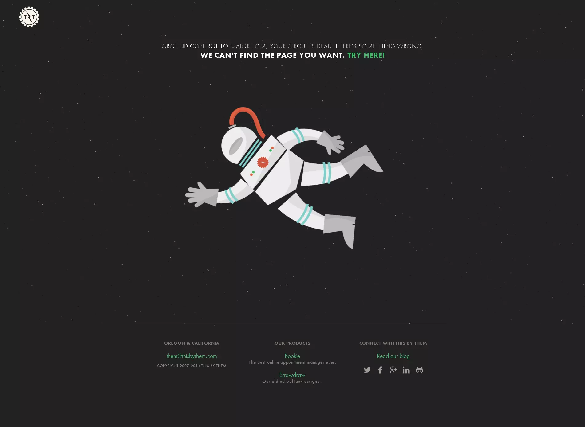
It appears that there are some David Bowie fans at the US software company, This by Them. At the very least, the company has opted for a suitable lyric from the late musician in this animated 404 page, which features a lost astronaut slowly rotating and drifting further and further off into space. The stars in the background can also be moved around using the mouse cursor.
Code School
Online programming school Code School sticks to the theme of space with a shuttle launch scenario on their error page. The animated launch runs anything but successfully: a piece of rope anchored in the ground below restrains the space shuttle. The 404 code appears with the classic ‘Houston, we have a problem’ quote.
Bluegg
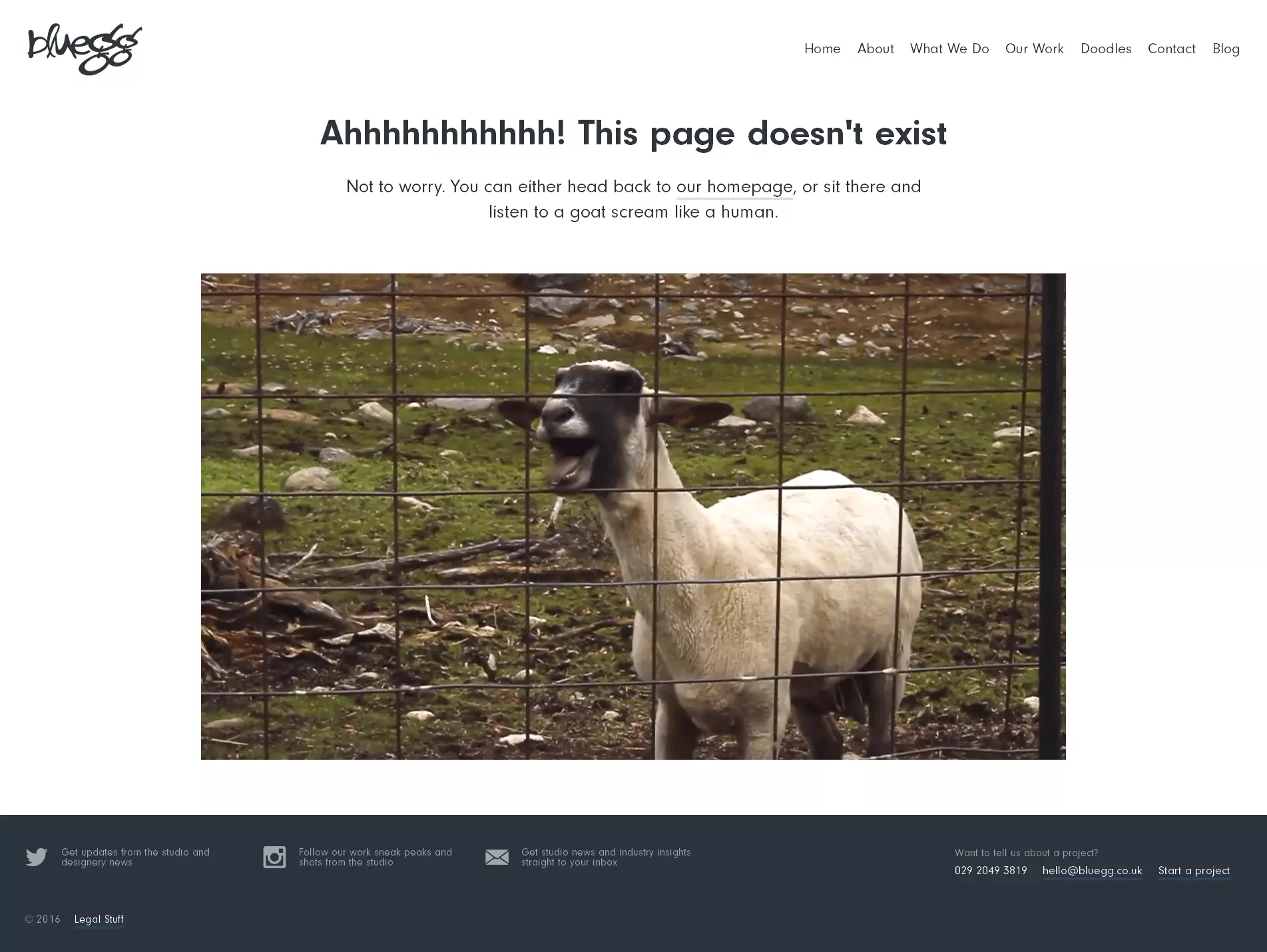
British agency Bluegg have opted for an abstract approach, decorating their 404 page with a video of a screaming goat.
Steve Lambert
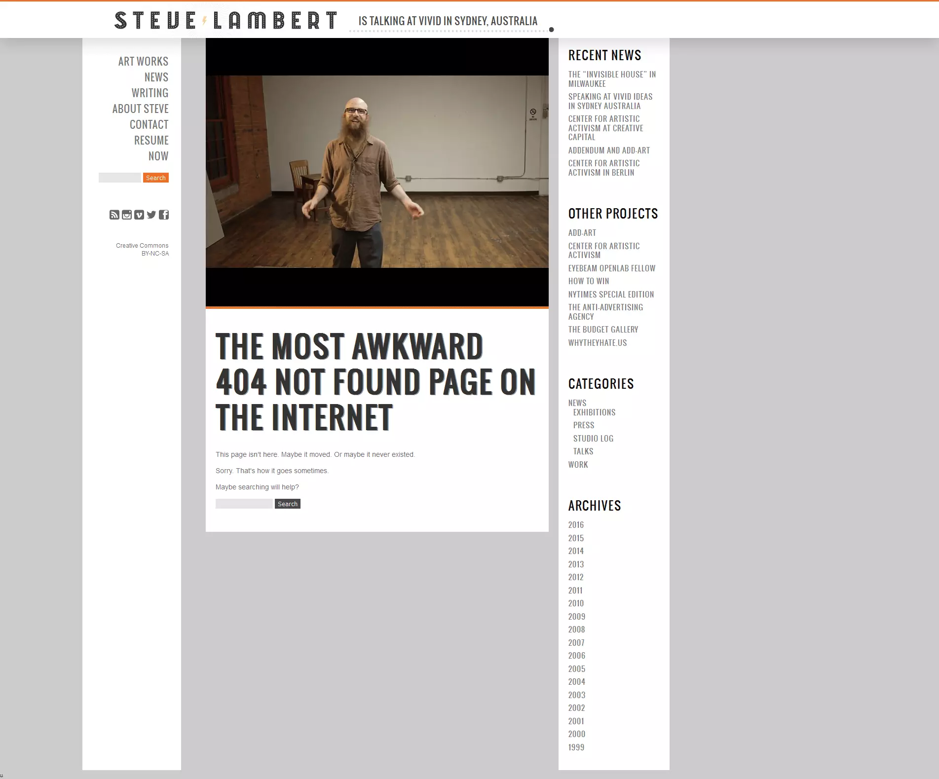
The 404 webpage of artist Steve Lambert is one of the strangest pages of its kind. During this bizarre, remarkably long video, the artist turns to his misguided visitors. His chatter is just as devoid of content as the space in which the video is shot, or the error page where the user has ended up. This page fits superbly to the style of the artist and his awkward nature.
Emailcenter UK
The Emailcenter UK error page is even more interactive. Here, you can choose to fire one of the development team for as a punishment for their alleged involvement in the 404 error, or choose to forgive all of them and return to the homepage. If you opt for the virtual dismissal, you then receive additional information about the employee(s) in question.
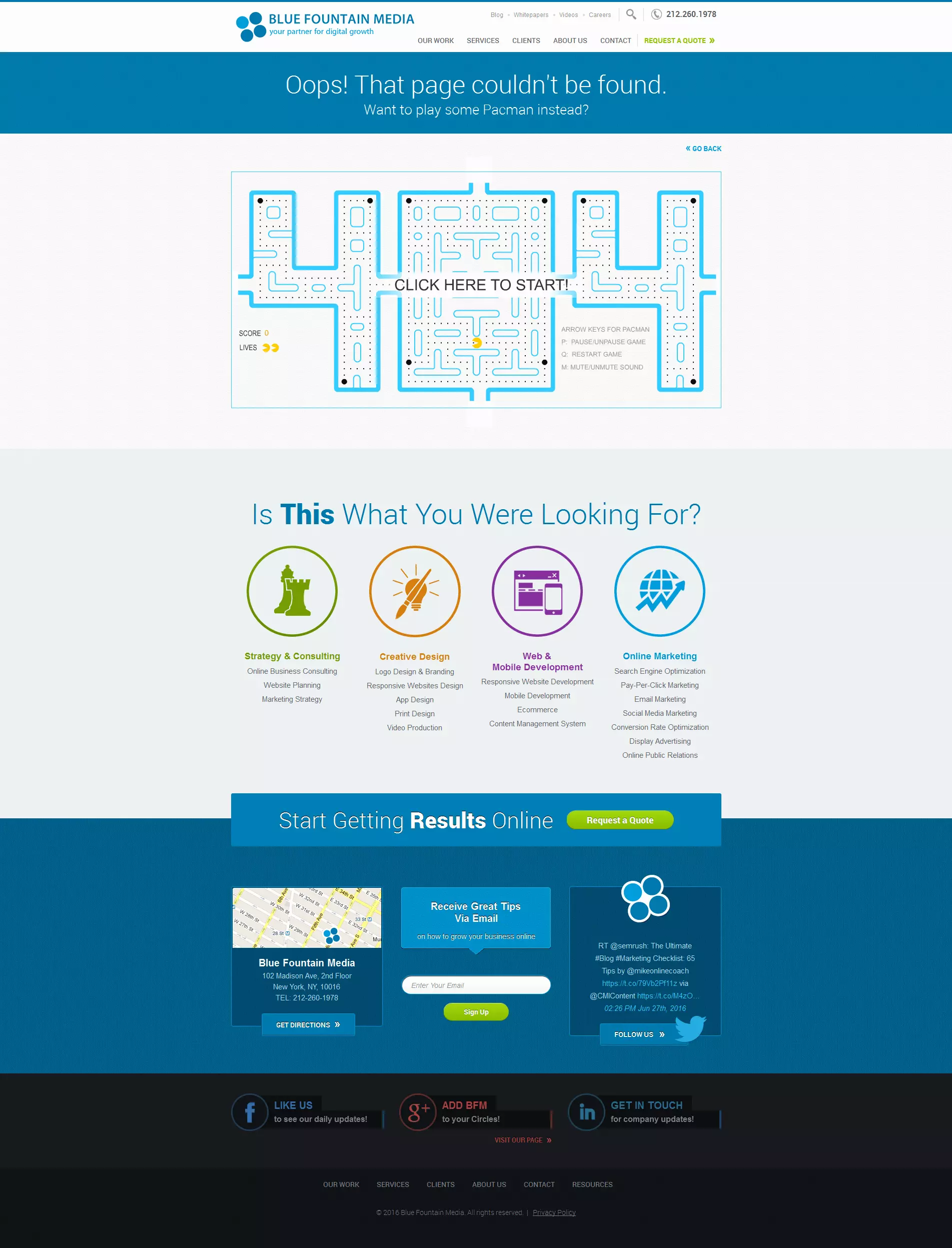
Blue Fountain Media
Blue Fountain Media’s 404 page features a playable version of the classic game Pacman for users to enjoy as an alternative to the page they were searching for.
Gamespot
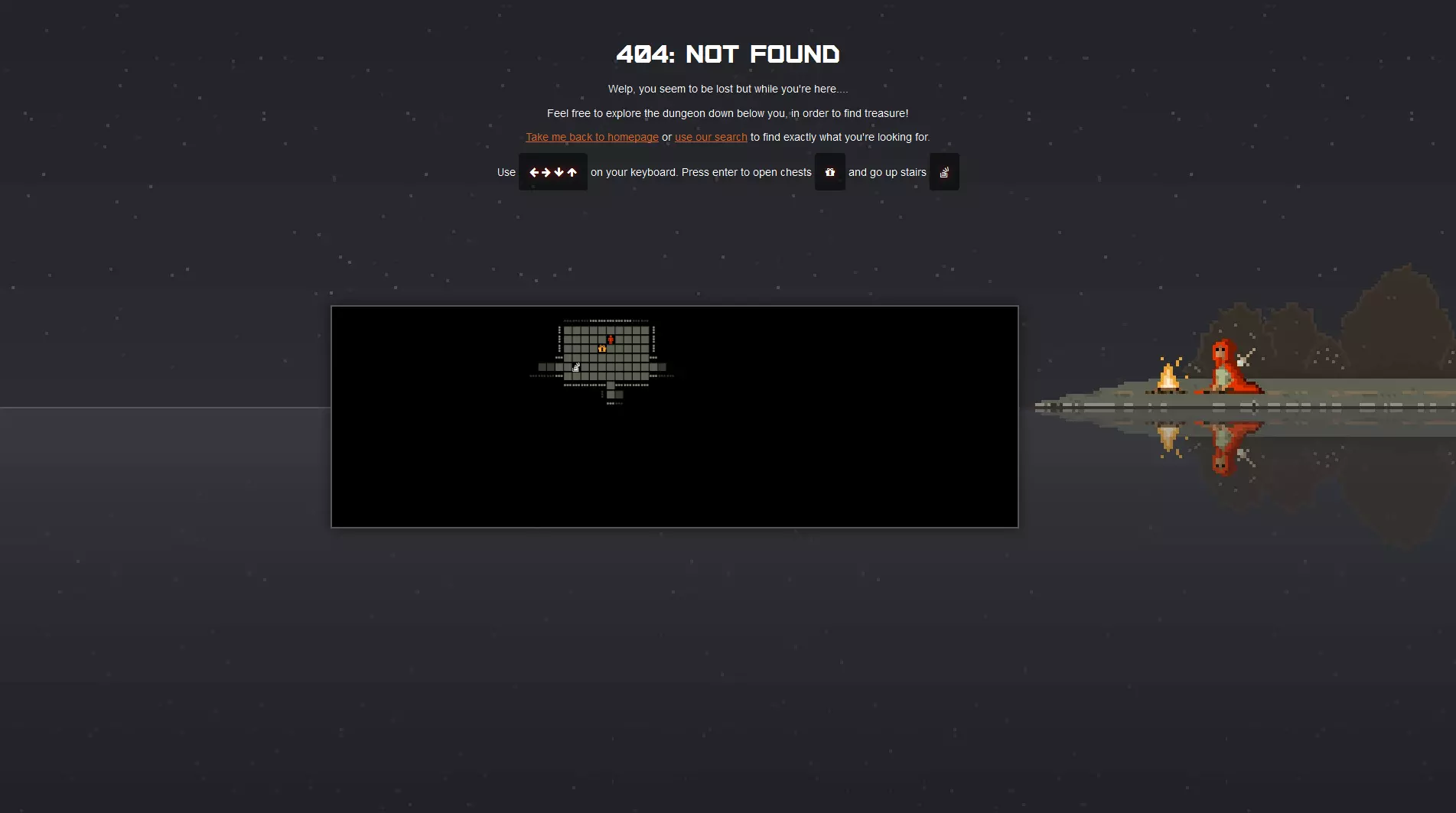
Lastly, in keeping with their content style, this error display page from Gamespot also gives visitors the chance to play a little game.


