How to create a perfect Website Background
First impressions count, also when it comes to website backgrounds. It should subtly emphasise the website’s message without overpowering it. When designing the background, factors such as colour composition, image size, motif, legibility, and current trends are all important.
It takes only 50 milliseconds to form an initial, decisive opinion about a website. Content or offers aren’t important here, because the subconscious first reacts to colours, shapes, motifs, and compositions rather than logic. A website’s background is an important part of this first impression. Since backgrounds or website background images are one of the largest elements, they also influence perception.
High image quality and consistent design are important. Poor resolution, harsh colours, inappropriate motifs, or long loading times can cause site visitors to leave after just a few seconds.
How do I find the right website background?
A common mistake when creating a website is picking the wrong background. But how do you know you’ve picked a good background? First, you should consider your website’s content. Whether it's a lifestyle blog, an online shop, a corporate website, or an artist or career site, the background should meet the requirements and expectations of your target audience. Keep in mind that emotional marketing and emotional branding are particularly important for website design. However, emotional content won’t work for every website.
Ideally, your website background should be discreet and unobtrusive, while making use of design and marketing potential. Before picking a background, ask yourself these questions:
- Which motif or pattern matches my content and theme, brand, industry, or online shop?
- Which colour scheme and visual language should feature throughout?
- Do I prefer an abstract-minimalist look or a bold, colour-forward background?
- Do images, photos, drawings, or embedded videos work as background?
- Does the background echo my brand’s/website’s message?
- Are text and page elements easy to ready?
- Do the colours create the desired effect?
What design options does a website background offer?
As a rule, three options are available for website backgrounds, which can also be used in various combinations:
- Background image: Widely used backgrounds like high-quality photographs of people, landscapes, products, objects, animals, or personalised motifs that match your website can generate emotional impact. Drawings can also be used here.
- Background video: Embedded videos are both modern and original, while conveying content in a short time. Make sure that the video is suited to your website, is professional, and doesn’t automatically play with sound, so as not to scare visitors away.
- Background colour/pattern/texture: Single or multicoloured page backgrounds are very common, as are colour gradients, full-surface colours, or creative patterns and textures. This can also contain the company logo and elegantly and discreetly elevate your copy.
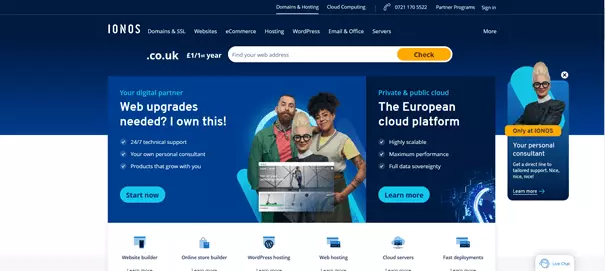
Set up your own professional website without much effort and with your own domain? Get a website with your own domain from IONOS with great features like high-end templates, SSL, and one-click design changes!
What kind of website backgrounds are there?
Something that’s just as important as the design of your website background is background composition. There are two main types that we can differentiate between here:
- Body background: This type of background fills the entire or almost the entire background screen. Here, the above design options can be used individually or combining images, video, gradients, patterns, or drawings.
- Content background: Here, the background doesn’t fill the entire space. Instead, select content and page elements are emphasised, directing the eye with deliberate accents.
How do I find and pick the right background?
How you approach designing your website background depends on whether you’re using a website builder or a CMS like WordPress. Website building kits offer high-quality and versatile background templates.
- The easy way to get your website online quickly
- Build your brand with your own domain name and email
- Includes maintenance and updates after your site is live
If you program a website yourself, you’ll need to integrate website background images, designs, or videos in the page’s CSS. Thanks to design tools like CSS Flexbox or CSS Grid, designing your background manually isn’t as tricky as it used to be. At first, visitors only see the full-screen background image, but when they scroll, are introduced to the other elements on the page. An original parallax website can also impress site visitors with cool scrolling effects.
Which backgrounds are most popular?
The question of which website background is the most popular or successful isn’t straightforward. Depending on the category, industry, target audience, or personal taste, different website backgrounds offer their own unique advantages. You can draw inspiration from the following trends and best practices:
Using accents and highlights
You can structure your content by dividing your website into sections. For example, arrange the page using different coloured sections and dividers, aesthetic product images, logos, or other page elements.
Aligning images to brand tones
Ideally, your website’s background colours align with your brand colours. Make sure that high-quality images, illustrations, and videos also match your brand colours and that of buttons and menus.
Bring storytelling into your background
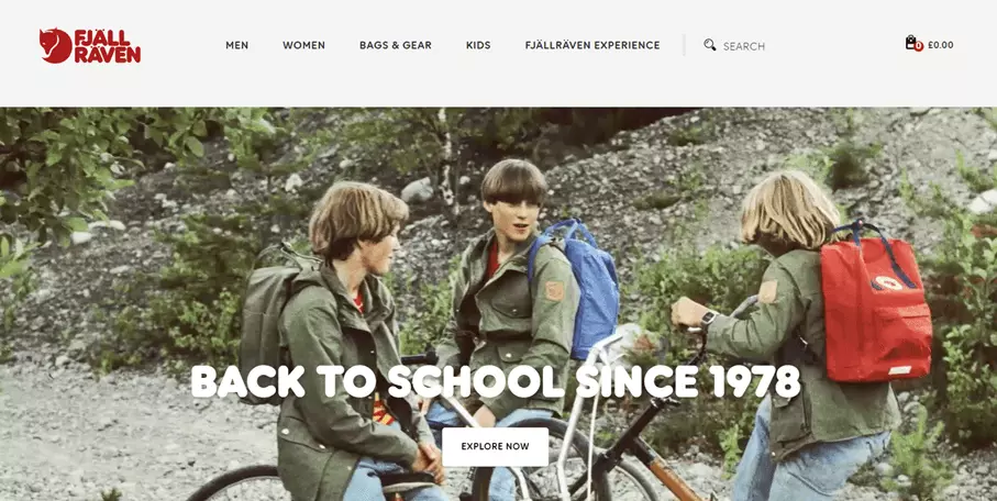
Depending on the product and industry, the 'story' of your brand can be illustrated at a glance with meaningful background images. Whether landscape images, portraits, or illustrations, embedding text into your background can be a great storytelling tool. A photo slideshow can deepen the message and emphasise your product or service range.
Try a minimalist, full-screen design
Less is sometimes more. Big brands like Tesla and Coca-Cola know this, too. Full-screen landing pages place the focus on the product and let images speak for themselves.
Combine original typography with fresh design
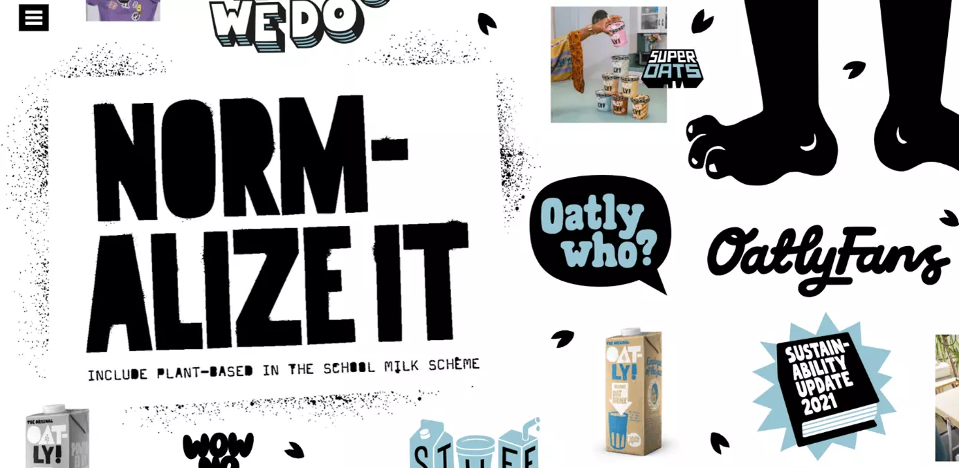
A combination of modern, appealing typography and original colour accents, illustrations, or geometric elements doesn’t only create a refreshing effect, but also provides structure. Abstract background designs and creative effect will help you stand out from the crowd.
Better overview with frames and grids
Frames and grids can help arrange content on your website and direct the visitor’s gaze. In combination with images and illustrations, the focus can be shifted to products and important subpages in a targeted manner.
Bring it to life with video and animation
Background videos and animations can make your website more interesting and livelier. It also offers an element of entertainment. However, don’t use design at the expense of website performance. If background videos or animations cause long loading times, users will be quick to jump.
How do you find the right website background image?
When looking for a suitable background, templates provided by website builders or professionally made photographs and videos are a great start. But stock photo galleries also provide a wide selection of images, patterns, and graphics, both for free and for a fee. Especially popular are:
Create a business website with IONOS. It’s easy with industry-based high-quality designs, a large selection of royalty-free photos, SEO, and excellent data protection.
Tips for a professional website background
The following tips and rules will help you choose and design your website background.
Colour composition and gradient
Colours are a message in themselves. Consciously chosen colour compositions and colour accents trigger feelings and reactions. Blue, for example, has a calming and professional effect, but in the wrong context can come off as cool and off-putting. Red, on the other hand, radiates warmth and liveliness and, as a signal colour, has a particularly emotional effect. Colour gradients, where several colours are gradually combined, are also very popular for website backgrounds. Different saturations create an individual look and intensity.
It’s a good idea to incorporate compositions coordinated around monochrome, solid, contrasting, and gradient colous. A combination of high-quality photographs and matching colour patterns and gradients will also help structure your website background. For this, take note of current colour trends from institutions like Pantone Colour Institute or the AkzoNobel Global Aesthetic Center (Dulux).
Legibility
A good homepage background doesn’t distract from foreground elements such as copy, images, or product photos. The text in the foreground should always be legible and stand out clearly from the background. Background colours and transitions serve to emphasise the legibility of the page. Dark mode, which is becoming every popular, should present the page in the same way.
Content and motif
Whether it’s a photo, video, pattern, texture, or block colour, a professional background matches the website’s overall intended impression. It complements it without dominating it. A full-screen page with a striking background image, for example, can create a positive first impression, while highlighting the page’s key content.
Current trends and best practices
It’s a good idea to keep an eye on current web design trends. This will highlight success models, what works well, and which elements and designs suit your website. You can also get inspired by the backgrounds used by successful brands and learn from best practices.
Consistent design with a personal touch
Ideally, a background’s colour composition and visual language will match the overall website design. That’s why one of the priorities when picking a website background is to make sure that it’s appropriate for your brand, industry, and target audience. Choose a colour palette or brand colours from a few hues and stick to those throughout. Add matching images, illustrations, and photographs for recognition and a personal touch.
Mobile first
Since many visitors will access your site via mobile devices, mobile optimisation is especially important. Backgrounds in too large file sizes or in the wrong format will impact the display and loading speed of mobile websites. This can have a negative impact on search engine rankings and placement in search results. Learn about mobile SEO and use responsive testing tools. Then check whether your website background is displayed optimally on mobile devices and offers a good user experience design.
These tips can help you optimise your website background:
- Avoid Flash elements.
- Integrate responsive web design by using scalable background images
- Compress large images and CSS.
- Use appropriate image and font size.
- Inform browsers on screen sizes and scaling using Viewpoint Meta Tag.
- Test your mobile SEO with the Google Mobile Friendly Test, W3C Mobile Checker, or IONOS Website Checker.
- Use a CMS plug-ins like WPTouch for mobile website optimisation.
Image size, dimensions, and file formats
For optimal rendering, consider image size, dimensions, and file format. Images or videos should always have a high resolution. However, when files are too large, there’s a risk that the loading time of your website will deteriorate. So, make sure that your images aren’t bigger than 600 KB. The image format 1,920 x 1,080 pixels is widely used. Ultimately, the optimal values depend on the website and end devices.
Test which sizes and formats work best on your website. Vertical formats usually work better on mobile devices, while landscape formats are more suitable for desktop. The most recommended file formats are .png and .jpg. While PNG images can be displayed with a lot of details and transparency effects, JPGs can be easily compressed. When integrating website graphics, it’s best to use the SVG format.
A professional website needs professional and secure hosting. Try IONOS’ web hosting and enjoy a fast, scalable hosting that’s set to your specific requirements.
Summary: The perfect website background for a perfect user experience
An appealing website background can be a reason for site visitors to stay. At the same time, it represents your brand, product, or company, and emphasises important elements on your website using colours and imagery. By investing time and effort in the design of a professional website background, you’ll benefit from its marketing potential as well as creative opportunities for emotional branding and corporate design.
Creating your own professional website gets easier the more you know about it. In our guides and tutorials you’ll will find handy tips and inspiration for designing your website:


