Branding: how effective are the best-known logos
How effective is a logo? We’re all familiar with the logos of Burger King, Starbucks, and Apple. But could you draw them from memory? Signs.com has tested this and has had more than 150 Americans reach for the digital pen. The result: although everyone knows the brands and have seen the company logo hundreds of times, only a handful managed to draw them using nothing but their memory. 156 men and women aged between 20 and 70 from the US took part in this experiment. The task sounded simple enough: draw the logos of the 10 best-known US companies. Having been given around a half an hour of time, the test persons were asked to draw the logos of Apple, Adidas, Burger King, Domino’s, 7-Eleven, Foot Locker, Starbucks, Walmart, Target, and IKEA, without looking at the logos first. Everyone involved worked with the same graphics software. Prior to doing the test, the participants were given a brief introduction to the software in question. This was done to avoid the possibility of differing technical abilities having an impact on the results of the test.
There are various factors that come together to make a logo. Our article on logo design provides helpful tips that you should take note of when designing one.
Brands are well known
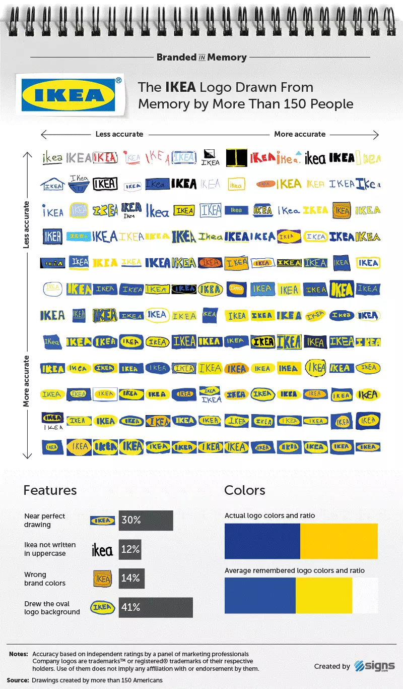
The good news for all marketers of the companies involved is that a large majority of the participants were able to, at a minimum, to get make some attempt with each of the logos. Of the 1500+ drawings, only very few featured aspects that were all wrong, i.e. at least one part of the attempt was correct. The logo that performed best among the participants of the study was that of the Swedish furniture giant IKEA. The decisive factor when it came to establishing a ranking was the extent to which the participant’s drawings resembled the original logo. This led to IKEA taking first place with 30 percent; nearly a third of the drawings resembled the original almost perfectly. Even with the decent drawings, i.e. those that were not perfect but were still easily recognisable after one glance, IKEA also took the top spot.
As the name suggests, Signs.com, is a company that produces signs for other businesses. Along with the technical aspect of sign production, the company from Salt Lake City also offers free design services to a wide variety of small and medium-sized businesses. The attention to detail and care to one's logo/brand for even the smallest of companies helps explain Signs.com's deep interest in effective brand images.
In both categories, the huge US discount store retailer Target is hot on the heels of IKEA. The massive American discount seller (2nd in the US behind Walmart) also appears to be firmly present in the minds of the participants judging by their self-confidence when it came to doing the drawings. Signs.com asked the participants to evaluate how accurate their drawings were. The average score that was given was 7.1 out of 10. Even independent third-party advertising professionals deemed the drawings for Target to be the most accurate. Both logos – Target and IKEA – have a simple design and only two colours. Furthermore, in the case of Target, the name of the company gives a lot of hints for the logo. It is a lot easier to remember the red and white target as opposed to the mermaid on the Starbucks logo.
Logos with complex designs are harder to remember
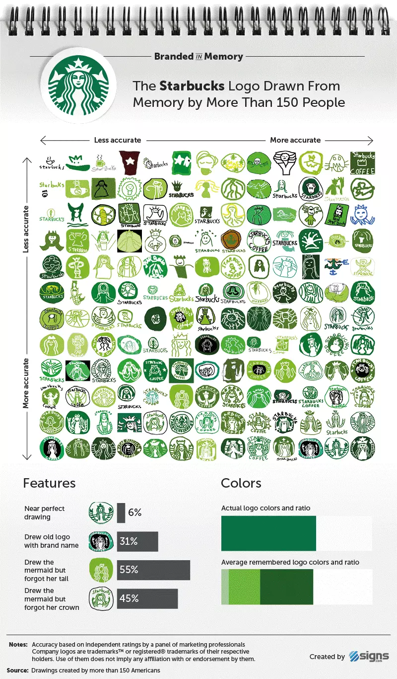
The coffee shop giant Starbucks performed worst in the test. Only 6 percent of the final drawings were deemed as resembling the original almost perfectly; 17 percent were deemed as being well recognisable. The main reason for these comparatively bad results: the complexity of the Starbucks logo. Although 90 percent of the participants were able to remember the mermaid, and most were also able to recall that the logo is green in colour, the majority forgot about individual aspects of it. Only very few were able to recall that the mermaid on the logo had a double tail and also wears a crown.
Something similar also happened to Foot Locker. The logo of the retail store chain is based on the referee who is wearing the classic black and white striped shirt. This aspect was also present in the majority of drawing attempts. But In which direction is the referee looking? Instead of facing him towards the right, several of the participants depicted the man facing towards the left. Some even went as far as to give the man a hat. Another problem when it comes to drawing something from memory is that in many cases a person will draw a logo almost perfectly, but it will be an older version of the logo. This led to 3 percent of the participants adding a rainbow-coloured pattern to the apple in the logo, despite the fact that this has not been part of the logo for nearly twenty years.
Well contrasting colours can make a big difference
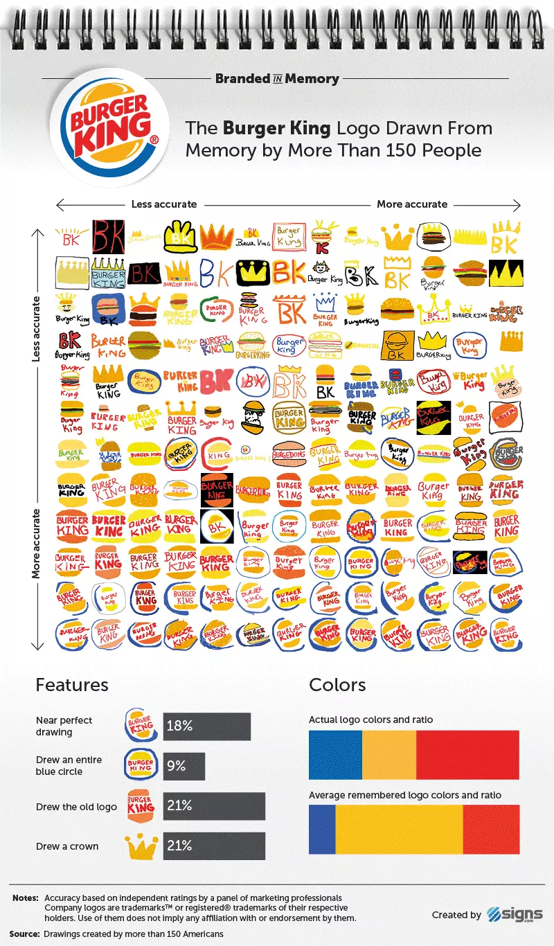
It happened in the case of some drawings that elements from older logos were thrown together with more modern ones. Or sometimes there were even completely new elements added to logos. The fast food chain Burger King has a large golden crown on the logo. Or maybe not? In reality, there was a very brief period during the 1960s when a very happy looking king was part of the logo and he wore a relatively small crown. However, crowns have become so ever-present in the brand’s corporate design (e.g. the paper crowns so often handed out for free in the fast food restaurants) and this meant that many of the participants were certain that a crown was a part of the company logo.
Generally it was the case that colours were not really a problem for the majority of participants. 80 percent of all the drawings had the correct colour scheme. One of the main things that this study clearly demonstrated was that logos with a simple design are much more likely to remain in people’s minds. If the logo contains only a few elements, we remember it much more effectively. The IKEA logo, a few letters within a yellow oval on a blue background, is clear proof of this fact. Colours that are clearly distinguishable from one another are also quite decisive when it comes to memorability (the fact that we can remember the two IKEA colours so clearly has a lot to do with yellow and blue also being the colours of the Swedish flag, with IKEA having become so well known as being originally a Swedish company).
We see, but do not observe
The results of the study can’t help but lead us to ask why people can be so bad at remembering the logos of certain brands, despite the fact that they see them every day. For explaining this, Signs.com quotes Sherlock Holmes: “We see, but do not observe.” Although we are constantly seeing these brands, we do not really take them in that much. Logos are omnipresent, but we only very rarely look at them and therefore often struggle to remember them clearly. It is also worth noting that the ability to remember a logo has nothing to do with gender (men and women performed equally as well or badly in the test), while having a lot to do with age; younger participants were much better at remembering the logos.
The term ‘inattentional blindness’ refers to the phenomenon of people not really perceiving something, despite being able to see it. It means that the brain needs to actively give attention to a thing in order for the person to really take it in.
‘Branded in Memory’ is not just an amusing experiment: the results provide business people and entrepreneurs with important reference points when it comes to designing their own logos. Anyone who uses an overly-complicated graphic as a business sign should consider doing some rebranding. A simple and well-designed logo has the ability to remain in the mind of potential customers much longer. This is something which the marketing people of the companies involved in the study have seemed to grasp, as can be seen from looking at the evolution of the various logos and how the designs have clearly become more simple and straightforward over the years. This is even the case with Starbucks and their mermaid, which in the early days was much more detailed than it is today.


