The best Web Fonts
For web designers finding exciting fonts for a website has never been easier. Thanks to modern web fonts, there are virtually no limits to your creativity. With the right combination of web-safe fonts that reflect the character of a site, website owners can make a lasting positive impression. We’ll tell you what web fonts are and what makes web-safe fonts so important.
What are web fonts?
Web fonts are digitised fonts that can be interpreted by browsers. Such fonts are primarily intended for use in HTML or XHTML documents – i.e., for use on the Web. Web fonts are characterised by the fact that they work independently of the operating system, since they are not loaded from the local font collection but from an external web server. To this end, the desired web fonts must simply be included in the CSS rule @font-face and specified in the font stack.
You can learn more about the possibilities of CSS for website typography in our article “Responsive web design and fonts: CSS commands”.
Why are web-safe fonts important?
Since the introduction of @font-face in CSS2, technically all fonts can be included in web projects. Previously, web designers only had a small selection of standard fonts such as Arial or Times New Roman at their disposal. The term “web-safe fonts” was coined, which initially identified the standard fonts that were indispensable for smooth web display.
Today, web designers can more easily meet corporate design specifications thanks to the vast collection of available web-safe fonts. Good fonts for websites are among the important foundations for implementing overarching marketing strategies, making them almost indispensable for a company’s successful web presence.
The right web fonts and the best possible CMS solution including hosting - choose WordPress Hosting from IONOS to get started with your WordPress project.
Web-safe fonts: an overview of the most important fonts
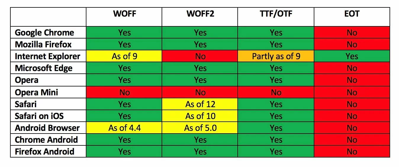
What Font Is lists over 800,000 fonts for use online. Anyone looking to design a web project and in need of a suitable font can download them freely here. Potential restrictions in terms of font display are now exclusively due to older web font file formats or outdated browser versions. The following table summarises the four main font categories for websites and their browser support.
The overview shows that the choice of the appropriate format is important, but no format can reliably guarantee that the desired web fonts will work on a user’s end device. Mobile devices with older browsers, for example, lack support for the standardised format WOFF (Web Open Font Format) and its successor WOFF2.
For users of Internet Explorer this is even more of a problem. The various versions of the Microsoft browser support the EOT (Embedded OpenType) format, which is not supported by any other Internet browser.
The broadest support is available for the TTF (TrueType Format) and OTF (OpenType Format) formats.
Opera Mini only supports fonts that are installed on the respective device (Updated: July 2021).
Web font categories and their usage
The term font generally refers to all characters that have been designed according to an identical design concept. If there are several variants of such a font that differ, for example, in terms of stroke width or tracking, then they are referred to as a font family. For example, the fonts Segoe UI, Segoe Light, and Segoe Semibold belong to a single font family.
Need a professional website? Use the IONOS Website Design Service and have your website created and maintained by experts.
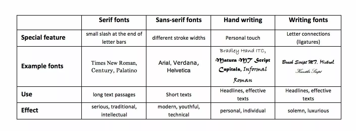
Web friendly fonts are suitable for various applications. When choosing a font, you should pay attention to two things in particular: the legibility of the font and its emotional impact. The medium also plays a major role. In so-called serif fonts, individual letters have small cross strokes at the end of letter bars, which make it easier to read small print. However, this typeface is not always ideal for reading on a monitor.
Function and position in a text should also influence the choice of web fonts. While eye-catching fonts in headlines may attract attention, they often look out of place in body text. For this reason, web designers tend to use several different fonts or font styles (as the variants within a font family are called) as part of the page design. However, it’s best not to overdo switching fonts otherwise a website could quickly look cluttered.
The features of different web font categories listed above are generalised. In practice, the use of unexpected fonts can be a good way to stand out from the competition. To find the right web fonts, you should heed the following advice:
- Consider theme and audience: A visually compelling combination of good website fonts is useless if it doesn’t match the theme of the page. Objectivity is best conveyed by a mix of serif and sans-serif fonts. Handwritten fonts are more eye-catching and appear livelier.
- The more text your page contains, the more you should focus on functionality. In addition to readability, it’s worth considering that mobile device users will access your page via mobile data transfer by default, which means that unique web fonts may unnecessarily increase load time.
- Limit the number of web-safe fonts. It is usually best to stick to two different fonts, one for body text and the other for headlines and special typographic mark-up.
- Look for fonts that are distinct and create a good contrast. The interplay of serif and sans-serif fonts is a good example here. However, it’s advisable to keep a healthy balance. If your web fonts are stylistically very different, this could create tension and website visitors are likely to notice. If the two fonts are too similar, experience has shown that this also has a negative effect.
More useful tips on choosing the best fonts for a website and responsive designs can be found in our article “Responsive web design – web fonts tips”:
An overview of the best web fonts
While designers struggled with a limited choice of fonts in the early days of web design, they face the opposite issue today: they need to keep track and select the most suitable fonts from an enormous number of web fonts.
For this reason, we have gathered a list of the most popular and safe web fonts below.
Arial
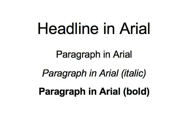
As of Windows 3.1, the sans-serif font Arial has been one of the standard fonts supplied with Microsoft operating system. Arial has long been in demand for use as a web font, both for headlines and in paragraphs. More recently, the classic font has increasingly become more of a fallback solution.
Download options:
Helvetica
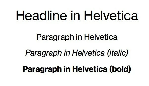
What Arial is for Windows, Helvetica used to be for Apple. Clean lines and shapes characterise this sans-serif font – a standard choice for many companies. On its 50th anniversary, filmmaker and artist Gary Hustwit paid tribute to the font in the documentary of the same name Documentary “Helvetica”.
Download options
Palatino
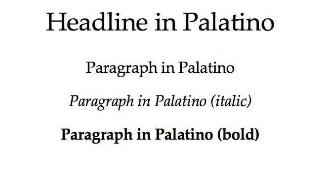
Palatino is an old-style serif font drawing inspiration from letterpress printing. However, the lighter web font is also an interesting option for blog texts and online magazines. The font, released in 1948, was named after the Italian calligrapher Giambattista Palatino.
Download options
Baskerville
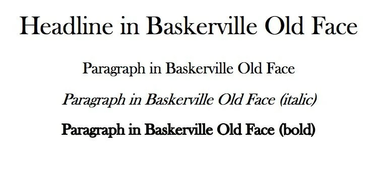
The Baskerville family of web fonts began in 1754 as a transitional Baroque antiqua typeface. Its creator was the English typographer, John Baskerville. The mixture of strong stroke contrasts, upright shadow axes, and horizontally accented serifs was considered a technical milestone and, like many of his typefaces, was frequently copied during Baskerville’s lifetime.
Download options:
Century Gothic
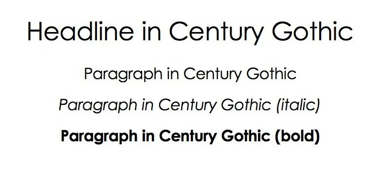
The Century Gothic sans serif typeface was designed by Monotype Corporation in 1991. It is largely based on the Futura alternative Twentieth Century, but unlike the latter, it is characterised by a more uniform type width, among other features. As a web-safe font, Century Gothic is particularly popular for headlines and sub-headlines.
Download options:
Consolas
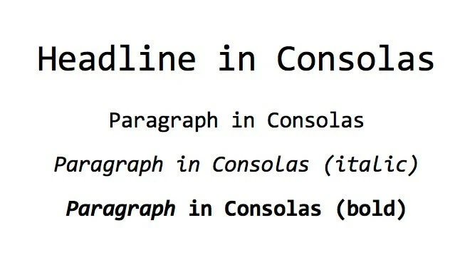
Consolas is a web-safe font that was introduced with Windows Vista in 2007. It is designed for development environments and situations where a non-proportional font, i.e., a font with a fixed character width, is needed. In web projects, Consolas is suitable for displaying code snippets, for example.
Download options:
Garamond
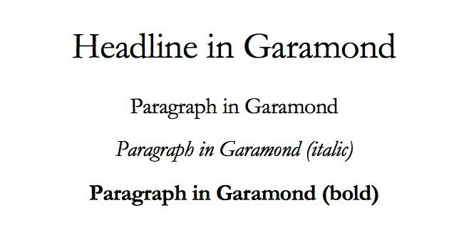
The Garamond font family has been used since the 16th century. Because of its excellent legibility, the serif font is one of the most important and widely used fonts in letterpress. Its softer, rounder edges make Garamond a great web font alternative to standard serif fonts such as Times New Roman.
Download options
Georgia
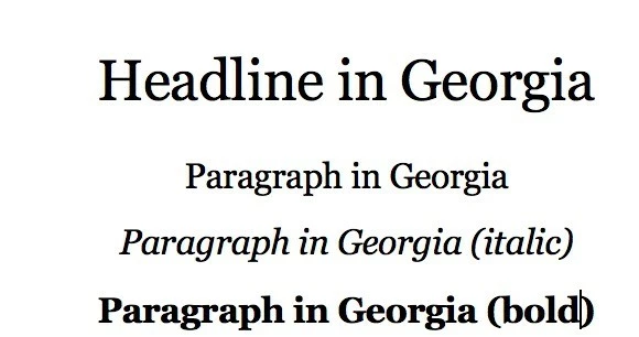
The Georgia proportional font was designed by Matthew Carter for Microsoft in 1996. From the start, the aim with this baroque antiqua was to achieve the clearest possible display and optimal readability on computer screens. With the increasing popularity of blogs, the web-safe font found its way online ten years later.
Download options:
Looking for a suitable hosting environment for your WooCommerce store? With WooCommerce Hosting by IONOS – including SSL/TLS certification and DDoS protection – you are well prepared for the future!


