What is Parallax scrolling?
Parallax scrolling is an animation technique in which background images move slower than the images in the foreground, creating an illusion of depth in an otherwise 2D scene. In order to get a better understanding of the concept, it helps to look into where the word comes from.
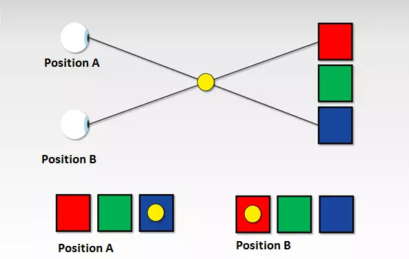
A parallax ('parallax' is derived from the Greek word παράλλαξις (parallaxis), meaning 'alternation') refers to a displacement of an object due to a change in the observer’s point of view. A classic example can be done using your thumb:
- Hold your thumb a few inches away from your face.
- First close your left eye, then swap to your right eye.
While there is hardly any movement in the background, your thumb will appear to jump from one position to another. The reason for this 'jump' is due to the distance between your eyes, which leads to a change in the point of observation when one eye is closed.
The parallax phenomenon isn’t really given much thought in daily life and yet it belongs to the basics of spatial perception.
If you move your head from right to left, you’ll soon see that the relative position of the objects in your field of view changes. Closer objects move in front of objects that are further away and hide them. Objects in the foreground appear to move faster than the ones in the background, which barely move at all. This effect is especially evident in train or car trips.
Imagine you are a passenger in a car and are looking through the window at the expanse of the landscape. You will notice that the signs on the side of the road move much faster than the forests and mountains in the background. The setting sun on the horizon appears to almost stand still.
The following video illustrates this phenomenon:
Perception psychologists call this (apparent) speed difference 'motion parallax'. Light reflections from nearby objects move faster across the retina than reflections of objects located further away. Since the effect occurs only when the observer is moving parallel to the objects being looked at, this is known as motion-induced depth perception. Further visual stimuli that contribute to the perception of a three-dimensional space are variations in texture, perspective convergence, atmospheric perspective, magnitude constancy as well as masking and overlapping.
The parallax scrolling effect
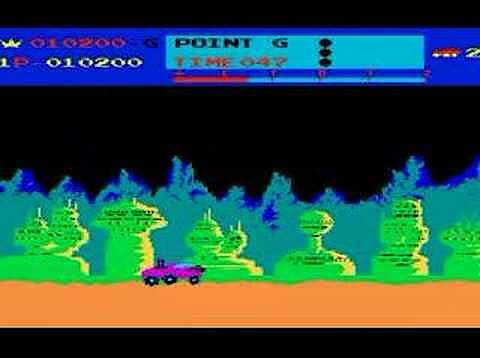
Game developers have used the effect of motion parallax since the side-scrolling games of the 1980s in order to produce a three-dimensional effect using two-dimensional means. Traditional jump and run games or shoot ’em up games such as Super Mario, Moon Patrol, or Jungle Hunt are comprised of foreground, middle, and background levels, which go across the screen at different speeds. While the foreground and background move constantly in one direction, the player can move the game figure around as they wish. The feeling of depth is created due to the fact that the foreground moves along the screen faster than the background. This is intended to enhance the experience of immersion while playing. The following demo video of the shoot ’em up classic, Moon Patrol, shows how this looks in practice.
Parallax scrolling in web design
Since the end of the 2000s, the parallax scrolling effect has also been used in web design. The parallax scrolling website, nikebetterworld.com (no longer online) from 2011 attracted a lot of media attention.
The web campaign for the sporting goods manufacturer is considered the starting point for a web design trend, which makes use of the parallax scrolling effect to produce an illusion of depth.
Similar to side-scrolling games, parallax websites also use the so-called layer method: the starting point is a single page website where design elements are arranged on different levels and can be moved independently in a horizontal or vertical direction.
In order to trigger the motion-induced depth perception, the website visitor has to navigate through the scenery with the scroll function. The movement and speed of the image are not fixed but are controlled by the viewer when they scroll with the mouse or the sidebar. Elements on the foreground layers move faster across the screen than elements on the background layers. This gives the impression of it being in 3D.
In a few cases, parallax websites also have an auto-scrolling feature, which means the visitor doesn’t have to scroll as much manually. In order to achieve a stronger sense of immersion, some web developers also use sound and video effects alongside parallax scrolling, which comes into effect when the viewer is at a certain place on the website.
When it comes to single page websites (also known as one pagers), this refers to web projects, which are comprised of a single HTML document and whose content is dynamically loaded as the visitor is interacting with the site (i.e. scrolling down). Parallax websites are generally created as one pagers.
Technically, parallax scrolling websites can even be implemented with basic web standards such as Hypertext Markup Language (HTML) and Cascading Style Sheets (CSS), which provide developers with extensive animations in the current versions, HTML5 and CSS3. For example, you can use a simple parallax scrolling effect with the CSS property attachment. If this is used together with the fixed value, the chosen element will remain in a fixed position while other elements move in the direction the viewer is scrolling. If you want to define different scroll speeds for foreground and background layers, you need additional web techniques.
The following video tutorial from YouTuber, Drew Ryan, shows how moving layers can be implemented over a still background with HTML5 and CSS3.
In order to enhance the depth perception, more complex parallax scrolling websites rely on the JavaScript script language or the JavaScript framework, jQuery. These provide various functions that can be used to determine exactly how the individual layers of a website should behave when scrolling. In this case, scrolling effects based on JavaScript don’t need to be programmed from scratch. Online, you will find various software projects that provide you with parallax effects and other animations in the form of easy-to-integrate plugins. Among the best-known projects are SuperScrollorama, ScrollMagic, and skrollr.
- SuperScrollorama by John Polacek: the jQuery plugin SuperScrollorama is based on the Greensock Animation Platform (GSAP) and was designed by John Polacek in collaboration with Jan Paepke. The plugin offers various animation possibilities for website elements and has long been the standard solution for scrollable web design. SuperScrollorama sees the scrolling bar as a kind of progress bar where the desired animations line up. If a website visitor reaches a pre-defined point during the scrolling, the effect is triggered. The plugin is still available for download but is currently not being further developed. Instead, the developers are concentrating on the successor project ScrollMagic. SuperScrollorama is under MIT and GPL license.
- ScrollMagic by Jan Paepke: ScrollMagic is a complete revision of the jQuery plugin, SuperScrollorama. ScrollMagic relies on jQuery and the Greensock Animation Platform (GSAP). However, these are not part of the software kernel and must be provided separately. As an alternative to GSAP, the animation engine Velocity.js can be used. ScrollMagic offers all the animation effects, which are dependent on the scrollbar, that its predecessor does and extends its functional spectrum by its improved performance, support for responsive design and mobile devices, as well as object-oriented programming. In addition to a variety of parallax scrolling effects, ScrollMagic offers an infinite scrolling feature that loads web page content in an endless loop using Ajax. Like its predecessor, ScrollMagic is under dual license (MIT and GPL license).
- skrollr by Alexander Prinzhorn: Skrollr also uses the slide bar as the starting point for animation effects. The lightweight plugin only includes JavaScript and CSS libraries and manages completely without jQuery (Vanilla JS). Knowledge of the script language is not a requirement for using the application but experience with CSS3 and HTML5 is a must. The program skrollr is suitable for desktop websites and supports mobile web browsers and Android and iOS. Users should note that the project has not been actively developed since 2014. Support for newer web browsers can’t be guaranteed. The software is available for download under MIT license.
The heavy use of scripts for animating web pages can have a negative impact on your web project’s performance. When using frameworks and libraries, you should ensure that they are supported by all current web browsers. Otherwise, there is a risk that some of the internet community will not be able to visit your site.
Parallax scrolling examples: hits and misses
While some users welcome designs with motion-induced depth stimuli, others may tire of these innovative stylistic elements. This is especially the case when parallax scrolling is used as an end in itself without conceptual context. Whether parallax effects enrich your web offer depends primarily on what you aim to achieve with your website and who you’re targeting. Parallax scrolling has proven itself as a stylistic tool for visual storytelling.
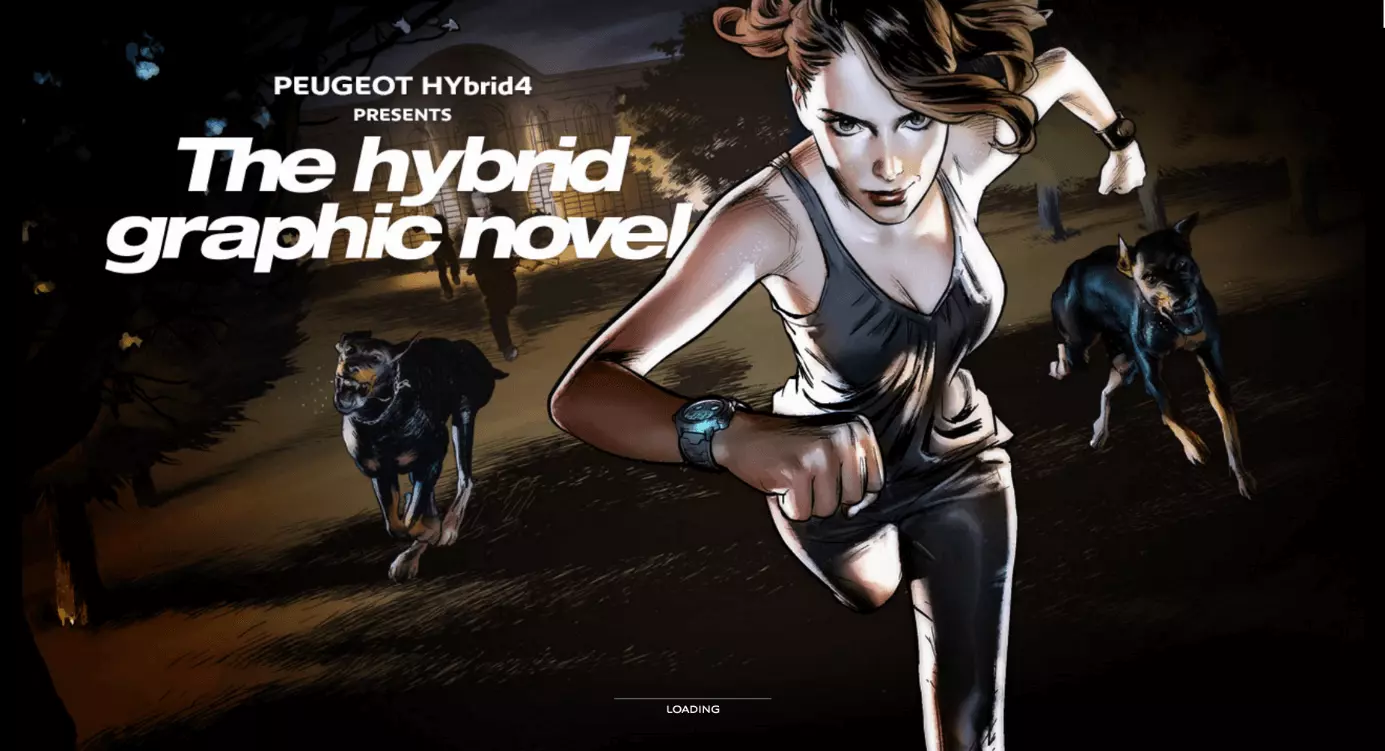
The Hybrid Graphic Novel
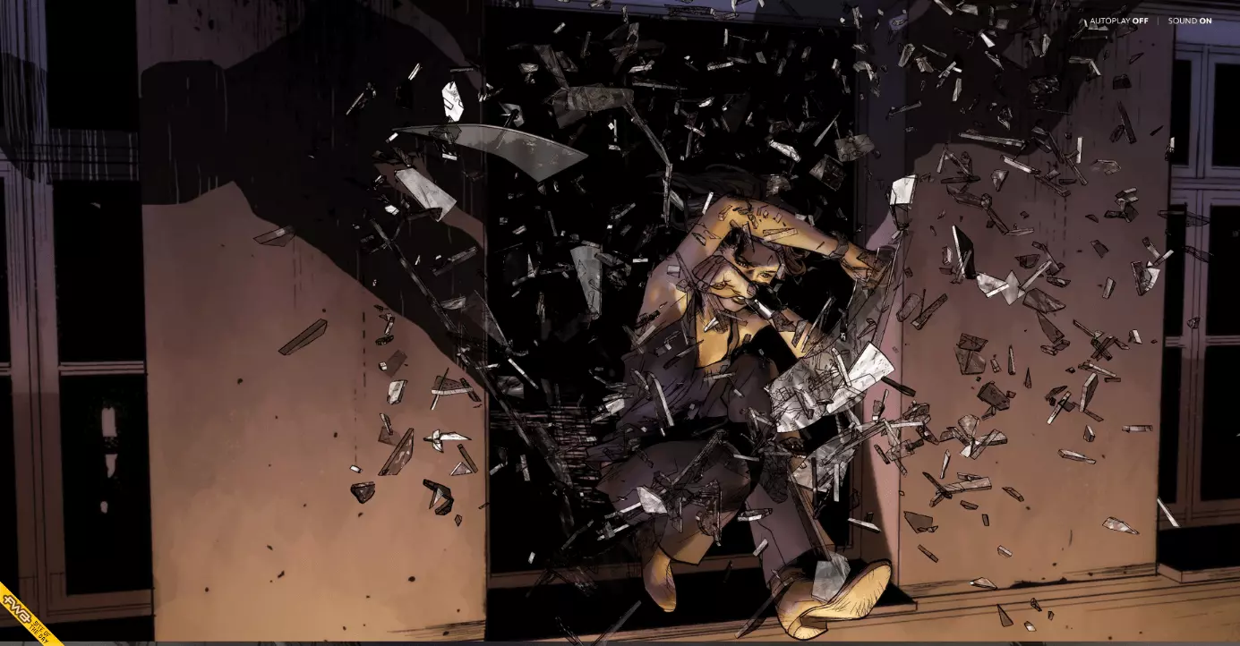
A project that excels in this area is the marketing website for the Peugeot Hybrid4, which is in the guise of a graphic novel and uses lots of interesting features (at the time of publication) of the new drive technology in the form of an action-packed picture story.
The concept and design of the single page website were developed by BETC Digital in collaboration with the MARVEL illustrator Gerald Parel. The technical implementation was carried out by the French digital agency 60fps under the direction of Sylvain Tran.
The online graphic novel provides visitors with two ways to navigate through the web pages: those who do not want to scroll continuously can activate the auto-play mode. This means that the animated web page elements will be automatically played without the user having to do anything. In addition to the parallax scrolling effect, the website uses sound design controlled by the scroll bar.
Technically, the front-end is based on HTML5, CSS, and JavaScript. The project was awarded the FWA of the Day award from The FWA website.
The FWA (Favourite Website Awards) is one of the best-known award platforms regarding web design. Since the early 2000s, an international judging team has been allocating the awards: FOTD (FWA of the Day), FOTM (FWA of the Month), PCA (People’s Choice Award) and FOTY (FWA of the Year). The website is a source of inspiration for creative people around the world.
Ben the Bodyguard
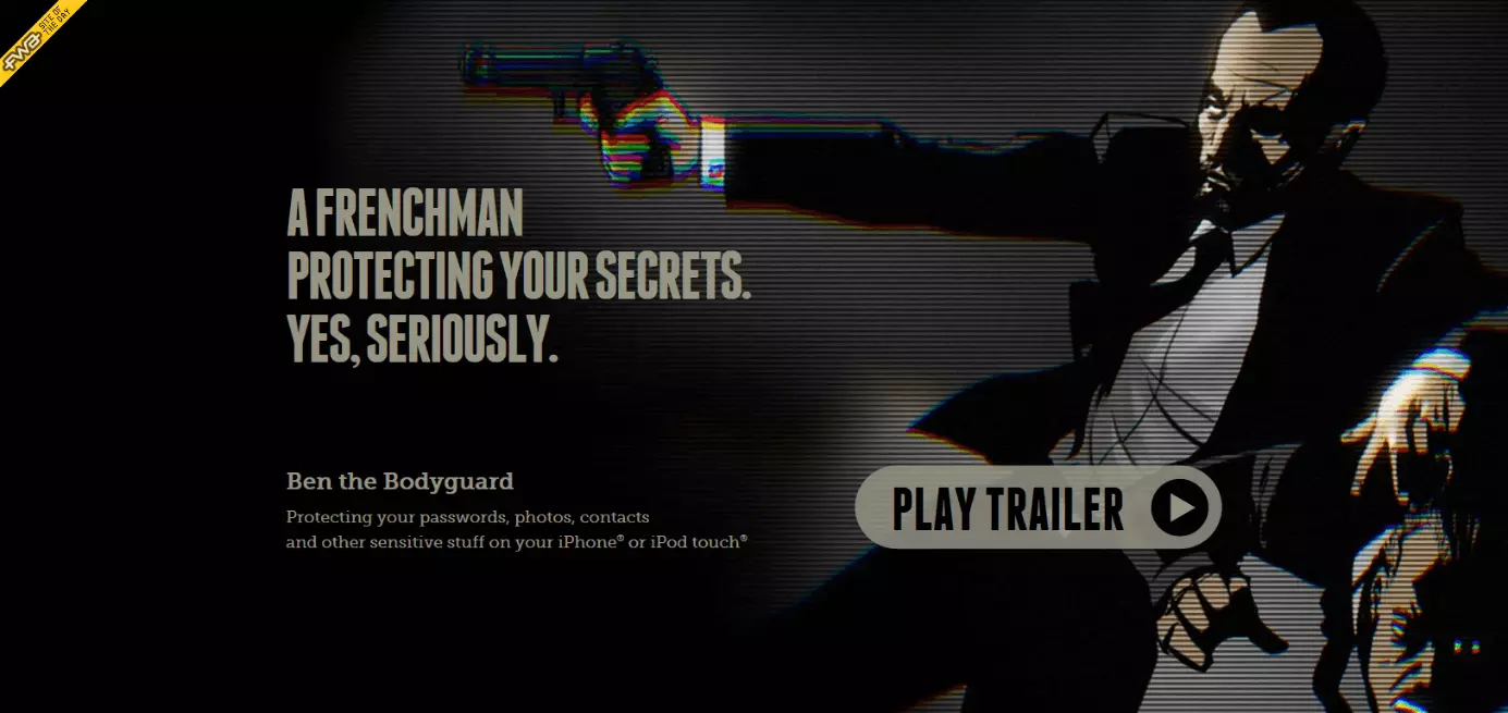
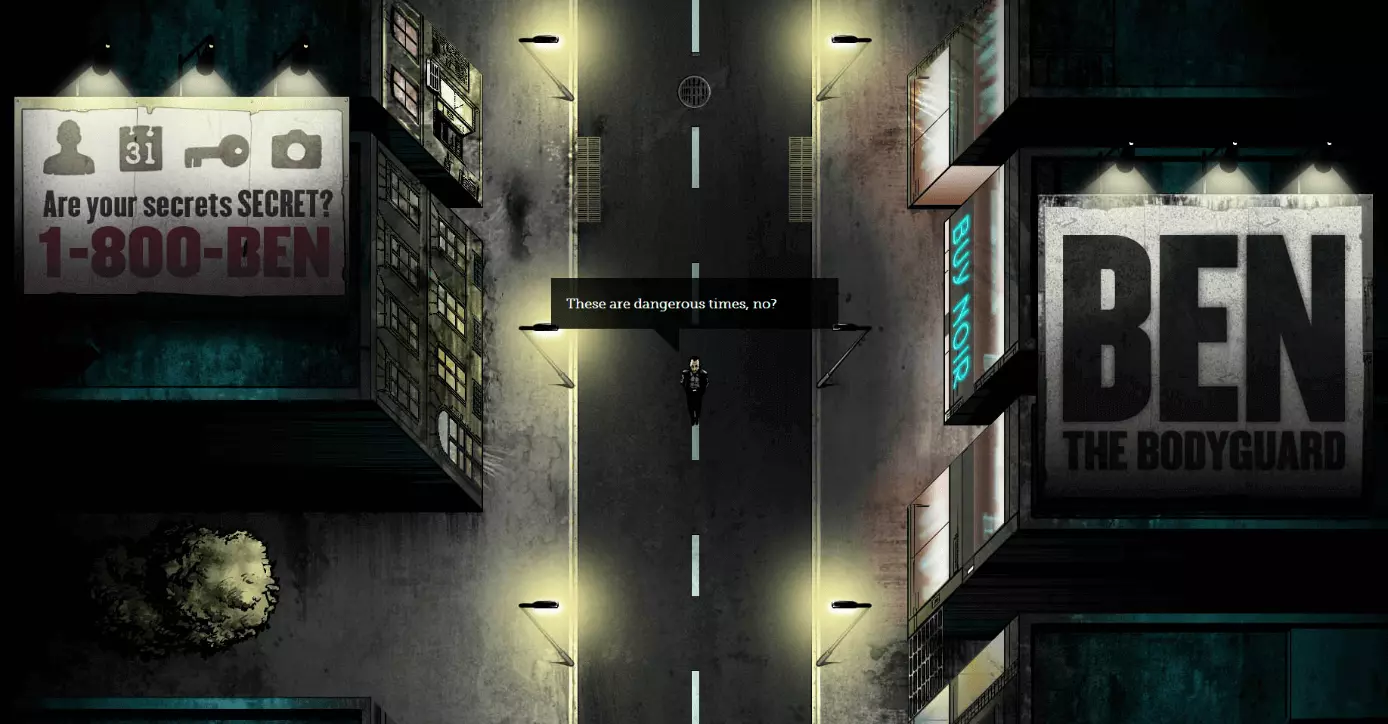
A similar use of the parallax scrolling effect can be seen on the iOS password tool website, Ben the Bodyguard (App no longer available).
Visitors to the single page website accompany Ben through a gloomy street scene and are met with some fears of the digital era: unprotected photos and contact details on your smartphone. There’s no need to worry since Ben acts as your phone’s bodyguard and protects sensitive data against the dangers of the internet with a secure 256-bit encryption.
The Berlin creative agency, Nerd Communications, is the mastermind behind the password tool and website. When implementing this one pager website, the developers used various tools, libraries, and frameworks such as jQuery, HTML5 Boilerplate, and Adobe Flash. Scrolling with parallax effects is based on the platform-independent Javascript scroller iScroll, developed by Matteo Spinelli. The single-page website was part of a cross-media marketing campaign to introduce the password tool. The protagonist, Ben, meets interested people in the YouTube in the trailer, on various social networks, as well as on the app’s user interface. Benthebodyguard.com was also able to secure the title of FWA of the Day from the FWA. The tool has now disappeared from the App Store.
The Walking Dead Zombiefied
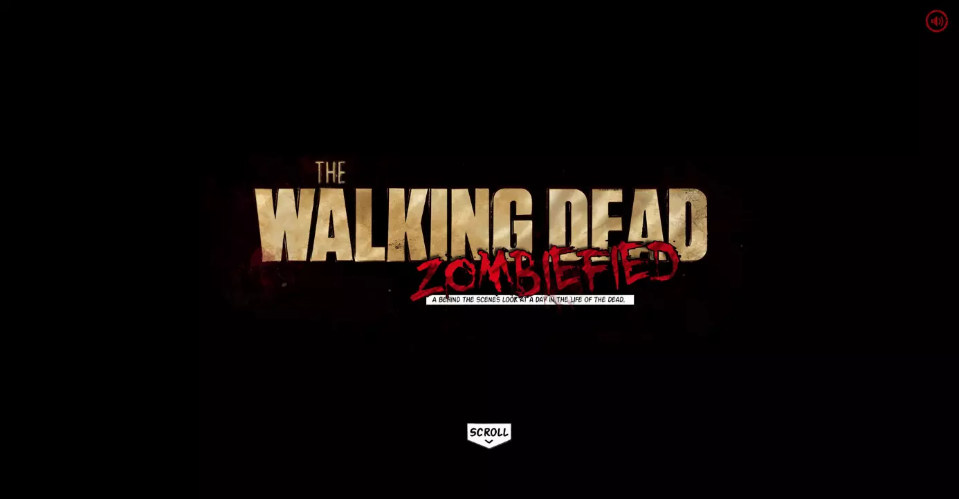
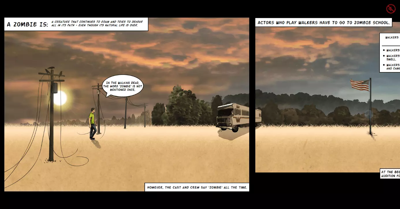
CableTV.com, an information platform about US cable TV, has also made use of parallax scrolling in its storytelling. The Walking Dead Zombiefied is an interactive infographic of the AMC cult series.
Website visitors follow the story by scrolling with the mouse. The different layers on the Parallax website pass horizontally past the viewpoint. New content is automatically reloaded. Sound effects and dark music, which play in time to the scrolling, ensure there’s a post-apocalyptic mood. According to the developer team, the source for inspiration for the scary Zombie website was the company presentation by the US security service provider ADT, which has a timeline with parallax scrolling effect on yourlocalsecurity.com. The technical basis of one pagers is the JavaScript plugin skrollr.js. The makers of The Walking Dead Zombiefied show just how fast a parallax website with video game optics can be created. You’ll find the information in a blog post on Dev.Opera.com.
NASA: Prospect
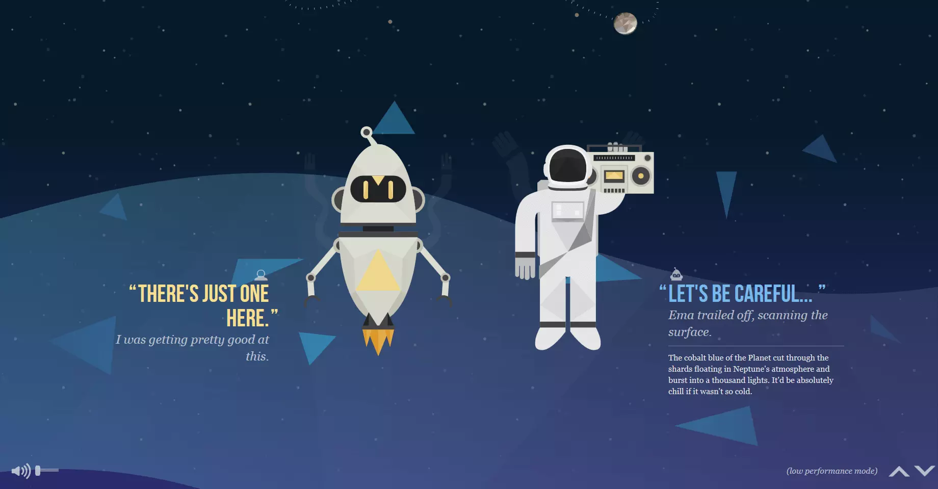
NASA has also realised that scroller websites are an ideal way of providing information online in an entertaining way. On the infotainment website, nasaprospect.com, the US space agency takes visitors on a journey through the solar system, using the parallax scrolling effect to present the vast expanse. The website visitor enters the role of space explorer and scrolls from planet to planet, while the stars whizz past in the background.
The website was developed in collaboration with design students at the University of South Dakota and the international youth art competition Humans in Space Art. In addition to the basic HTML5, CSS3, and JavaScript web technology, the libraries: Modernizr, LESS, Bootstrap, Require, jQuery, Signals, SoundManager2 as well as Greensock Tweening Engine are also used. The parallax scrolling effect is based on the jQuery plugin, stellar.js from Mark Dalgleish. The website’s source code is available on GitHub under the MIT license. The project has been awarded for its creative, innovative web design by various award websites such as The FWA, Awwwards.com, and CSSDesignAwards.com.
Parallax effects supplement visual storytelling by creating depth and dynamics and enables a stronger immersion so the reader can position themselves in the scenes and story.
Firewatch
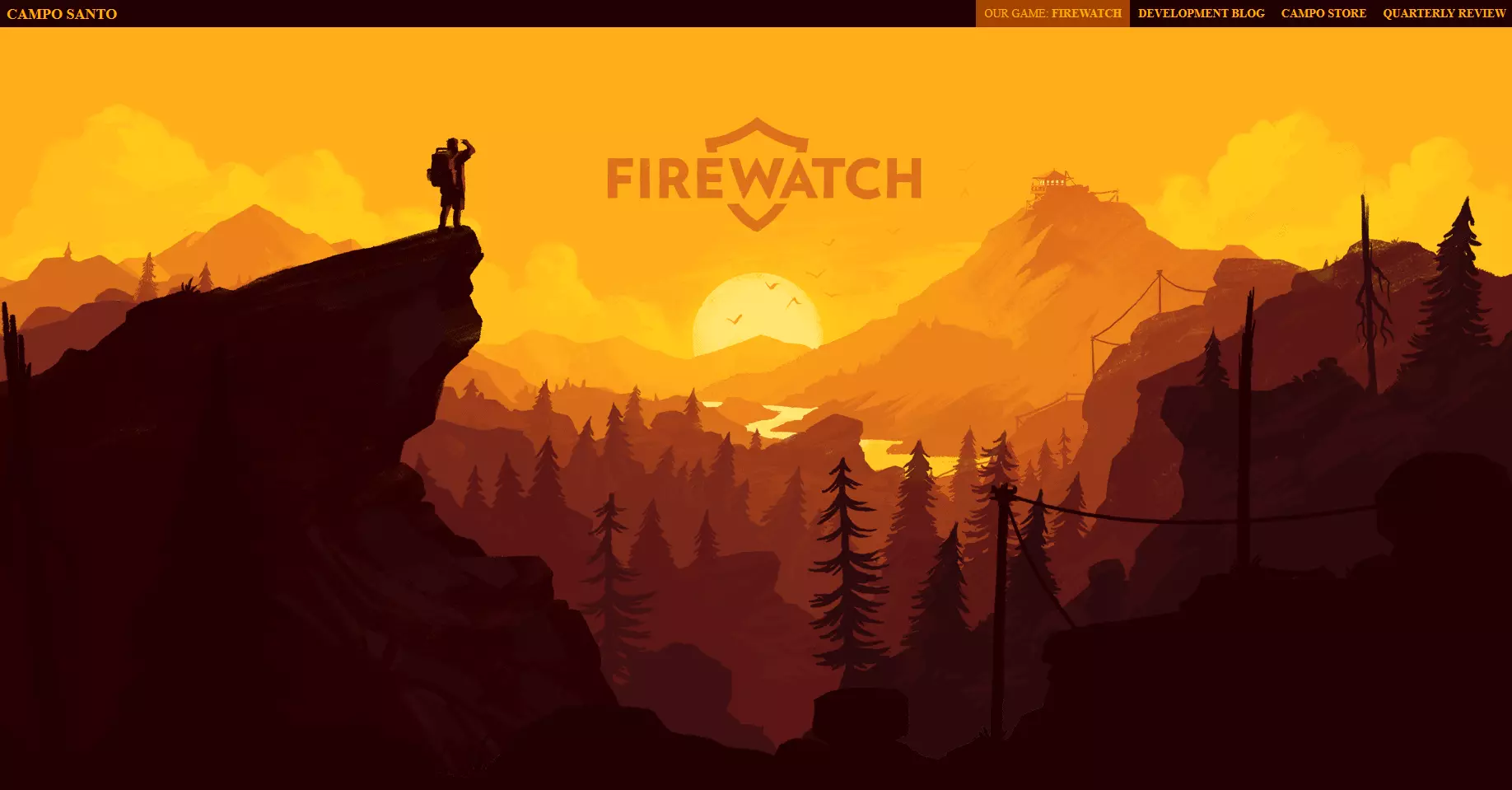
The parallax effect is also an eye-catcher when the visitor first clicks onto the page since they are wowed by the stylistic design and the potential it has for telling the story in different ways. A prime example is the Firewatch video game site from Campo Santo.
The header of the website shows the visitor a mountain landscape at dusk. It consists of six graded layers, which asynchronously move out of the field of view when the visitor starts scrolling, thus emphasising the landscape’s expanse. The actual contents of the website – information about the game, a trailer, as well as links to various gaming platforms – glide into view on the foreground layer.
Various web tutorials and code examples show how well the parallax effect on the Firewatch website comes across to the internet community. Here, you’ll find step-by-step instructions, which enable you to replicate these designs. For example, you’ll find a demonstration on CodePen.io.
Parallax effects can also be used as eye-catchers, which get visitors interested in your website and emphasise the content. Too many gimmicks, on the other hand, end up being annoying. In the worst case, an excessive amount of animation distracts the visitor and may cause them to leave the site.
Greensplash
It may work great when it comes to storytelling but could end up being annoying on websites that focus on other things, especially if visitors want to get information quickly without being led on a detour. An example of this is the web design agency, Greensplash. Here, the parallax scrolling effect is for their own benefit and has no connection to the other design elements on the website.
The website visitor is presented with a funny picture: two nerdy primary school kids with sieves on their heads. There’s an ape next to them, taking notes. When you scroll down, the photo disappears from view. This optical 'highlight' also comes with a green loading bar, which creeps across the screen as the website’s loading. Not very well designed.
Vermeiden Sie optische Effekte, die ihr Webprojekt nicht wesentlich bereichern. Vor allem dann, wenn diese auf Kosten der Website-Performance gehen.
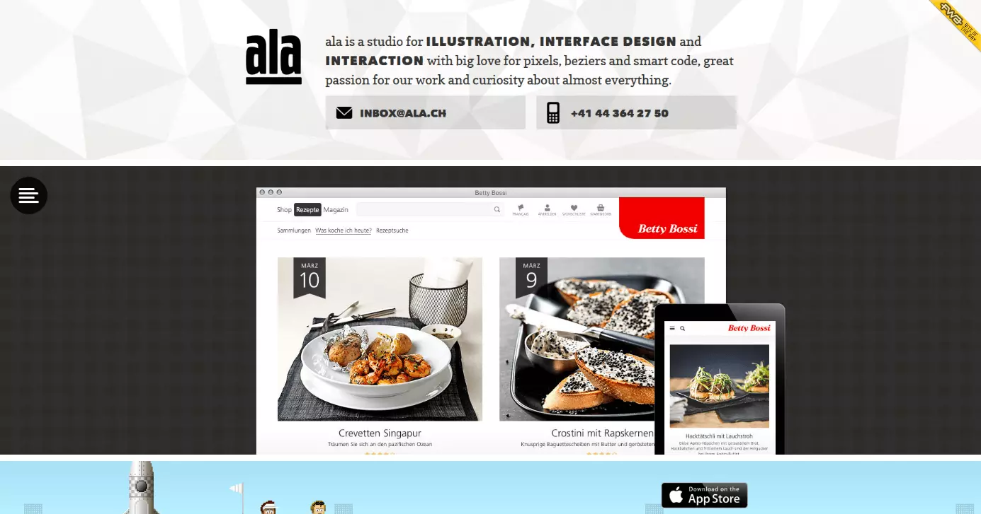
The Swiss web and interface design agency, Ala shows that an elaborate design doesn’t have to affect website performance. The visitor is presented with a crazy collage of random unconnected projects. It might be an overload for the senses but is there to demonstrate the range of possible animation effects and the technical skills that the developers possess. Despite the elaborate design, the animations move smoothly across the screen without any delays.
A small consolation for fans of sleek website designs: you don’t have to get lost looking for important information amongst the crazy animations on the website; everything you need is luckily contained in the header.
Happy 25th Birthday Game Boy
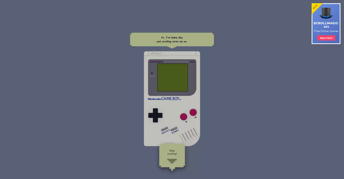
Even if the parallax effect can be automated in principle, most developers of single page websites with appropriate animations rely on navigation where visitors control the scrolling themselves. There is, however, a limit to how much a visitor is prepared to scroll. An example of a website that tests its visitors’ patience is ihatetomatoes.net. The website used for the 25th anniversary of the Gameboy doesn’t use parallax effects but requires the visitor to do A LOT of scrolling.
The single-page site acts as an advertising campaign. Those interested will register on ihatetomatoes.net to receive the tutorial on the basic features of the animation plugin, ScrollMagic. Visitors first see a Gameboy on a grey background and when they scroll down, the Gameboy becomes bigger and a game of Tetris starts. However, the viewer can’t play the game and must instead keep scrolling while watching the blocks stack themselves on the Gameboy’s screen. At the bottom of the website, you will see a link to video tutorials that you have to pay for.
Scroller websites with parallax effects should be fun. If you make your visitors scroll until their finger is tired, you run the risk of them skipping the end (i.e. the call to action).
GitHub 404
GitHub’s 404 error page (source: 'https://github.com/404') is an example of parallax effect without the need to scroll. It behaves in a similar way to a parallax website but the visitor doesn’t have to scroll, instead, they simply have to move the cursor around.
The jQuery plugin Plax is behind the parallax animation. This plugin was developed by Cameron McEfee and is free to use via GitHub under the MIT license. What’s special about Plax: the Parallax plugin turns the website visitors’ perception upside down. Here, the foreground doesn’t move faster than the background - rather the background moves faster than the foreground. The aim is to disorientate the viewer, which is fitting since the visitor is probably already confused after having been redirected to this error page.
The question 'parallax websites: yes or no?' is hard to answer. In principle, the parallax effect is very eye catching. Yet, because this stylistic design has been used a lot (sometimes unnecessarily) since 2011, these sites have become quite annoying, especially when navigating isn’t as easy as the developer has planned. You should consider the following points:
- If parallax scrolling isn’t used in visual storytelling, you should use the effect sparingly.
- Parallax effects and other animations should improve the user experience, highlight content, products, and services, and encourage visitors to make content.
- If an effect has a negative impact on the site’s performance, you should consider whether you actually need it.
- The site should be accessible to all internet users, despite the parallax scrolling effect. Only use up-to-date technologies that are downward compatible and work with both old and new web browsers.
- Ensure that your parallax website can also be displayed on mobile devices. Current parallax plugins generally support responsive web design.


