CSS tricks: useful snippets for your web project
CSS (Cascading Style Sheets) has fundamentally changed the World Wide Web. Previously, the display instructions for layout, typography, etc. had to be painstakingly programmed into a website’s HTML document, but now the style sheet language is able to do it in a much shorter amount of time and has made the previous inflexible method a thing of the past. Display-oriented HTML elements have been considered outdated since HTML5 came on the scene – content and presentation is now dealt with separately.
CSS is being steadily developed as 'living standard' which opens up many versatile and complex design possibilities, but in return, is becoming increasingly more complicated to keep an overview of. Here you will find the most interesting and useful tricks, including the corresponding CSS snippets.
Numbering headings
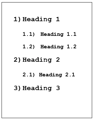
If you’ve added different headings and sub headings in your HTML document and numbered them before, you probably did this manually or by using a script. But instead, you can simply use CSS and let the style sheet language do the counting. This old CSS trick, which is supported by all current browsers, can be used with the following CSS snippet:
#Heading {
counter-reset: heading;
}
h1:before {
    content: counter(heading)") ";
    counter-increment: heading;
}
h1 {
    counter-reset: subheading;
}
h2:before {
    content: counter(heading)"." counter(subheading)") ";
    counter-increment: subheading;
}
body{
    font-family: courier new;
}Hiding elements in an SEO-friendly way
Trying to hide the contents of the HTML document using commands such as display: none; or visibility: hidden, does not perform well with search engines. Although excessive use is not recommended, the following code provides an excellent way to get around these two elements skillfully:
.hidden {
    position: absolute;
    top: -9999px;
    left: -9999px;
}
Creating text shadows
Shading can be produced in texts using graphic programs, but this requires the necessary know-how as well as preventing the content from being legible for search engines. Ever since version 3 of the style sheet language, there have been several CSS effects which lead to attractive results when combined together and do not alter the underlying text elements. The following CSS tip demonstrates the shading option from the style sheet language:
p {
font-size: 50pt;
font-family: sans-serif;
text-shadow: 10px 11px 18px rgba(300, 180, 100, 1),
-10px -11px 18px red;
}
With the help of this code, <p> elements can also be defined so that they have two shadows. This number can be increased, but make sure you always use a comma for separation. The first two parts of information determine the positioning of the shadow – first the X coordinate and then the Y coordinate. The third piece of information defines the size. In the last place you can specify the color of the shadow, either by RGBA indication (300, 180, 100, 1) like in the first row, or absolute like in the second (red). The example shows what it looks like after being applied:
Changing website elements with CSS filters
CSS is not only a good alternative to Photoshop when it comes to shading; the style sheet language also comes with useful filter effects, similar to those of image editing programs. This is how graphics, backgrounds, texts, and videos can be creatively adapted by increasing the brightness, changing the contrast, or using grayscale. The filter options are available in nearly all modern browsers (except Internet Explorer). You can see the syntax of these CSS effects in the grayscale filter example:
.grayscale {
    -webkit-filter: grayscale(1);
    filter: grayscale(1);
}Additional features that could prove useful:
| Filter | Description | Value |
| blur(VALUE) | Soft focus | Radius in Pixels |
| brightness(VALUE) | Brightness | Standard: 1, brighten: >1, darken: <1 |
| contrast(VALUE) | Contrast | Standard: 1, increase: >1, decrease: <1 |
| invert(VALUE) | Invert colors | Value of 1: complete inversion |
| opacity(VALUE) | Opacity | Maximum value: 1 (the element completely disappears) |
| saturate(VALUE) | Sättigung | Standard: 1, increase: >1, decrease: <1 |
| sepia(VALUE) | Sepia colors | Maximum value: 1 (corresponds to a Sepia tone of 100%) |
Optimally adjusting image captions
There aren’t any specific rules to adhere to when it comes to the descriptive snippets of text placed below images. Centering the caption looks better when the description is no longer than one line; otherwise it can end up looking sloppy. On the other hand, using left alignment for short captions is also not recommended. The solution is to give separate information in the container element <figure> as well as in the element <figcaption> since both are used as standard when it comes to image captions. Here is the corresponding CSS snippet:
figure {
    text-align: center;
}
figcaption {
    display: inline-block;
    text-align: left;
}
This CSS trick causes the image caption to be left-aligned by definition, but it’s actually shown centrally due to the inline-block information, which comes into effect when the piece of text does not cover the full length of the image.
Emphasizing the first letter in excerpts
With the help of pseudo-classes it is possible to emphasize single specific HTML elements such as the first letter of a paragraph. With ::first-letter you can easily implement this command, which is often seen in stories, especially fairy tales:
p{
    font-family: "bookman old style"
}
p:first-child::first-letter{
    font-family: "papyrus";
    font-size: 25px
    font-weight: bold
}Use the parallax effect
Many modern sites are built on the parallax effect, which the visitor triggers when scrolling. This is where the background moves at a slower rate to the foreground and thus creates a 3D effect. The effect is achieved using JavaScript or jQuery. The following CSS3 trick shows how you can incorporate parallax scrolling into your website just using the style sheet language:
p {
    width: 100%;
    margin: auto;
    font-size: 50px;
    transform: scale(.5);
    font-family: courier new;
    font-weght: bold;
}
div {
    background-image: url("URL DES HINTERGRUNDBILDES");
    background-attachment: fixed;
    transform: scale(1.25);}
body {
    height: 100%;
    overflow: scroll;
}
Using the parameter background-image: url, you can specify the URL of the background image. The values used here regarding typography and element size can be individually configured.
Highlighting obligatory form fields
You can optimize forms embedded in your website by using :required and :optional. Both the pseudo classes allow color to indicate which form fields have to be filled out and which are optimal. The corresponding CSS snippet looks like this:
:required {
    border: 1px solid red;
}
:optional {
border: 1px solid black;
}Lists with triangular bullet points
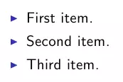
If you have unordered lists in your HTML document, you don’t always need to use the standard round bullet points. With the following CSS trick you can easily create triangular bullet points:
ul {
    margin: 0.75em 0;
    padding: 0 1em;
    list-style: none;
}
li:before {
    content: "";
    border-color: transparent #111;
    border-style: solid;
    border-width: 0.35em 0 0.35em 0.45em;
    display: block;
    height: 0;
    width: 0;
    left: -1em;
    top: 0.9em;
    position: relative;
}
The results will look like this:


