Learn CSS - Tutorial
Next to HTML, CSS is the most important standard in web design. If you want to write contemporary web pages by hand, you won’t be able to do it without using CSS. It’s also easier to handle graphic HTML editors, homepage kits, or content management systems if you have basic CSS knowledge. Our CSS tutorial subscribes to the motto of “CSS coding made easy”, and introduces you to the basics of the stylesheet language in the form of a crash course.
Separation of content and presentation
In combination with HTML, CSS offers a separation between content and presentation. The Hypertext Markup Language (HTML) is used to supplement text documents with information that’s then used for the semantic structuring of the text elements. The markup language creates the basis for every website: the HTML code. This describes the elements from which a document is composed (e.g.: <body>, <header>, <footer>,) and how the information should be interpreted (e.g.: Headline <h1>, text paragraph <p>, line break <br>, link <a>, photo <img>, video <video>). This is enough for web browsers to be able to display HTML documents as web pages. But from today’s point of view, the result isn’t very appealing. A decisive step is missing: individual formatting.
Originally, HTML also offered rudimentary design instructions. But with HTML5, these are considered outdated and shouldn’t be used anymore. Instead, the stylesheet language CSS (Cascading Style Sheets) is used to separately manage presentation requirements. But what exactly is CSS?
What is CSS?
Like HTML, CSS is also notated in text form. This can take place directly in the HTML document (inline for each document or just once in the HTML header). Generally, though, web designers bind separate CSS documents together to format web pages. The result is a clear source code with eliminated redundant design instructions by referring to separate stylesheets. The fewer repetitions, the leaner the source code. This is reflected online in shorter download times and a faster site loading time. CSS also facilitates the maintenance of a website. If adaptations to the design are necessary, these are made in the central CSS files, so it’s not necessary to look through each individual HTML document and adapt them separately. As a living standard, CSS is continually developed by the World Wide Web Consortium (W3C) and is currently available in its third version as CSS3. While the versions CSS1 and CSS2 have long been integrated in all current browsers, the newly introduced properties of the third version are not yet universally supported. A support overview for the popular browser models Microsoft Internet Explorer, Mozilla Firefox, Google Chrome, Apple Safari, and Opera is offered by w3schools.com.
Basic structure: The CSS syntax
The central purpose of CSS is to define the design of a website. For this reason, the underlying HTML elements are assigned certain values using the stylesheet language. The basic structure of a design instruction looks as follows:
Selector { Declaration }Selector deals with the representation of the HTML elements being defined by the design instruction. The declaration subsists of a property-value combination, which is then listed in the braces. Every declaration ends with a semicolon:
HTML element { Property: Value;}In this format, for example, you can assign a font colour to a headline:
h2 { color: red; }The selector h2 represents the second headline class. The declaration contains the property color and the value red. On a website with such a design instruction, all text passages marked with <h2> in the source code would be displayed as red. Alternatively, detailed colour settings can be defined using hexadecimal color codes (see the chapter on CSS color).
h2 { color: #ff0000; }Web designers have the option to assign a single property to a selector, or to define extensive rule sets that contain detailed design instructions. For the sake of clarity, a spelling has been established in which all properties of a rule set are listed together:
Selector {
    Property1: Value;
    Property2: Value;
    Property3: Value;
}
For example, such a property bundle could look as follows:
h2 {
    color: #ff0000;
    font-family: Helvetica, sans-serif;
    font-size: 19px;
    font-weight: bold;
    text-align: center;
}
The property-value combinations in the braces define the font colour, font family, font size, font style, and alignment of the text. A detailed description of the CSS properties will follow in this tutorial.
A rule set may also specify several selectors. In this case, they’re separated by commas before the declaration:
Selector1, Selector 2 { Declaration }CSS Selectors
CSS supports various selectors that enable user-defined, custom design instructions. But for getting started, it’s sufficient to familiarise yourself with type, class, ID, and universal selectors.
| Type of selector | CSS notation | Description |
|---|---|---|
| Type selector | HTML element (e.g. h2) | A type selector corresponds to the name of the element to which it refers. Formatting is applied to all HTML elements of the same type. |
| Class selector | .example | A class selectors refers to all elements of a certain class. Class selectors are formed with a full stop(.) and a chosen class name: .example. Classes are assigned to HTML elements using the class attribute (class=“example”). |
| ID | #example | An ID selector is an element with a unique ID. These are integrated in the HTML source code with the id attribute (id=“example”). |
| Universal selector | * | The universal selector asterisk (*) refers to all HTML elements in a document. |
The use of various CSS selectors can be illustrated with simple examples. The following line of code shows the type selector h2 with declaration:
h2 {
    color: #305796;
    font-family: Helvetica, sans-serif;
}
The formatting applies to all HTML elements with the type h2 (second headline class).
Alternatively, the CSS formatting can be performed using a class selector. This allows web designers to provide the same design instructions regardless of type.
.content {
    color: #ff0000;
    font-family: Helvetica, sans-serif;
}
This formatting applies to all HTML elements to which the class .content have been assigned. The assignment is formatted as follows:
<p class="special-text">Beispieltext</p>In HTML the class name is notated without a full stop(.).
If a design instruction refers only to a single element in the HTML source code, an ID selector can be used. The following example shows the formatting of a navigation area:
#navigation {
    font-family: Helvetica, sans-serif;
    background-color: #8ad8d4;
    border: 2px solid #448278;
}
The assignment of the formatting is put in the HTML source code without a hashtag (#):
<div id="navigation">
    <ul>
        <li><a href="index.htm">Homepage</a></li>
        <li><a href="legal.htm">Legal</a></li>
    </ul>
</div>
The benefit of using an ID selector is that you can see, at a glance, which sections in the source text are unique. ID selectors also take priority when assigning styles. If a particular element finds that class and ID formatting are contradicting one another, the latter will be used. Classes, in turn, take higher priority than type selectors.
Classes, as well as IDs, are free to be named whatever you want. But keep in mind that CSS selectors are case sensitive: Upper and lower case differences are interpreted as separate classes (e.g. navigation vs. Navigation). Empty and special characters aren’t allowed, and umlauts are unusual.
If a design instruction refers to all elements of an HTML document, then the asterisk (*) is used:
*  {
    font-family: Helvetica, sans-serif;
}
In this example, all text elements of the website will now be shown in Helvetica font in the browser.
Integrating CSS in HTML
For a browser to consider CSS formatting in the context of the website layout, the design instructions need to be linked with the HTML source code. Users have three options:
- Direct integration of the CSS declaration into HTML tags
- CSS markup in the HTML header
- Reference to a separate stylesheet
The last solution is generally considered to be the best: In practice, stylesheets are usually created as external text files and then integrated.
CSS declaration in HTML tags
If a CSS declaration is formatted to a single place in the source text, then the style attribute can be used to specify it directly in the introductory tag of the HTML element to which the design statement is referring. In this case, it’s called “inline style”.
<h2 style=“color: red;”>subheading</h2>This is advantageous because you don’t need to create your own stylesheet, the selector is left out and the assignment has a high priority. When an entire rule set is used, though, this form of formatting can become confusing and redundant.
<h2 style="color: #ff0000; font-family: 'Helvetica New', sans-serif; font-size: 19px; font-weight: bold; text-align: center;">subheading</h2>This integration of design instructions is recommended only (if at all) for small websites with minimal formatting.
CSS markup in the HTML header
If the same design instruction is to be used several times for the same element within an HTML document (e.g. for all h2 on the webpage), then putting a CSS declaration in the HTML tag isn’t enough. Instead, it’s recommended to define the corresponding design instructions just one time using the style element of the HTML header of the document.
<!DOCTYPE html>
    <html lang="en">
        <head>
            <style>
                h2 {
                    color: #ff0000;
                    font-family: 'Helvetica New', sans-serif;
                    font-size: 19px;
                    font-weight: bold;
                    text-align: center;
                }
            </style>
        </head>
        <body>
            <h2>Subheading1</h2>
            […]
            <h2>Subheading2</h2>
            […]
        </body>
</html>
The rule set within the style element is automatically applied to all following h2 elements. But what if the h2 element is also being used on other pages within the same online project, and should also employ the same design instructions? In this case, website operators would have to integrate the code block with the instruction into each HTML site and adapt each individually to any new changes. But with a central CSS file, this problem is given an elegant solution.
Reference to a separate stylesheet
If design instructions are defined in a separate stylesheet, then these must be integrated into the underlying HTML document. This is done using the HTML element <link>, which, like the style element, is a child element of the head element.
<link rel=“stylesheet” href=“example.css”>The link element contains the obligatory attributes rel and href and can be optionally supplemented with the attributes type and media.
| link element attributes | Description |
|---|---|
| rel | The rel attribute defines the type relationship type of the element. The value stylesheet indicates that a stylesheet should be integrated. |
| href | The href attribute references the file that should be integrated as a stylesheet. |
| type | The optional attribute type describes the type of media of the integrated file – in the case of CSS, “text/css”. |
| media | With the media attribute website operators can choose whether the referenced stylesheet should only be used with a certain output medium. This allows different stylesheets to be made available for various end devices. Possible values are, for example, screen or print. |
CSS colour specifications
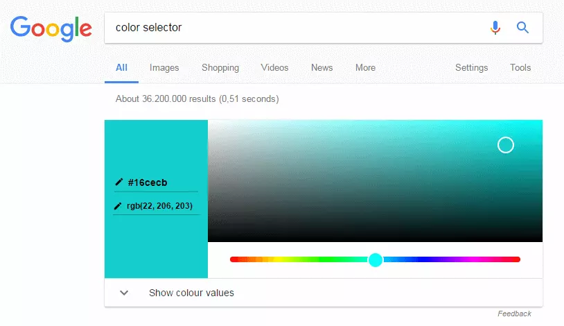
As mentioned in the introductory chapter, color assignments via CSS can be defined using the English colour words (e.g. red, blue, green). In practice, though, you don’t find design instructions like this very often. More commonly the RGB model is used. This offers significantly more shades, and allows website operators to define detailed colour settings. The corresponding codes can be determined using a colour selector. Google offers this, for example, in the form of Quick Answer.
The RGB model
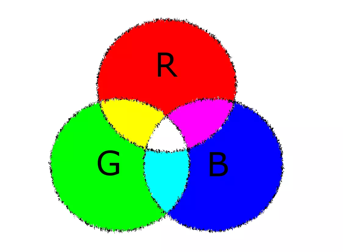
In the RGB model, every colour can be precisely specified by its proportions of the basic colors red (R), green (G), and blue (B).
Colour proportions in the RGB model are defined using decimal values between 0 and 255. While a value of 0 means that a colour has no percentage of that particular base colour, a value of 255 means a maximum proportion.
The notation of RGB colour values corresponds to the following scheme (the spaces aren’t necessary):
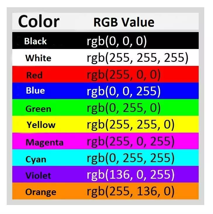
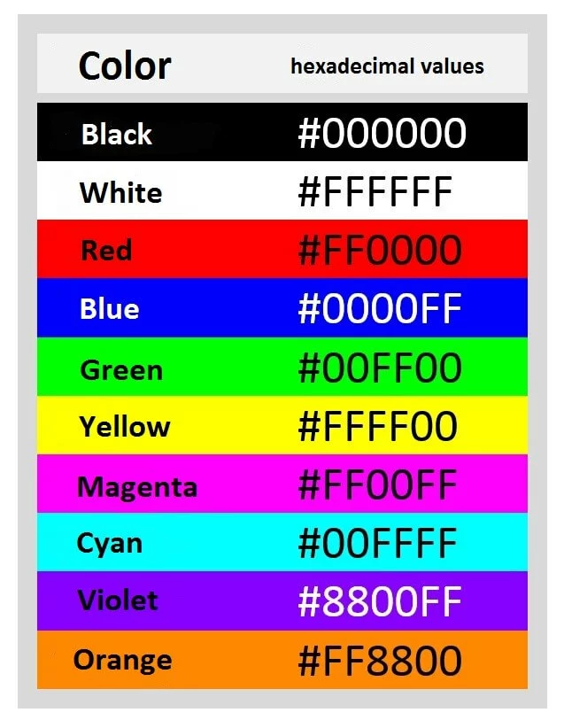
rgb(Red value, green value, blue value)In this way, the RGB model enables you to define around 16.7 million different colours for the design of your website. The following table shows the RGB values for the standard colours black, white, red, blue, green, yellow, magenta, cyan, violet, and orange:
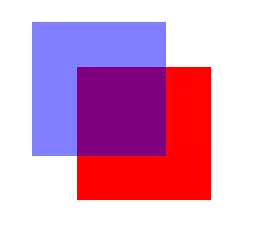
Since CSS3, RGB values can be expanded by a fourth value: the so-called alpha channel (a). This specifies the opacity of the colour and is given in values from 0 to 1 (e.g. 0.8).
rgba(red value, green value, blue value, opacity)For example, the following RGBA values give the basic colour blue, as illustrated above, with a transparency of 50 percent.
rgba(0, 0, 255, 0.5)Alternatively, the specification of colours in hex values instead of decimal notation has been established for use online.
Hexidecimal colour codes
Hexidecimal colour codes define colour values by means of a score system with the base 16. Unlike the decimal system, not 10 but 16 digits are used in the following order: 0, 1, 2, 3, 4, 5, 6, 7, 8, 9, a, b, c, d, e, f.
The basic structure of a hexadecimal colour code is a hashtag (#) followed by six hexadecimal digits, which are represented in blocks of two for each colour in the RGB model (red, green, blue):
#RRGGBB
The saturation of each colour is indicated by the hexadecimal number value. 00 means a complete absence of that colour, and FF (decimal: 255) means maximum colour saturation. The respective colour is based on an additive mixture of the basic colours. For example, the following hex values are for the same colour samples already shown in the RGB code example:
In addition to RGB, CSS also supports the HSL colour model. In the future, web designers will also be able to define colour settings via CMYK.
The most important CSS properties
With CSS, you can choose from around 420 properties with which to define your design instructions for HTML elements. Each property accepts a specified set of values. For the sake of clarity, CSS properties are divided by application area. The font, colour adjustments, text formatting, layout using the CSS box model, and the positioning of CSS boxes are of central importance. Our crash course in CSS for beginners concentrates on the most important properties for an introduction to Cascading Style Sheets, and demonstrates the creation of CSS rule sets by means of practical code examples. A complete list of all CSS properties can be found on the W3C website.
Font
Fonts are a central feature of a website. CSS offers you diverse possibilities for formatting the writing elements of an HTML site. The most important properties in text formatting are:
- font-family
- font-style
- font-variant
- font-size
- line-height
- font-weight
font-family
Should a particular font be defined for the text elements of a website, then the CSS property font-family is used. This allows you to create a font stack. This is a prioritised list of suitable fonts. Font stacks are built in such a way that the desired font is named first, followed by a list of matching display alternatives.
.content {
    font-family: Georgia, Garamond, serif;
}
The example shows a design instruction for the .content class in the CSS file. This is referred to in the HTML document through the class attribute and class name content:
<p class=“content”>Example text</p>Georgia is defined as a prioritised font, with Garamond as the alternative font. This way, a web browser is instructed to display the text section in Garamond if Georgia isn’t installed on the system.
But what if no named alternative is available? In such a case, it is recommended to define a generic font as a fallback mechanism. Georgia as well as Garamond belong to the serif font family. If these are included in the declaration as the last alternatives, then the web browser displays the paragraph in a font of the generic family available to it – for example, in the widespread Times New Roman font. This ensures that an effect intended by the stylesheet author is at least retained in its basic features.
Other generic families are sans-serif (e.g. Arial, Trebuchet, or Verdana) and monospace (e.g. Courier, Courier New, or Andale Mono). Fonts whose names consist of several words are placed in single or double quotes in the CSS declaration:
.content {
    font-family: 'Trebuchet MS', 'Liberation Sans', sans-serif;
}Generic families are keywords that cannot be quoted in quotation marks.
font-style
The CSS property font-style refers to the font style of a paragraph, and allows you to define design instructions for the inclination of excellent characters.
| Value for text inclination | Description |
|---|---|
| normal | Normal font style (standard settings) |
| italic | Cursive font |
| oblique | Slanted font |
The following example shows a design instruction for the cursive font style:
.special-content {
    font-family: Arial;
    font-style: italic;
}
<p class=“special-content”>Example text</p>
The values italic and oblique are generally displayed identically in web browsers, but the value oblique is used less often. The difference between it and the italic value is that oblique will slant a normal font, even if it doesn’t provide an italicised variant.
font-variant
The CSS property font-variant is used to define font variations.
| Value for font variants | Description |
|---|---|
| normal | Normal font variant (standard settings) |
| small-caps | Small capitals replace lowercase letters |
| all-small-caps | Small capitals replace both uppercase and lowercase letters |
The following examples show the font variants small-caps and all-small-caps:
.content {
            font-family: Arial;
            font-variant: small-caps;
    }
<p class=“content”>Example text</p>.content {
font-family: Arial;
font-variant: all-small-caps;
}
<p class=“content;”>Example text</p>font-size
With the CSS property font-size, the display size of the text elements is defined. This can be done in absolute values or in relation to surrounding elements. The font size, or height of the characters, is given here. Web designers have various spellings and units of measurements available.
Absolute measurements are oriented in physical length. But on the screen, browsers calculate all units in pixels using a resolution of 96 dpi. On a modern laptop or smartphone, for example, 1 cm will be significantly smaller than would be expected. Other than px, absolute units of measurement hardly play a role in web design. The only way to make sense of them is to print out where the browser it targeting real sizes.
Absolute measurements:
| Unit | CSS notation | Description |
|---|---|---|
| Pixel | px | The measurement px was developed specially for CSS and represents the size of an element in pixels. Pixels are displayed in relation to point density (i.e. dots per inch, dpi). It is still a definite unit, though. 1 px today doesn’t necessarily correspond to a display pixel. To prevent text elements from being displayed too small, browsers work on high-resolution displays with a scale of the px measure unit. A CSS pixel is represented by several display pixels, depending on the screen resolutions. The following applies as a guideline for scaling: 1 CSS pixel is 1/96 of an inch. Users can change the assignment of px unit to device pixel by zooming in on the browser. |
| Centimeters | cm | Size in centimeters |
| Millimeters | mm | Size in millimeters |
| Inches | in | Size in inches (1 in = 2.54 cm) |
| Points | pt | Size in points (1 point represents 1/72 of an inch) |
| Pica | pc | Size in pica (1 pica represents 12 points) |
With relative units of measure, the font size is a function of a pre-determined variable. HTML elements inherit their font size from their respective parent elements. A technical guide value, such as the display size of a device or the default value in a web browser, could also serve as references for relative font size.
Relative measurements:
| Unit | CSS notation | Description |
|---|---|---|
| Percentage | % | The % measurement gives the font size as a percentage of the inherited font size. With an inherited font size of 16 px, a font-size of 75% corresponds to a font size of 12 px. |
| em (font height) | em | The measurement em also stands in relation to the parent element. A measurement of 1 em means 100% of the inherited font size. If a font size of 20 px is defined, that corresponds to a value of 0.8 – for example, a font size of 80% or 16 px. If no font size is defined for the parent element, then the default font size of the device is used. |
| x-height | ex | The reference value for the ex measurement is the height of the lowercase letter x in the chosen font. If the chosen font doesn’t have a defined x height, then 1 ex = 0.5 em. |
| Root-em | rem | The measurement rem refers to the root element of a document (e.g. the HTML element). 1 rem represents 100% of the font size determined for the root element. |
| Viewport width | vw | The vw measurement is based on the width of the display (viewport) of a device. This means that 1 vw = 1% of the viewport width. |
| Viewport height | vh | The measurement vh is based on the height of the display (viewport) of a device. This means that 1 vh = 1% of the viewport height. |
Font size can also be defined using absolute and relative keywords. The default font size of the browser can be used as a guide (it corresponds to font-size: medium).
Absolute keywords:
| Absolute | Description | Example |
|---|---|---|
| xx-small | tiny | 9 px |
| x-small | very small | 10 px |
| small | small | 13 px |
| medium | medium (default browser font size) | 16 px |
| large | large | 19 px |
| x-large | very large | 24 px |
| xx-large | huge | 32 px |
Relative keywords:
| Relative | Description |
|---|---|
| smaller | The current element is displayed smaller than the parent element. |
| larger | The current element is displayed larger than the parent element. |
To guarantee an optimal display of the font size on different user devices, it’s recommended to use relative measurements such as em or %. If the output needs to be absolute, px is the choice of measurement for most web designers.
The basic structure of the font size formatting via CSS corresponds to the following code example:
.content {
            font-size: 19px;
    }
<h2 class=“content”>Example text</h2>line-height
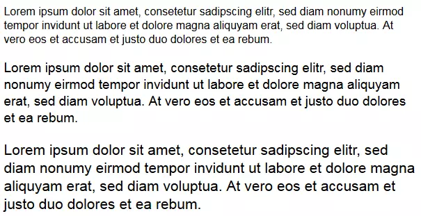
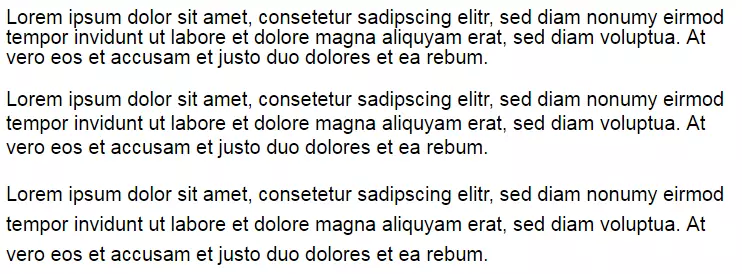
The CSS property line-height is used to define the amount of space above and below text elements in a paragraph. The same measurements apply as for font-size, where percentages refer to the font-size of the respective text. Alternatively, you can specify the line-height in numbers with no unit of measurement. Other possible values are normal (standard settings) and inherit (corresponding to the parent element). A line-height of 1.5, for example, corresponds to a line height of 150% percent of the respective font size, or 1.5 em.
.content {
    line-height: 1.5;
}
<p class="content">Lorem ipsum dolor sit amet, consetetur sadipscing elitr, sed diam nonumy eirmod tempor invidunt ut labore et dolore magna aliquyam erat, sed diam voluptua. At vero eos et accusam et justo duo dolores et ea rebum.</p>font-weight
The CSS property font-weight defines the stroke width of a text element. Web designers use these to display areas of texts as fatter than normal. Absolute or relative values of the parent element can be given.
| Absolute value | Description |
|---|---|
| 100 | extra thin |
| 200 | very thin |
| 300 | thin |
| 400 | normal (standard settings) |
| 500 | medium |
| 600 | half-thick |
| 700 | thick |
| 800 | very thick |
| 900 | extra thick |
| normal | normal width (same as 400 value) |
| bold | thick (same as 700 value) |
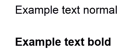
Absolute values for the font-weight property are displayed differently depending on the font. The problem is that different font thicknesses are necessary for different font styles. Normally, fonts are only available in normal, italic, bold, and italic + bold. If only two font thicknesses are defined, then the browser takes the thinner font for the value 100, 200, 300, 400, and 500, and the thicker for the higher values. Number values are only relevant for web fonts. As a rule, two different font thicknesses are enough: normal and bold.
.content {
    font-weight: normal;
}
.content {
    font-weight: bold;
}Relative values for the CSS property font-weight define the font thickness of a text element in comparison to the inherited font thickness of the parent element.
| Relative value | Description |
|---|---|
| bolder | bolder than the parent element |
| lighter | thinner than the parent element |
Text formatting
In addition to formatting the font, there are multiple options available in CSS for various text formatting properties. These enable you to make settings for text alignment, as well as for the distance between characters and words, or to provide decorations for text elements. Important properties of text formatting are:
- text-align
- hyphens
- word-spacing
- letter-spacing
- text-indent
- text-decoration
- text-transform
text-align
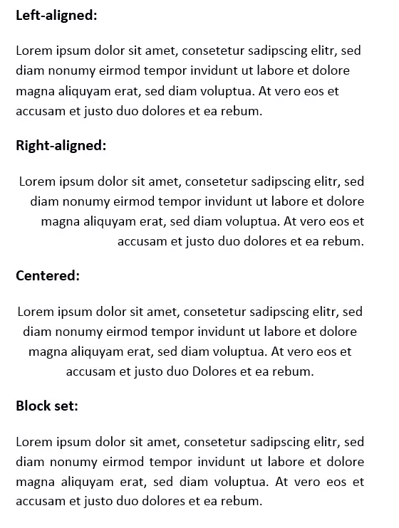
The CSS property text-align is used to align text and inline elements: elements that are contained in the text flow, such as images or buttons. Standard values are left (left-aligned), right (right-aligned), center (centred), justify (block set), or inherit (like parent element). The following code achieves a centred alignment of the example text:
.content {
    text-align: center;
}
<p class="content">Lorem ipsum dolor sit amet, consetetur sadipscing elitr, sed diam nonumy eirmod tempor invidunt ut labore et dolore magna aliquyam erat, sed diam voluptua. At vero eos et accusam et justo duo dolores et ea rebum.</p>
Other values for the text-align property define the text alignment in relation to the direction of the text.
| Values for the relative text alignment | Description |
|---|---|
| start | Text is aligned to the side on which it begins. For text direction that goes from left to right { direction: ltr; }, the value start means left. For a right to left text direction { direction: rtl; ,} the value start means right. |
| end | Text is aligned to the side on which it ends. For text direction from left to right { direction: ltr; }, the value end means right. For a right to left text direction { direction: rtl; }, the value end means left. |
Generally, start serves as the standard value.
All popular browsers automatically display the last row in a block set as left-aligned. If this isn’t what you want, you can format it separately with the CSS propert text-align-last. The possible values correspond to those of the text-align property.
hyphens
With the hyphens property, CSS3 offers the possibility to set up an automatic syllable separation. The stylesheet language has the following available values for the hyphens property:
| Value for hyphens property | Description |
|---|---|
| manual | Manual syllable separation: Soft separators (­ or ­) are considered for syllable separation (standard value for hyphens). |
| none | No syllable separation: Soft separators (­ or ­) are not considered for syllable separation. The link breaks are only inserted for space. |
| auto | Automatic syllable separation: The word separation is carried out according to the rules of the language defined by the HTML attribute lang. |
| inherit | The settings correspond to those of the parent element. |
The CSS property hyphens is not currently supported by all web browsers.
word-spacing
The CSS property word-spacing controls the internal word spacing of a text element. Website operators have the option to define the distances between words by size. Displayed measurements are available under font-size – with the exception of percentage specifications. Other possible values for the word-spacing property are normal (standard settings) and inherit (corresponding to the parent element).
The following code example defines a word spacing of 2 em. This adds to the default word spacing (word-spacing: 0; is the standard value).
.content {
    word-spacing: 2em;
}
<p class="content">Lorem ipsum dolor sit amet, consetetur sadipscing elitr, sed diam nonumy eirmod tempor invidunt ut labore et dolore magna aliquyam erat, sed diam voluptua. At vero eos et accusam et justo duo dolores et ea rebum.</p>letter-spacing
If the spacing of the letters is supposed to be defined instead of the spacing of the words, then the CSS property letter-spacing is used. Here too, sizes (with the exception of percentage specification) as well as the values normal and inherit, are available.
The following code example shows a text selection in which one of the words has a letter spacing of 1 em. The class special-content in the HTML source code is given the span element.
.special-content {
    letter-spacing: 1em;
}
<p>Lorem ipsum dolor sit amet, consetetur sadipscing elitr, sed diam nonumy eirmod tempor invidunt ut labore et dolore magna <span class="special-content">aliquyam</span> erat, sed diam voluptua. At vero eos et accusam et justo duo dolores et ea rebum.</p>text-indent
With the CSS property text-indent, you have the option to define indentations which are only applied to the first line of a paragraph. Possible values are positive and negative, as well as percentages in relation to the width of the respective text blocks.
The following code example defines an indentation for the first line of 5 percent:
.content {
    text-indent: 5%;
}
<p class="content"> Etiam rhoncus. Maecenas tempus, tellus eget condimentum rhoncus, sem quam semper libero, sit amet adipiscing sem neque sed ipsum. Nam quam nunc, blandit vel, luctus pulvinar, hendrerit id, lorem.</p>To define hanging paragraphs, the text-indent property is given a negative value.
text-decoration
The CSS property text-decoration provides text elements with decorations, such as underlines. Possible values are:
| Values for the text-decoration property | Description |
|---|---|
| none | No text decoration. |
| underline | Every line of the highlighted text selection is underlined. |
| overline | A line is displayed over every line of the highlighted text selection. |
| line-through | Every line of the highlighted text selection is struck through. |
| inherit | The text decoration corresponds to that of the parent element. |
The following code example defines underlines for the selected word groups within the text selection. The class content-underline in the HTML source text is given the span element.
.content-underline {
    text-decoration: underline;
}
<p>Nullam quis ante. Etiam sit amet orci eget eros <span class="content-underline">faucibus tincidunt</span>. Duis leo. Sed <span class="content-underline">fringilla mauris sit</span> amet nibh. Donec sodales sagittis magna.</p>text-transform
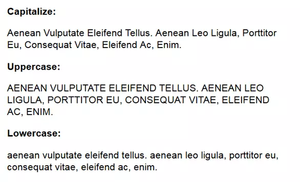
The property text-transform makes it possible to carry out text transformations via CSS. Here, text areas can be displayed is majuscules (uppercase letters) or minuscules (lowercase letters) without needing to adapt the text base. The property enables the following transformations:
| Value for text-transform property | Description |
|---|---|
| capitalize | The first letter in every word is displayed in uppercase. |
| uppercase | The entire text selection is displayed in uppercase. |
| lowercase | The entire text selection is displayed in lowercase. |
| none | No transformation. |
| inherit | The transformation corresponds to the parent element. |
If the beginning letters of a selection are displayed as uppercase, regardless of the source text, the following formatting is used:
.content {
    text-transform: capitalize;
}
<p class="content">Aenean vulputate eleifend tellus. Aenean leo ligula, porttitor eu, consequat vitae, eleifend ac, enim.</p>
The following graphic shows the CSS text transformations in comparison.
Font and background colours
When choosing font and background colours, web designers generally utilise the previously established colour codes in decimal or hexadecimal notation. Here, the CSS properties color and background-color are used. You can also integrate a background image using the background-image property.
color
The CSS property color offers formatting for font colours. Common values are colours in the form of RGB values, hexadecimal codes, or HSL data. The transparent value enables elements to be displayed with little visibility. According to W3C recommendations, the keyword transparent has the value rgba(0,0,0,0) (transparent black).
The following code example shows color formatting using a hexadecimal colour code:
.content {
    font-family: Arial;
    font-size: 5em;
    color: #d82451;
}
<p class="content">Example text</p>background-color
The CSS property background-color is used if an element is to be assigned a background colour. The possible values correspond to those of the color property.
The following code examples shows a formatting of font and background colour:
.content {
    font-family: Arial;
    font-size: 5em;
    color: #d82451;
    background-color: #24d8ab;
}
<p class="content">Beispieltext</p>
The formatting instructs the web browser to display all text elements of the content class claret red (#d82451) and to make the background turquoise green (#24d8ab).
background-image
Instead of setting a background colour, you can also set an image as the background for an element. Web designers use the property background-image, which contains the path to the graphic as the value according to the following notation:
.content {
    background-image:
        url (path to image file);
}
Instead of background-image or background-color, you can also use the abbreviated form background.
CSS3 also offers the possibility to define color gradients as the background. Possible values are the functions linear-gradient(), radial-gradient(), repeating-linear-gradient(), and repeating-radial-gradient().
| CSS colour gradient | Description |
|---|---|
| linear-gradient() | The function linear-gradient() generates a linear colour gradient. |
| radial-gradient() | The function radial-gradient() generates a radial colour gradient. |
| repeating-linear-gradient() | The function repeating-linear-gradient() generates a repeating linear colour gradient. |
| repeating-radial-gradient() | The function repeating-radial-gradient() generates a repeating radial colour gradient. |
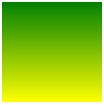
More about colour gradients can be found on the W3C website. In our CSS introduction, we limit our examples to the function linear-gradient(). If an element is to be stored with a linear color gradient, use the linear-gradient() function as the value for the background property. This expects at least two colour indications as arguments. Which notation is used to define the colours is up to the web designer. For the sake of clarity, we use the colour key words for our example.
.content {
    width: 400px;
    height: 400px;
    background: linear-gradient( green, yellow );
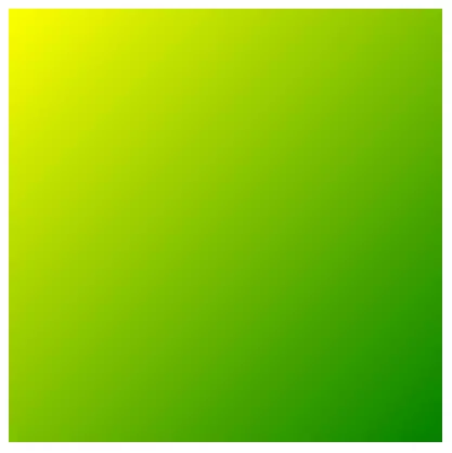
}Web designers have the option to individually determine the direction of the color gradient and its position. The gradient direction is defined either as an angle measure or by specifying an edge (to top, to bottom, to left, to right) or to a corner (to right top, to right bottom, to left bottom, to left top).
.rahmen {
    width: 400px;
    height: 400px;
    background: linear-gradient( to left top , green, yellow );
}A trend indication as an angle measure is made clockwise from the standard value (to bottom). Possible measurements are deg (degree), grad (gradian), and rad (radian). In this case:
to bottom = 180deg = 200grad = 3.1416rad
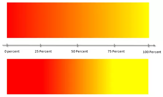
The position of a colour gradient is determined by the colour stop indicators. These are usually indicated on the gradient axis with a value of 0 to 100 percent.
The standard positions of colours in a two-color gradient are 0 percent and 100 percent. The area between these is calculated by the browser as a color gradient and displayed in intermediate tones.
Colour stops make it possible to start or end the color gradient at any selected position on the gradient axis.
The following graphic shows two color gradients with different colour stop data:
background: linear-gradient( 90deg, red 0%, yellow 100% );
background: linear-gradient( 90deg, red 25%, yellow 75% );
The first example shows a colour gradient from 0 to 100 percent. In the second example, the gradient begins at 25 percent and ends at 75 percent.
In CSS colour gradients, you can combine as many colors as you want – with transparency levels as desired.
Borders
CSS also allows you to frame HTML elements with a border. This is especially recommended for block-level elements, such as headings (h1-6), paragraphs (p), div elements, or tables that are contained within the body element. Without other formatting, the content blocks extend over the entire available width and arrange themselves one below the other. Some block-level elements such as <p> or <h1> have a default margin setting.
Inline elements like <b>, <i>, <a>, or <span> help to distinguish between the block-level elements. Inline elements occur exclusively within block-level elements. The width of an inline element is determined solely by its own content.
If a border contains an entire block-level or inline element, then the borders property is used. Alternatively, you can define the border design for each page of an element individually.
| Border properties | Description |
|---|---|
| border | Defines the border design for all pages of an element. |
| border-top | Defines the properties of the top border. |
| border-right | Defines the properties of the right border. |
| border-bottom | Defines the properties of the bottom border. |
| border-left | Defines the properties of the left border. |
Both the border property and the properties for individual border edge can be specified with respect to the border-style, the border-width, and the border-color. Corresponding values are notated in the following pattern, behind the property and separated with spaces:
.content {
    border: style width color;
}
.content {
    border: solid 4px #ff0000;
}
The border-radius property also gives the option to round the border edges.
border-style
With the choice of border styles, you can define a decorative frame for the block-level or inline element in question. Some border styles only come into play if an adequate frame width is selected.
| Possible border style values | Description |
|---|---|
| none | No border. |
| hidden | Displays no border and suppresses it with the neighbouring table cells. |
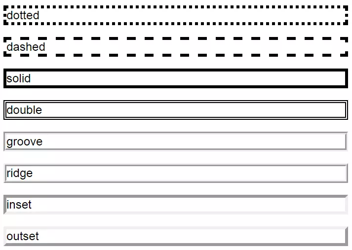
| dotted | Defines a dotted border. |
| dashed | Defines a dashed border. |
| solid | Defines a solid border. |
| double | Defines a double border. |
| groove, ridge, inset, outset | These values implement different 3D effects. |
Specifying the border style is obligatory, and if no border style is given then the border isn’t displayed by the web browser – even if there are values for frame width or frame colours.
border-width
The border width defines the thickness of the border’s lines.
| Possible border width values | Description |
|---|---|
| Length specification | The size specification of the border width is determined using the units described under font-size. The border width can’t be specified as a percentage. |
| thin | Thin width |
| medium | Medium width |
| thick | Thick width |
border-color
The colour settings for the border-color property correspond to the properties color and background-color.
| Possible border colour values | Description |
|---|---|
| Colour specification | Colour specifications for borders can be given in keywords (i.e. red), as HEX values or as RGB or HSL specifications. |
| transparent | Defines the border as transparent. |
The following code example combines the border property with formatting for font and background colours. This rule set is defined in the CSS document for the border class:
.border {
    font-family: Arial;
    font-size: 5em;
    color: #d82451;
    background-color: #24d8ab;
    border: 10px ridge #d82451;
}
To apply the formatting, the CSS class border is transferred to the <p> element in the HTML source code using the class attribute.
<p class=“border”>Example text</p>border-radius
The border-radius property allows you to round the corners of a border, either circularly or elliptically. A possible background is trimmed along the defined curve – even when an element doesn’t have a border. Cleverly used, simple geometric forms can also be drawn with border-radius.
Possible values for the border property are up to four size declarations, each for a respective border corner. Assignment can be by one, two, three, or four values.
| Values for the border-radius property | Description |
|---|---|
| One value defined | The value is applied to all four corners. |
| Two values defined | The first value defines the top left and bottom right corners. The second value defines the top right and bottom left corners. |
| Three values defined | The first value defines the top left corner. The second value defines the top right and bottom left corners. The third value defines the bottom right corner. |
| Four values defined | Every corner is defined by its own value. The order is applied in a clockwise direction: top left, top right, bottom right, bottom left. |
The individual values for the border radius are noted by separating spaces behind the border-radius property. The declarations are given in a pattern that looks as follows (the number values here are just examples):
border-radius: 4em 2em 3em 1em;
The border-radius property can be defined in the same rule set as the border property or in a separate class.
The following rule set defines a border with border-radius of 2 em:
.border {
    height: 100px;
    width: 600px;
    border: solid 10px #d82451;
    border-radius: 2em;
}You can also define different values for each of the four corners:
.border {
    height: 100px;
    width: 600px;
    border: solid 10px #d82451;
    border-radius: 2em 1em 3em 4em;
}In both cases, the corners of the border are circularly rounded. If you want the rounding to be elliptical, then two values would be required for each corner. The declaration of an elliptically rounded border can contain up to eight values:
border-radius: 1em 4em 1em 4em / 4em 1em 4em 1em;
The values before the slash (/) define the radius of the horizontal semi-axis of the ellipse, and the values after the slash define the radius of the vertical semi-axis.
.border {
    height: 100px;
    width: 600px;
    border: solid 10px #d82451;
    border-radius: 1em 4em / 4em 1em;
}Potential backgrounds are automatically altered along the curve.
.border {
    height: 100px;
    width: 600px;
    border: solid 10px #d82451;
    border-radius: 2em;
    background-color: #24d8ab;
}
The CSS box model
To align text elements, graphics, and other design elements on a website, a CSS strategy based on the formatting of the rectangular surfaces is used, created by the various block-level and inline elements. This is called the CSS box model.
Every HTML element is rendered as a rectangular area in the frontend display of a website – the so-called box. The characteristics of such boxes, their flow and extent, determine the design of a website. As a result, every website can more or less be viewed as an arrangement of various boxes.
The positioning of individual boxes is defined by the document flow. This follows a standardised pattern: As long as no other formatting is present, every element can be displayed as far left as possible – beginning with the first element in the HTML source text. All following elements are arranged next to them, on the right. If there is no more room, the next box can be placed into a new row.
CSS differentiates between two types of boxes:
- Block boxes: Block boxes are comprised of block-level elements (e.g. p or div). As a rule, web browsers display these so that their width corresponds to the overall width of the parent elements. It is also paragraph-generating. Following elements are automatically placed in the next line. The height of a block box fixes itself based on the content of the elements or the potential formatting. Block boxes can contain not only other block-level elements, but also inline elements.
- Inline boxes: Inline boxes are comprised of the internal inline elements (e.g. b, i or span) of a block box, and so are not paragraph-generating. Width and height of an inline element are fixed exclusively based on its own content.
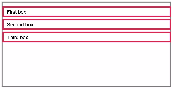
The following diagrams illustrate the document flow of block and inline boxes:
If no other formatting is in place, then block boxes are displayed with a maximum width, regardless of their content. Every box begins a new paragraph and extends over the total width of the parent element. In the example, this is recognised with the gray border. It should be noted that some block-level elements, such as <p>, are rendered by web browsers with an automatic default margin.
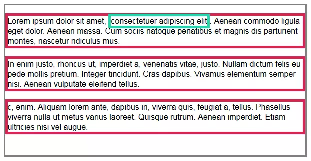
Inline boxes within a block-box don’t begin a new paragraph, and are instead displayed ‘inline’ with the document flow.
The example shows an inline box outlined in turquoise, containing the word group “consectetuer adipiscing elit”.
Based on the paragraph-generating functions, the layout of a website primarily results from the formatting of block boxes. It doesn’t necessarily have to revolve around the content elements, such as headline or text paragraphs. Often, the empty semantic HTML elements like <div> are used to group other elements and create a set that can be formatted via CSS.
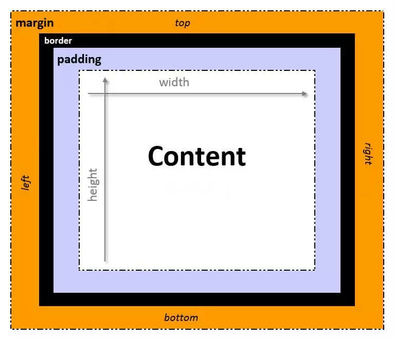
The formatting is carried out using CSS box model. According to this model, each HTML element can be described by four nested boxes, which can be adapted independently to fit the desired design idea. These are differentiated between Content-Box, Padding-Box, Border-Box, and Margin-Box.
| Box model levels | Description |
|---|---|
| Content (Content-Box) | The Content-Box represents an area whose extent is determined by the text range or dimensions of a graphic. With block-level elements, the height and width can be individually defined using the height and width properties. For inline elements, formatting of this type isn’t available. |
| Internal space (Padding-Box) | The Padding-Box defines the space between the Content-Box and the Border-Box. |
| Border (Border-Box) | The Border-Box defines the border. |
| External space (Margin-Box) | The Margin-Box defines the space between the current elements and their parent elements or neighboring elements. As opposed to padding and border, the margin property can also display negative values. |
If all four edges of a box are formatted the same, then the padding, border, and margin properties are used. Internal and external space, as well as borders, are formatted separately for every side of a CSS box. The respective properties are shown in the following table:
| Internal space | Border | External space | |
|---|---|---|---|
| upper | padding-top | border-top | margin-top |
| lower | padding-bottom | border-bottom | margin-bottom |
| left | padding-left | border-left | margin-left |
| right | padding-right | border-right | margin-right |
Use of the CSS box model
The CSS box model can be clarified by adding the individual levels to the content box step-by-step. The starting point is a short text selection, which in this example is formatted using the class selector content:
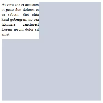
<p class="content">At vero eos et accusam et justo duo dolores et ea rebum. Stet clita kasd gubergren, no sea takimata sanctusest Lorem ipsum dolor sit amet.</p>The following rule set gives the content box dimensions of 150 px x 150 px. Further formatting defines a black font (color: #000000;) on a white background (background-color: #ffffff;). The text in the block set is also aligned (text-align: justify;):
.content {
     height: 150px;
     width: 150px;
     color: #000000;
     text-align: justify;
    background-color: #ffffff;
}According to the document flow, the text selection appears in the upper left corner of its parent element – displayed here as the gray background field. The text and the white background begin without any space on the left side of the browser window and fill the entire available area (150 px x 150 px). The white background ends directly with the text body.
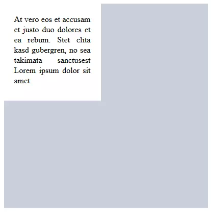
But a design like this isn’t very pretty, and makes it difficult to read. The padding property enables a web design to define an internal space to separate text elements from surrounding design elements.
.content {
     height: 150px;
     width: 150px;
    color: #000000;
    background-color: #ffffff;
    text-align: justify;
    padding: 10px;
}The web browser adds an internal space of 20 px to all four sides of the content box. The element now measures 190 px x 190 px. A further design element is the border.
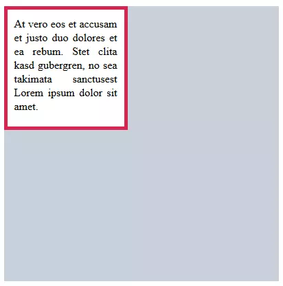
.content {
     height: 150px;
     width: 150px;
     color: #000000;
     background-color: #ffffff;
     text-align: justify;
     padding: 10px;
    border: 5px solid #d82451;
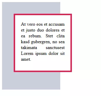
}A border is offset from the content by the padding value.
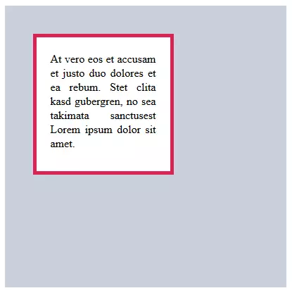
According to the natural document flow, a box formatted in this way fits without any space from the upper left corner to the parent element. The margin property allows you to loosen up the design of a website by using external space.
The corresponding declaration is simply added to the existing rule set:
.content {
    height: 150px;
    width: 150px;
    color: #000000;
    background-color: #ffffff;
    text-align: justify;
    padding: 20px;
    border: 5px solid #d82451;
    margin: 40px;
}The block box <p> is now freely set within the parent element.
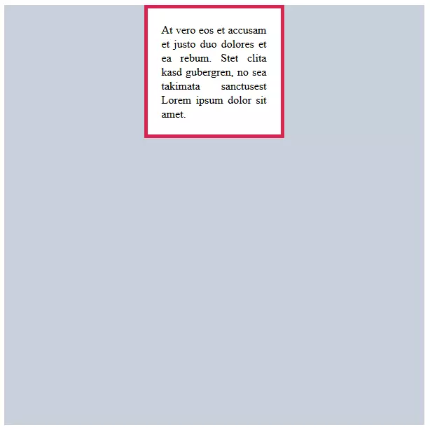
Measurements can also be provided in the margin property with the auto value. In this case, the box is automatically horizontally centred within the parent element. The auto value doesn’t work in the vertical direction.
.content {
    width: 150px;
    color: #000000;
    background-color: #ffffff;
    text-align: justify;
    padding: 20px;
    border: 5px solid #d82451;
    margin: auto;
}Calculating the height and width of a CSS box
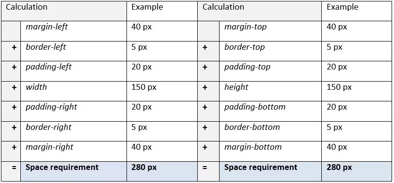
The space requirement of a CSS box is determined once all values of the relevant areas of the box have been added. The follow calculations are used:
If the element measures 200 px x 200 px, then the required space is 280 px x 280 px.
Float
In practice, the automatic line break after a block box is not always desired and can be prevented with the float property. This removes block boxes from the normal document flow and instead puts them in the desired position. According to CSS specifications, float accepts four values:
| Values for the float property | Description |
|---|---|
| none | No element shift takes place. The value float: none; is the standard value of a CSS box. |
| left | The block box shifts to the left inner edge of the parent element. |
| right | The block box shifts to the right inner edge of the parent element. |
| inherit | The float value corresponds to the parent element. |
A box with float formatting is called a float.
If multiple floats meet one another, they are arranged either from left to right (float: left) or right to left (float: right), in the order in which they appear in the HTML source code.
The following code example shows a .content rule set that includes a float property.
.content {
    height: 150px;
    width: 150px;
    color: #000000;
    background-color: #ffffff;
    text-align: justify;
    padding: 20px;
    border: 5px solid #d82451;
    margin: 40px;
    float: left;
}
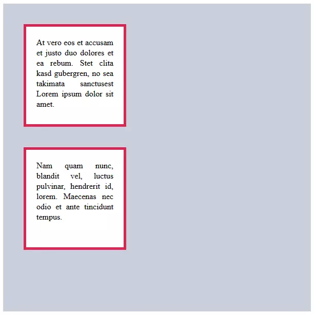
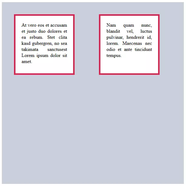
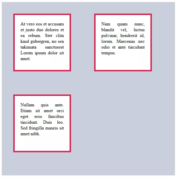
If this is applied to two HTML elements, then they are taken out of the document flow and aligned together to the left.
<p class="content">At vero eos et accusam et justo duo dolores et ea rebum. Stet clita kasd gubergren, no sea takimata sanctusest Lorem ipsum dolor sit amet.</p>
<p class="content">Nam quam nunc, blandit vel, luctus pulvinar, hendrerit id, lorem. Maecenas nec odio et ante tincidunt tempus.</p>The large spacing is obtained by adding together the external spacing of both boxes (each margin in 40 px). Without a float, the external margins of adjacent elements would collide.
If the total width of the successive floats is larger than the width of the parent element, then the following elements coming from the parent element are placed into the next line.
Another option for using the float property is customising the positioning information, in order to lift CSS boxes out of the natural document flow.
Positioning
The CSS property property serves to remove a box from the document flow and place it in a specified location on the website. Other boxes – whether tied to the document flow or positioned otherwise – have no influence on the positioning of boxes formatted in this way.
The position property has the five possible values of absolute, fixed, relative, static, and sticky, and is specified using the left, right, top, and bottom properties, as well as their values as measurements. In general, two values are enough to specify a position (e.g. top and left).
| Values for the position property | Description |
|---|---|
| absolute | The box is detached from the document flow and positioned where defined by the top, bottom, left and right properties. The information is given in relation to the next highest element also specified using the position property. If such an element doesn’t exist, then the root element <html> is used as the reference point. Boxes with the position: absolute declaration have no influence on the position of other elements, and either superimpose or overlay them. |
| relative | When the position: relative declaration is used, the box remains integrated in the natural document flow, but can be moved relative to this using the positioning information top, bottom, left, and right. The respective box is positioned on its own. Existing and following elements in the flow behave as if the box had not been moved. |
| fixed | When a box is placed using position: fixed, the position is defined in relation to the viewport. A box fixed in this way appears in the same place on the screen – even if a visitor scrolls through the page. Navigation elements like menus or stopper buttons (i.e. “Back to Home”) can be attached to the user’s view like this. |
| static | This box occupies a natural position in the text flow. If the position: static declaration is chosen, then the position specifications top, bottom, left, and right are voided. The static value is the standard value for the position property. |
| sticky | This position is calculated according to the normal document flow, and behaves like an element with the position: relative declaration, as long as it’s within the viewport. But if it’s close to disappearing form the display area, then it will break out of the document flow and ‘stick’ to the position defined by the web designed while the visitor is scrolling. The sticky value can also be used in combination with relative and fixed. |
Absolute positioning
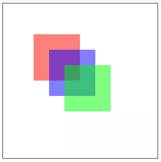
The following rule set contains absolute positioning specifications for red, blue, and green CSS boxes within the background parent element.
.background {
    height: 500px;
    width: 500px;
    border: solid grey
}
.red {
    height: 150px;
    width: 150px;
    background-color: rgba(255,0,0,0.5);
    position: absolute;
    top: 100px;
    left: 100px;
}
.blue {
    height: 150px;
    width: 150px;
    background-color: rgba(0,0,255,0.5);
    position: absolute;
    top: 150px;
    left: 150px;
}
.green {
    height: 150px;
    width: 150px;
    background-color: rgba(0,255,0,0.5);
    position: absolute;
    top: 200px;
    left: 200px;
}
The red, blue, and green content boxes are formatted with half-transparent, 150 px x 150 px areas. The background content box is 500 px x 500 px and has a gray border.
The design instructions are integrated via classes in the HTML code.
<div class="background">
    <p class="red"> </p>
    <p class="blue"> </p>
    <p class="green"> </p>
</div>Relative positioning
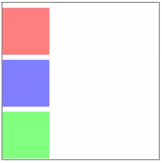
The external spacing above the elements corresponds to the default value for <p> elements.
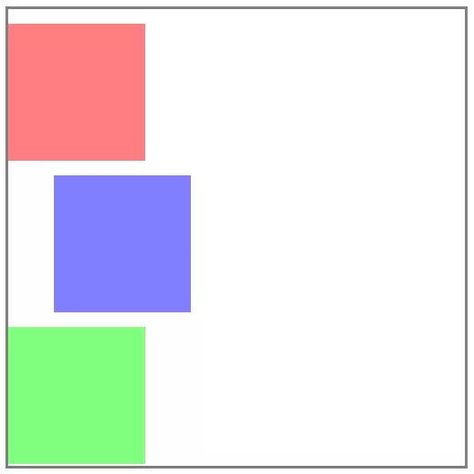
To align a box out of its position in the document flow, the corresponding rule set is extended by the position: relative declaration, as well as the desired position data.
The following code block uses the blue box as an example:
.content2 {
    height: 150px;
    width: 150px;
    background-color: rgba(0,0,255,0.5);
    position: relative;
    left: 50px;
}
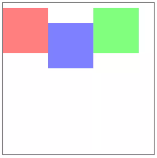
The relative positioning can also be applied to floated elements.
.content2 {
     height: 150px;
     width: 150px;
     background-color: rgba(0,0,255,0.5);
     position: relative;
    top: 50px;
    float: left;
}Fixed CSS boxes
The orientation of fixed boxes is similar to the absolute positioning of elements removed from the document flow. All positioning information is related to the viewport of the user.
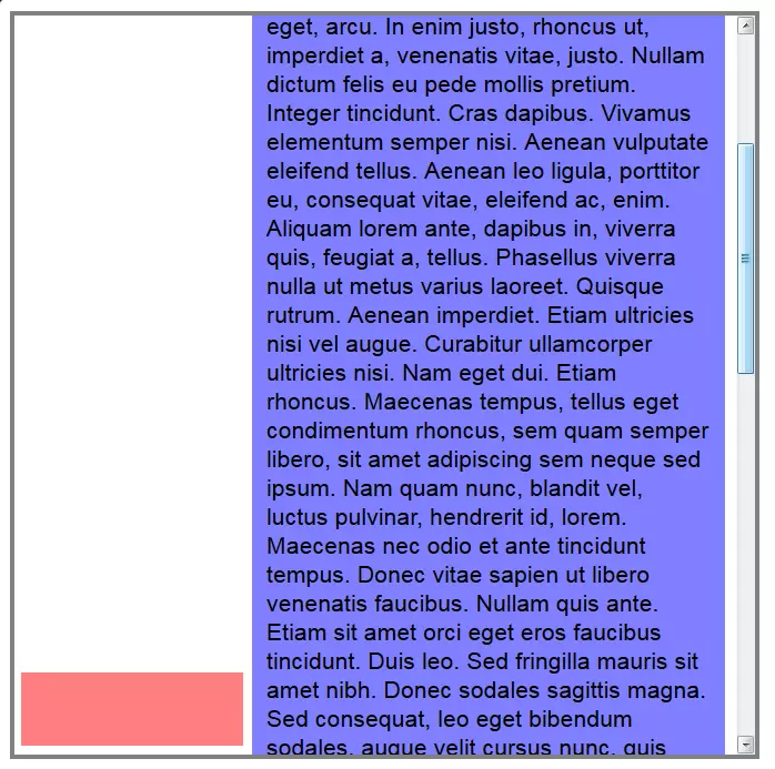
The following rule set instructs a web browser to fix a small red box in the upper left corner of the viewport.
.content1 {
    height: 50px;
    width: 150px;
    background-color: rgba(255,0,0,0.5);
    position: fixed;
    bottom: 10px;
    left: 15px;
}From beginners to professionals
The goal of our tutorial was to illustrate the possibilities of CSS for beginners. A short crash course is obviously not enough to describe all functions of the stylesheet language in detail. If your interest in CSS goes beyond the formatting discussed here, we recommend the very detailed wiki W3 for further research, as well as the Mozilla Developer Network. We’ve also compiled a selection of useful CSS tricks for advanced users in a more detailed guide article on the topic.


