Breadcrumb navigation and its advantages
Who remembers the famous Grimm fairytale Hansel and Gretel? Two brothers and sisters, who have gotten lost in the forest, sprinkle breadcrumbs behind them so they can find their way back home. The children become caught in the clutches of a cannibalistic witch, but end up escaping and finding their way out of the forest. But what does this gloomy fairytale have to do with web design? Easy: The World Wide Web and some particularly complex websites can also appear like a dark forest. When navigating through extensive online shops or widely branched web portals, a lost user would also appreciate a trail of breadcrumbs to help find the uncomplicated way back to more important pages. Breadcrumb navigation serves exactly this purpose. Read about what breadcrumb navigation is, what a breadcrumb trail looks like, and what it means for the usability of websites and SEO.
What is Breadcrumb navigation?
Breadcrumb navigation is a secondary navigation element, which is used to support the usual menus found at the top of a website. It provides better orientation for users in a number of ways: On the one hand, breadcrumb navigation allows the user to always see where they are on the website, and on the other hand, it also typically indicates which path leads to higher-level areas. ‘Breadcrumb trails’ represent the individual stations logically, successively, and usually hierarchically. Users move from the homepage via the category pages to the concrete content. The breadcrumb trail offers links to all these stations. This allows users to understand the structure of the website and go back with just one click.
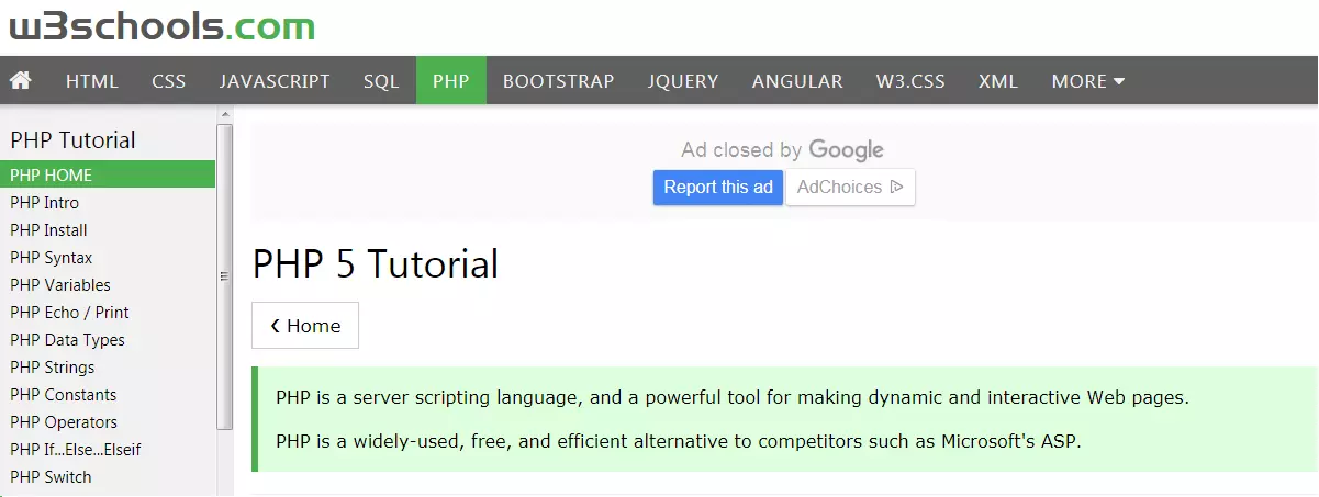
As such, breadcrumbs on websites fulfill the same function as the breadcrumbs in the fairytale – with the crucial difference that the breadcrumbs cannot be picked away by birds, which is what happens to Hansel and Gretel in the story. There are various representations of breadcrumb navigation: arrow symbols or the greater than sign (>) are widespread, act as a separator, and represent the hierarchy of the website. Graphic buttons are often used in the arrow form. This usually results in a path which corresponds approximately to the following scheme:
- Start page > category > current position
On particularly complex pages, there are often other categories and subcategories between the start page and the current position. According to the above formula, breadcrumb navigation is also called a location breadcrumb, because the start position and the way to the start page are both represented. Another less common version is the path breadcrumb, which focuses on the actual click path rather than the location, and can be confusing for complex pages. The path breadcrumb maps the surfing behavior of the user on the site – no matter how jumpy it is. This variant might look like the following:
- Start page > Category 1 > Start page > Category 3 > Category 2 > Start page
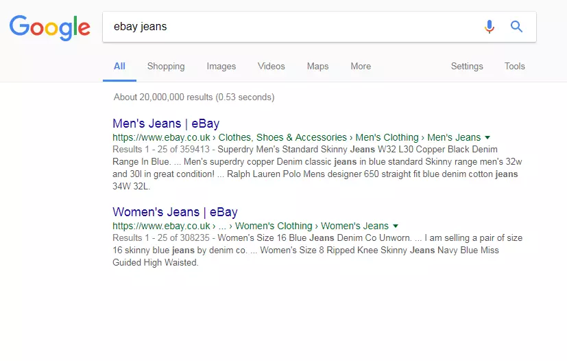
A third variant are category- or attribute-based breadcrumbs: these are often found in the e-commerce sector, particularly online shops. They show the user which category the currently open page belongs to, and its attributes. At the same time, it collects meta-information. For example, a pair of jeans is a category of trousers, but it can also have the attributes ‘blue’ and ‘size 32’:
- Start page > Clothing > Menswear > Trousers > Jeans > Blue > Size 32
There are three different types of breadcrumbs: the location, path, and category or attribute breadcrumbs. Location breadcrumbs indicate the location on the site, path breadcrumbs form the path, and attribute breadcrumbs point to the selected categories and filter options.
Breadcrumb navigation and usability
At this point, some people might be asking themselves what breadcrumb navigation is really useful for. After all, there are already menu bars that we navigate through. Every current browser also has buttons for scrolling back and forth. These aspects make is possible to navigate a site, but in some cases they can be cumbersome and complicated. One of the most important rules for good User-Experience-Design is that the fewer clicks the user needs to make, the better the experience. This principle applies to navigation in particular. There is hardly anything more annoying than clicking on the ‘back’ arrow or having to trawl through a whole category again in the menu bar. Beyond that, when using breadcrumbs, users always know where they are on the site: The hierarchy and structure of the page is much more transparent with breadcrumb navigation than with single menu navigation. Even if the users reach the target page via an external or internal link and have not clicked through the start page to the current position, they can see where they are just by glancing at the breadcrumb navigation. Additionally, it invites you to browse on the respective page and reduces the risk of users jumping: the parent category is just a click away, and thanks to breadcrumb navigation, you do not have to make another search query. This also keeps users who have reached the bottom side through external links from other sites, or through search engines. Another plus is that it is usually quick and easy to create a breadcrumb navigation and to integrate it into the website. The advantage for the user experience is enormous – it is unobtrusive and fits seamlessly into almost any design. Even if it ends up only being used actively by some visitors, it does not usually interfere with other users. Subsequently, there is hardly any reason to argue against having breadcrumb design. Only websites with a very flat hierarchy would not see all the benefits of having breadcrumbs as a secondary navigation tool.
Breadcrumb navigation from an SEO perspective
What is good for the user is also good for search engines. This online marketing principle also applies to breadcrumb navigation: nowadays, breadcrumbs are sometimes displayed in the Google SERP’s instead of a long and confusing URL. Search engines classify breadcrumbs as a positive signal: Looking at them shows the user what to expect from a website, and which category it belongs to, before they even visit the website.
When you take a look at the names of the individual breadcrumbs, the second important advantage for the search engine optimisation is clearly apparent: Breadcrumb navigation offers the perfect opportunity to underline very natural internal links with relevant keywords. A logically structured web design with breadcrumbs makes it easier for users, as well as search engine crawlers, to understand the structure and relevance of a website.
Crawlers follow the internal links and include the found pages in the search engine box. Ideally, this leads to an improved ranking for the site. For visitors, the improved navigation system means they usually stay longer on the site: the length of stay and the bounce rate of users are also important ranking factors for the search engines.
Dos and Don’ts: Using breadcrumbs properly
Breadcrumb navigation can improve the usability and even search engine ranking – provided it is properly integrated, sensibly placed, and indeed, offers added value. In the following examples, we outline the do’s and don’ts of breadcrumbing:
Breadcrumbs must offer added value
There are only a few cases where breadcrumb navigation can be seriously irritating: one of them is when it does not actually perform a function. Websites that do not have an extensive structure, just a few pages, do not need breadcrumbs. In this case, navigation takes place via the primary menu bar, or the header of the page. In contrast to this, the attribute-based breadcrumb navigation of amazon offers real, clear added value:
In Amazon’s online shop, breadcrumb navigation is a useful addition: the more complex the search queries, the more important it is for the user to be able to reset the search easily. Additionally, this ensures that the user always knows where they are and which filters are currently active. In the following example, breadcrumb navigation is almost obsolete:
This web developer site includes only one other category for the departments listed in the page navigation. If you choose a random category – such as the category Speyer, shown in the screenshot – it is evident that there are no further subcategories. The location breadcrumb offers hardly any added value with such a flat site structure.
Breadcrumbs must be logical and should not be confusing
Websites that offer numerous navigation options run the risk of confusing their users with too many choices. Particularly confusing are doubles, as shown in the previous example. Breadcrumbs are unobtrusive and fit nicely into most designs, but if they do not offer anything except reflecting the function of the primary navigation bar, nobody benefits. Double is not always better. The next positive example is quite different: On Apples’s website, the breadcrumb trail is worth it, being both subtle yet easy to find.
This breadcrumb navigation is absolutely logical, easy to comprehend, and very well integrated into the page design.
Less elegant solutions can be confusing when teamed with completely pointless breadcrumb trails. This can be seen in the following example, where neither the homepage nor a parent category appears in the path. The breadcrumb trail only consists of the current position, without any further orientation or navigation options for jumping forwards or backwards. The clickable link is equally pointless, as it simply leads the user to the page they are already on. The position display offers little added value, and can even lead to more confusion.
Breadcrumb navigation supports the primary navigation, it does not replace it
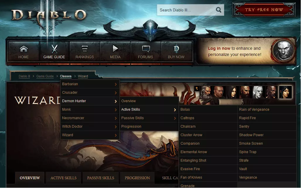
Breadcrumb navigation should only be used as a support and supplement to the main navigation. They should be kept small, so as not to distract from the actual content. It should not overshadow the primary navigation tool, and it should only serve as fine-level navigation and fast-paced orientation. Only in exceptional cases does extensive breadcrumb navigation lead to better usability – for example, the website for the computer game Diablo III, where the navigation is presented as a borderline:
Opponents of breadcrumbs would probably argue in cases like this that the navigation option here is instead an indication of deficient web design and creates confusion in the website. Looking closer at the screen shot of the Diablo III site, it’s easy to see how awkward navigation would be without breadcrumbs because there are so many classes and abilities to discover on this site. The structure of the website goes all the way from the start page through the game guide, to individual skills of the figures in many categories. The breadcrumb navigation tool with its extensive mouseover drop-down menus complements the main navigation despite its size, and helps to keep track of all the subcategories. It also speeds up selection and movement from category to category.
How can breadcrumbs be implemented?
So much of the theory on how you actually implement breadcrumbs still needs to be clarified. Depending on the requirements and the existing CMS, you have different ways of doing it: breadcrumbs can easily be created using HTML. You can then customise the appearance using CSS. The following code example shows how to implement breadcrumbs using HTML:
<div id="breadcrumbs">
    <a href="/index.html">Startseite</a>
    >
    <a href="/ebene1.html">Ebene 1</a>
    >
    <a href="/ebene1-3.html">Unterpunkt zu Ebene 1</a>
</div>
In the code example above, the location of the current position is the only missing aspect for a logical, location-based navigation system. No further hyperlink is required, since you are already at this location. You can also use the list item (‘li’). As an alternative to the ‘id’ tag, you can also use ‘class’ instead of ‘div’ as well as the ‘nav’ tag. In order to make breadcrumbs more search-friendly, microdata, RFDa, or JSON-LD are also options. If the breadcrumbs in the source code are semantically distinguished like this, the search engine crawlers can read out the different elements, which can also be displayed as rich snippets in the SERP’s.
In addition to implementation via HTML and CSS, there are a few other ways to integrate breadcrumbs: the easiest option is offered by content management systems. With the management systems, the backend implementation happens easily in just a few clicks. CMS, which does not offer a complete solution, has several available corresponding plugins. It is also possible to implement breadcrumb navigation on dynamic websites using PHP or JavaScript.
Breadcrumb navigation can improve the user experience on complex websites with many categories and subcategories. It improves usability, allows you to orient yourself quickly with the page structure, and fits well into most designs. Also, from an SEO perspective, it is worth installing to gain the natural internal links, and there is also the possibility that breadcrumb navigation in Google SERPs will replace the URL. The condition is a logical, sensible execution with added value for the user, and correct integration. Websites with very flat hierarchies, however, rarely require breadcrumb navigation.


