Gantt chart in Excel – it’s this easy!
With a Gantt chart, you can visualise the chronological order of actions or tasks. That’s why the graphic is such a popular tool in project management. Every team member can see at a glance when what actions need to be carried out. But how do you make a Gantt chart? Excel already provides everything you need to produce the chart.
What do you need a Gantt chart for?
For around 100 years, companies, teams, and freelancers have worked with Gantt charts to plan and complete their projects. The chart is made up of a biaxial graphic. The various sub-tasks within a project are arranged along the y-axis. The x-axis, on the other hand, represents the chronology. Bars in this chart make clear in what amount of time the respective tasks are to be completed in.
The Gantt chart is named after the business consultant Henry L. Gantt. The tool, also known as a block diagram, is used particularly in project management, where the chart helps to visualise timescales.
The chart provides a lot of leeway to adapt it to a specific project. The time intervals on the x-axis can be divided into days or weeks, for example, but you can also work with less specific time frames. If you colour the individual bars differently, the chart becomes easier to understand. The axes and bars can be extended with further information, for example in order to illustrate more complex relationships or explain competences.
A Gantt chart can also be useful outside of project management. The graphics are used in the production industry, for example, in order to create an occupancy plan. Instead of periods of time, the tasks are assigned to certain resources. This shows at a glance where there is availability.
- Up to 50 GB Exchange email account
- Outlook Web App and collaboration tools
- Expert support & setup service
Making a Gantt chart in Excel
If you’d like to create a Gantt chart in Excel, you have to take various steps. To start with, you need a table containing all the necessary information. From this table, you can generate the actual chart in Excel and then adapt this to the respective requirements.
Step 1: Preparing the table
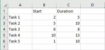
All the information in a Gantt chart can also be represented in a table. However, this is nowhere near as easy to grasp as the chart is. In order to make the visual representation possible, though, you have to create the foundation for Excel. This is the reason why you create a table: In the first column, enter all the tasks that come up in your project. The title line contains information regarding the timespan. For a Gantt chart, it’s necessary to state both the starting point and duration.
Step 2: Creating a Gantt chart
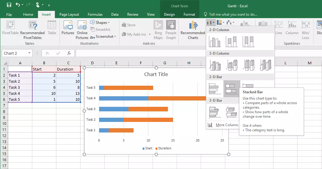
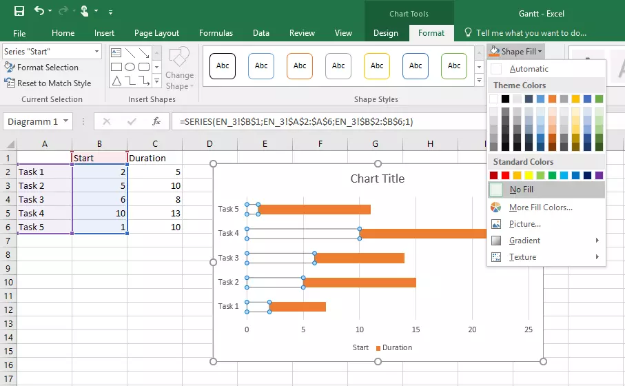
Based on this data you can now create the chart. For this, first, highlight the complete table, then switch to the “Insert” tab and select the option “Stacked Bar” under the vertical and horizontal bar charts. Excel will now link the two values. The value that you entered as a starting point is now shown as the beginning of the bar, and the duration forms the rest of the bar (as shown in the following illustration). The colour delimitation of the first part of the bar is unnecessary for a Gantt chart, though, and should be removed. You can use a trick for this in Excel: instead of removing the area itself, simply remove the colouring. To do this, switch to the “Format” tab (in the “Chart Tools” area) that appears in the menu sleeve when creating the chart.
Now, select the first part of the bar. Make sure that this area is also selected in all the other lines, otherwise, you’ll have to repeat the procedure for each bar individually. Then, select the option “Fill Effect” in the menu sleeve and click “No Fill.” The first part of the bar is still there, but no longer visible. You’ve now created a classic Gantt chart: The tasks are arranged along the left-hand side of the graphic and the (visible) bars depict the duration of these tasks.
Step 3: Adapting the chart
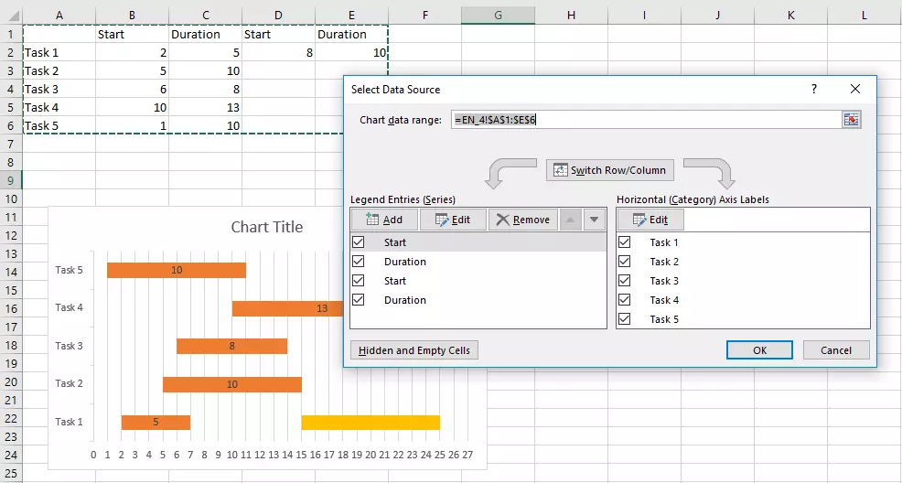
Excel’s advantage is that if you’d like to make a change, for example altering the timespan or renaming a task, you can do this directly in the table, and the graphic will update automatically. If you’d like to introduce another task, though, you have to adapt the chart data area. As soon as you’ve activated the complete diagram with a mouse click, you’ll see the filter symbol. After clicking the button, you can then click on “Select data...” right at the bottom. In the menu that opens, you have the possibility to include data into your chart.
You can see the area currently selected in the top menu row. To add new tasks, you have to extend this. Write the correct cell references either directly in the cell or click on the button on the right edge of the row. You can now also select the area with the cursor.
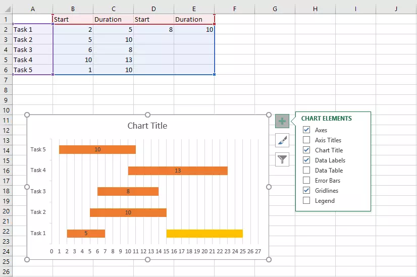
In the course of a project, it’s also possible that certain tasks will come up again and again. To illustrate this, several bars have to be visible in the same row. First of all, add more columns to your table. Define additional starting points and timespans. Here, too, you have to adapt the chart data area and remove the colouring from the areas of the bars that aren’t relevant for your Gantt chart.
Step 4: Configuring your Gantt chart
Presumably, you’d like to make more changes to your Gantt chart to adapt it to your project’s requirements. The first design adjustment will probably be to furnish each bar with its own colour. For this, follow the same process as with changing the fill colour for the starting areas of bars – in this case, you simply have to go from bar to bar individually.
It could make sense for you to show or hide certain elements of the chart. Use the plus symbol next to the graphic to select the chart components that you need. A key, for example, is of little help in this kind of chart. If you activate the data label, on the other hand, you can read the duration of tasks directly from the respective bar. It might also make sense to adjust the x-axis: Right-click on the axis label and then on “Format axis...” In the sidebar that opens you can now change the interval, for example, and adjust it to the respective project.
You’d like to use Microsoft’s spreadsheet software to create a Gantt chart, but you don’t have the Office Suite? IONOS can also offer you Microsoft 365. Enjoy all the functions of Microsoft Office online in your browser.


